Background:
I enrolled an app in Google play open beta testing. Google sent me prelaunch report and it got me worried.
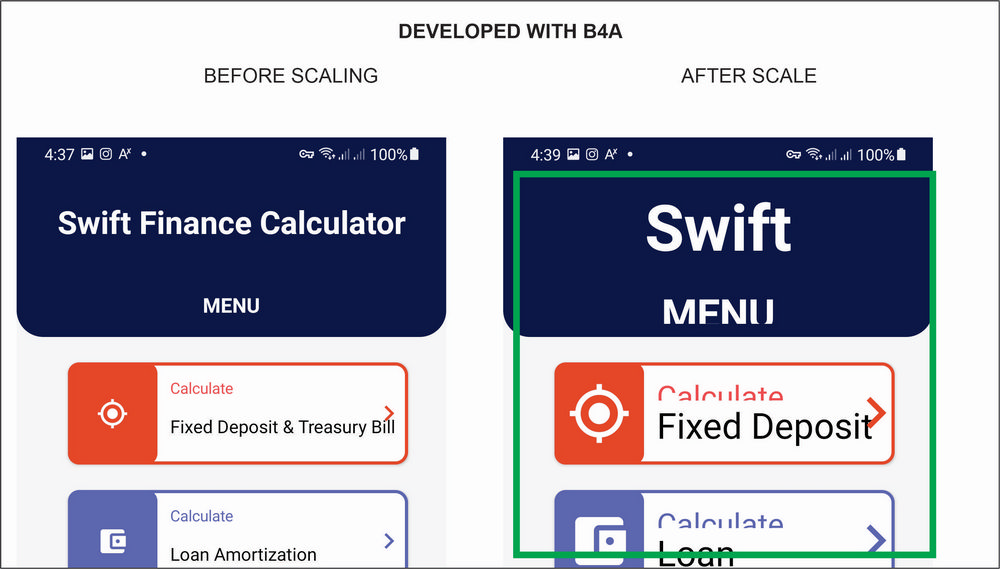
On devices where user increases the display font size, my labels and other views overlap (cropped) each other.
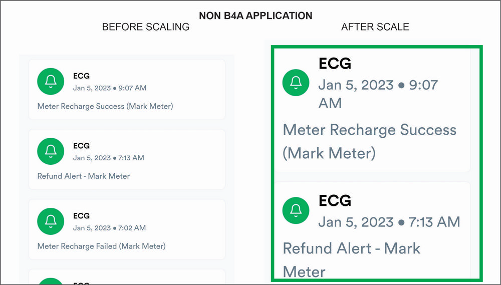
I tested some other apps and they are able to adjust and even wrap content. Only my B4A appss are cropping.
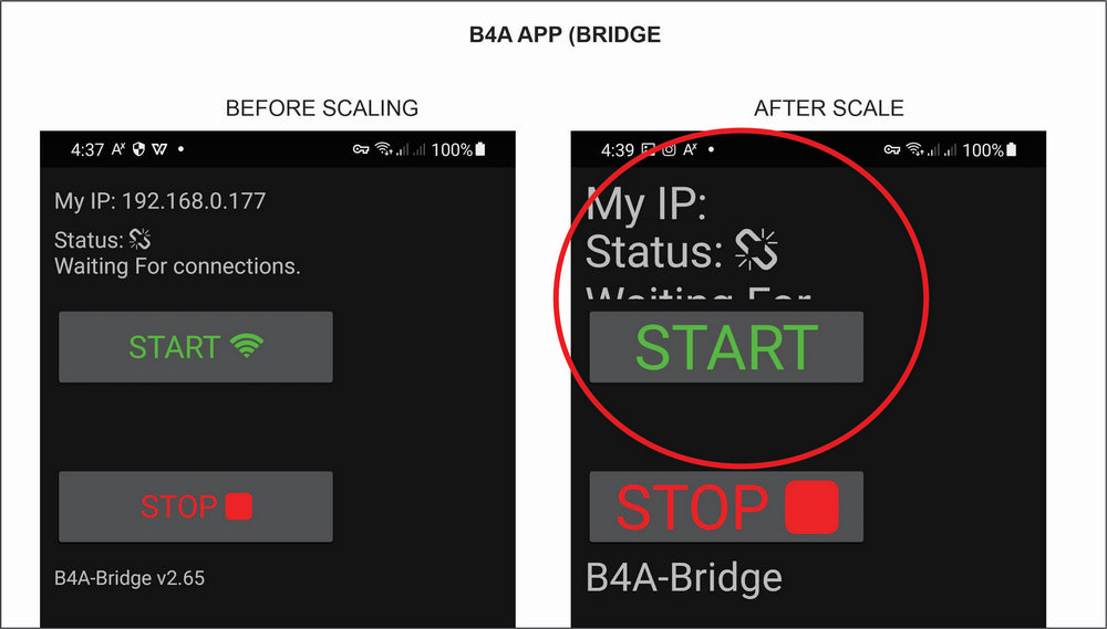
Out of curiosity, i also opened B4A Bridge App and it also have labels overlaping when scalled.
Google report Recommendation
This TextView has a fixed size and scalable text.
Consider modifying the LayoutParams to allow for text expansion.
"wrap_content" or "match_parent" is preferred for the dimensions of a TextView or a non-scrolling container of scalable text.
More information from link below gave ways of correct implementation. Chere spoiler
Some users have difficulty when they read texts that are small. They can use their device's Font size Accessibility setting to make text larger on the screen. However, this setting only affects the appearance of text if its font size was specified in units of scalable pixels (sp).
When you adjust the font size to make text appear larger, the increased size may cause parts of the text to become cropped, cut, or obscured if the layout is overly constrained. "wrap_content" or "match_parent" is preferred for the dimensions of a TextView or a non-scrolling container of scalable text.
<TextView
android:layout_height="wrap_content"
android:layout_width="match_parent"
android:textSize="20sp"
android:text="@string/directions" />
Text with size in sp, and height that allows expansion.
<TextView
android:layout_height="wrap_content"
android:layout_width="match_parent"
android:textSize="20sp"
android:minHeight="48dp"
android:text="@string/directions" />
Height allows expansion, but will be at least 48dp.
<TextView
android:layout_height="wrap_content"
android:layout_width="match_parent"
android:textSize="20dp"
android:text="@string/directions" />
Text with a size in density-independent pixels (dp) won't scale.
<TextView
android:layout_height="48dp"
android:layout_width="100dp"
android:textSize="20sp"
android:text="@string/directions" />
Text with a fixed width and height might not provide sufficient room for enlarged content, potentially causing text to be clipped when scaled.
Give feedback about this article
Two things
1. "wrap_content" or "match_parent" is preferred
2. Text sizes are defined in scalable pixels (sp) instead of dp
If these already work in B4A, then someone should point me in the right direction, else the question is How do we utilize these to make better UI for our apps?
Is the solution calculating the system font and adjusting our views as it changes?
Please advice


I enrolled an app in Google play open beta testing. Google sent me prelaunch report and it got me worried.
On devices where user increases the display font size, my labels and other views overlap (cropped) each other.
I tested some other apps and they are able to adjust and even wrap content. Only my B4A appss are cropping.
Out of curiosity, i also opened B4A Bridge App and it also have labels overlaping when scalled.
Google report Recommendation
This TextView has a fixed size and scalable text.
Consider modifying the LayoutParams to allow for text expansion.
"wrap_content" or "match_parent" is preferred for the dimensions of a TextView or a non-scrolling container of scalable text.
More information from link below gave ways of correct implementation. Chere spoiler
Text scaling - Android Accessibility Help
To support different screen sizes, screen orientations, pixel densities, and font sizes, Accessibility Scanner looks for places where text doesn’t scale. Some users have difficulty when they read tex
support.google.com
Text scaling
To support different screen sizes, screen orientations, pixel densities, and font sizes, Accessibility Scanner looks for places where text doesn’t scale.Some users have difficulty when they read texts that are small. They can use their device's Font size Accessibility setting to make text larger on the screen. However, this setting only affects the appearance of text if its font size was specified in units of scalable pixels (sp).
When you adjust the font size to make text appear larger, the increased size may cause parts of the text to become cropped, cut, or obscured if the layout is overly constrained. "wrap_content" or "match_parent" is preferred for the dimensions of a TextView or a non-scrolling container of scalable text.
Implementation
Text sizes are defined in scalable pixels (sp).Good examples:
<TextView
android:layout_height="wrap_content"
android:layout_width="match_parent"
android:textSize="20sp"
android:text="@string/directions" />
Text with size in sp, and height that allows expansion.
<TextView
android:layout_height="wrap_content"
android:layout_width="match_parent"
android:textSize="20sp"
android:minHeight="48dp"
android:text="@string/directions" />
Height allows expansion, but will be at least 48dp.
Bad examples:
<TextView
android:layout_height="wrap_content"
android:layout_width="match_parent"
android:textSize="20dp"
android:text="@string/directions" />
Text with a size in density-independent pixels (dp) won't scale.
<TextView
android:layout_height="48dp"
android:layout_width="100dp"
android:textSize="20sp"
android:text="@string/directions" />
Text with a fixed width and height might not provide sufficient room for enlarged content, potentially causing text to be clipped when scaled.
Design
When you design a user interface, you should:- Define text sizes in units of scale-independent pixels (sp), not dp, px, or others.
- Avoid using tiny text that's difficult for some users to read.
- Avoid text content with a fixed height and width. Prefer responsive layouts that can readily accommodate different screen sizes, screen orientations, pixel densities, and font sizes.
Testing
When you test your app, consider these test scenarios:- Increase the Accessibility "Font size" to its largest setting.
- Test the app and verify that:
- All the text is displayed correctly.
- Texts have become larger, especially any text that was initially small.
- While the Font size is enlarged, view each screen in both Portrait and Landscape, if available.
Give feedback about this article
Two things
1. "wrap_content" or "match_parent" is preferred
2. Text sizes are defined in scalable pixels (sp) instead of dp
If these already work in B4A, then someone should point me in the right direction, else the question is How do we utilize these to make better UI for our apps?
Is the solution calculating the system font and adjusting our views as it changes?
Please advice
