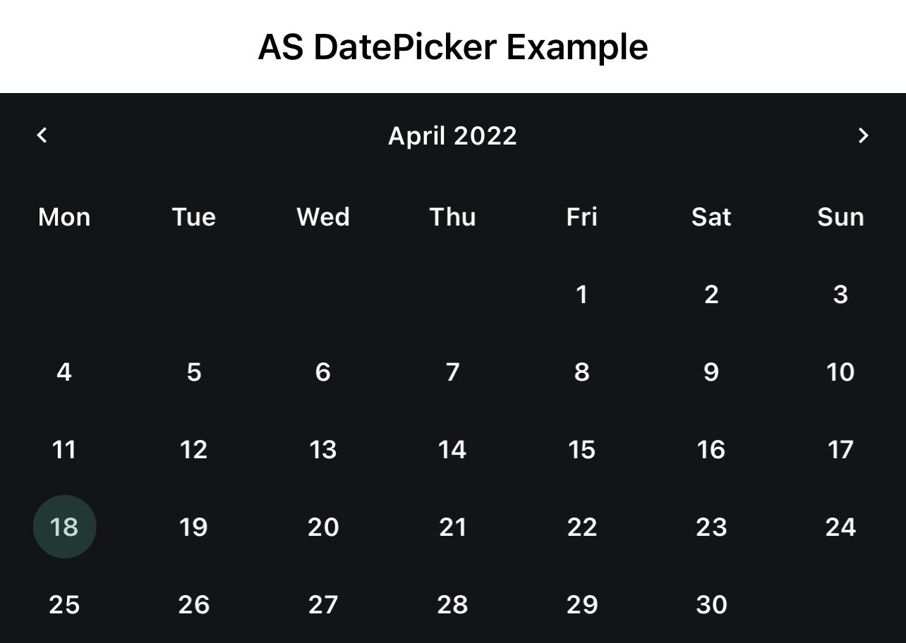
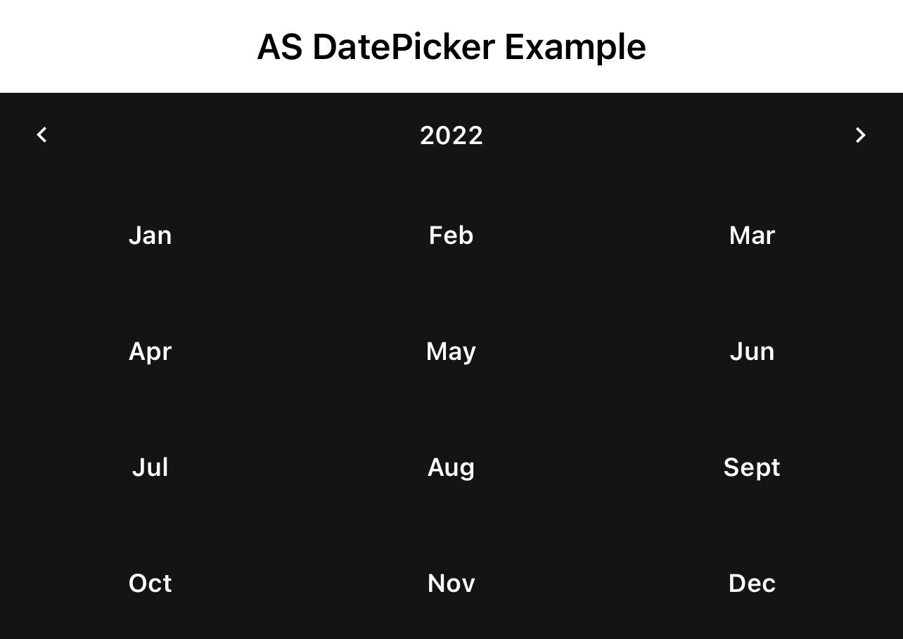
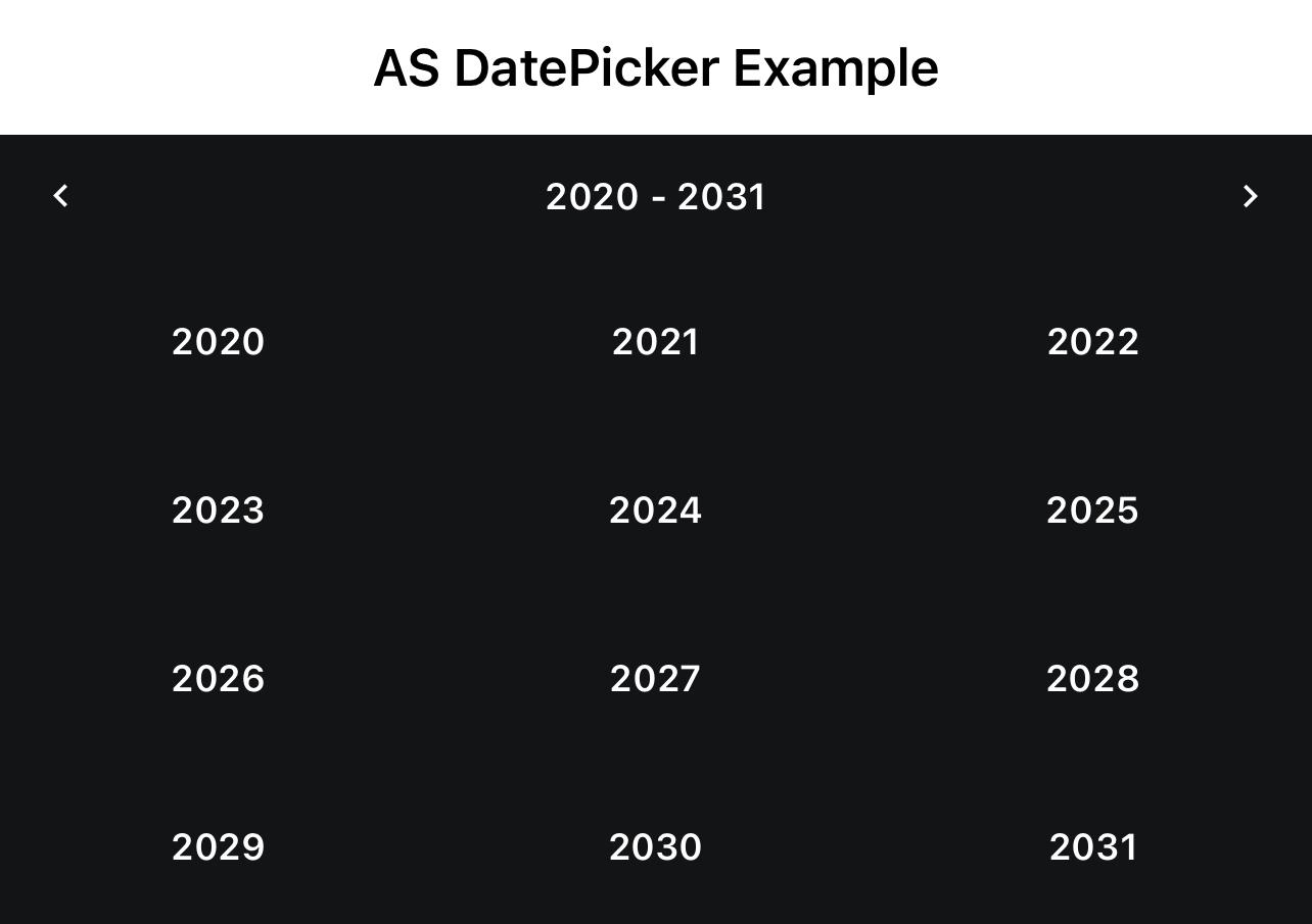
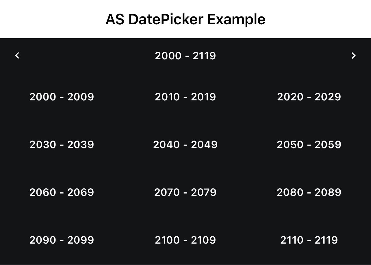
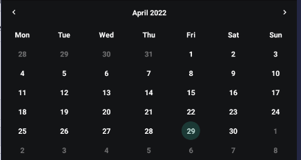
This is a simple DatePicker, with which you can quickly reach your target date. With a click on the header the view changes.
I spend a lot of time in creating views, like this and to create a high quality view cost a lot of time. If you want to support me and further views, then you can do it here by Paypal or with a coffee.
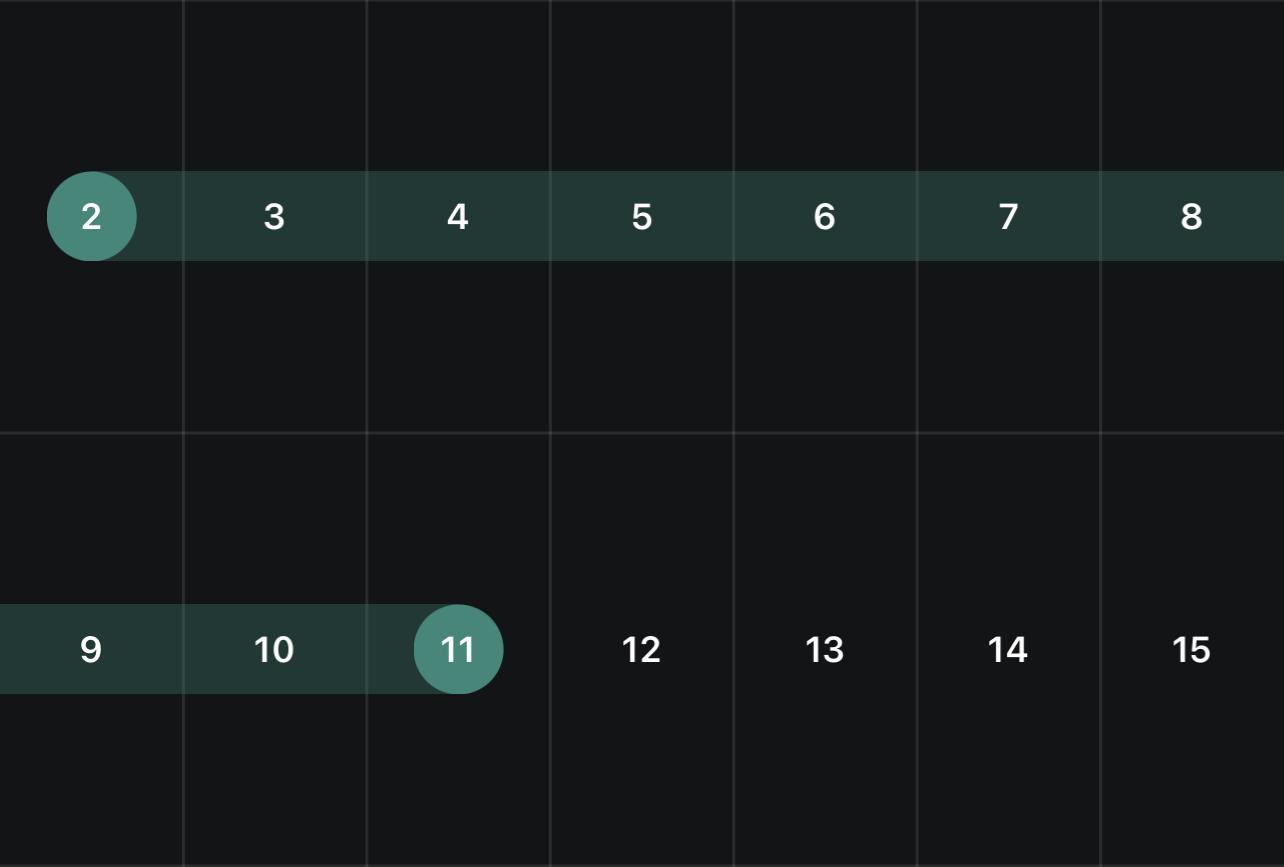
SelectMode = Range
Make sure you are using ASViewPager V2.01+
ASDatePicker
Author: Alexander Stolte
Version: 1.17


I spend a lot of time in creating views, like this and to create a high quality view cost a lot of time. If you want to support me and further views, then you can do it here by Paypal or with a coffee.
- In the month view, you can select a date
- In the year view, you select a month
- In the decade you see a range of 10 years
- In century you can see 100 years
SelectMode = Range
Make sure you are using ASViewPager V2.01+
ASDatePicker
Author: Alexander Stolte
Version: 1.17
- ASDatePicker_BodyProperties
- Fields:
- IsInitialized As Boolean
Tests whether the object has been initialized. - TextColor As Int
- xFont As B4XFont
- IsInitialized As Boolean
- Functions:
- Initialize
Initializes the fields to their default value.
- Initialize
- Fields:
- ASDatePicker_CustomDrawDay
- Fields:
- BackgroundPanel As B4XView
- IsInitialized As Boolean
Tests whether the object has been initialized. - xlbl_Date As B4XView
- Functions:
- Initialize
Initializes the fields to their default value.
- Initialize
- Fields:
- ASDatePicker_HeaderProperties
- Fields:
- ButtonIconSize As Float
- Height As Float
- IsInitialized As Boolean
Tests whether the object has been initialized. - TextColor As Int
- xFont As B4XFont
- Functions:
- Initialize
Initializes the fields to their default value.
- Initialize
- Fields:
- ASDatePicker_MonthNameShort
- Fields:
- April As String
- August As String
- December As String
- February As String
- IsInitialized As Boolean
Tests whether the object has been initialized. - January As String
- July As String
- June As String
- March As String
- May As String
- November As String
- October As String
- September As String
- Functions:
- Initialize
Initializes the fields to their default value.
- Initialize
- Fields:
- ASDatePicker_WeekNameShort
- Fields:
- Friday As String
- IsInitialized As Boolean
Tests whether the object has been initialized. - Monday As String
- Saturday As String
- Sunday As String
- Thursday As String
- Tuesday As String
- Wednesday As String
- Functions:
- Initialize
Initializes the fields to their default value.
- Initialize
- Fields:
- ASDatePicker_WeekNumberProperties
- Fields:
- Color As Int
- IsInitialized As Boolean
Tests whether the object has been initialized. - Text As String
- TextColor As Int
- Width As Float
- xFont As B4XFont
- Functions:
- Initialize
Initializes the fields to their default value.
- Initialize
- Fields:
- AS_DatePicker
- Events:
- CustomDrawDay (Date As Long, Views As ASDatePicker_CustomDrawDay)
- SelectedDateChanged (Date As Long)
- SelectedDateRangeChanged (StartDate As Long, EndDate As Long)
- Fields:
- mBase As B4XView
- Tag As Object
- Functions:
- ChangeView (NewView As String)
- Class_Globals As String
- CreateASDatePicker_BodyProperties (xFont As B4XFont, TextColor As Int) As ASDatePicker_BodyProperties
- CreateASDatePicker_HeaderProperties (Height As Float, xFont As B4XFont, TextColor As Int, ButtonIconSize As Float) As ASDatePicker_HeaderProperties
- CreateASDatePicker_MonthNameShort (January As String, February As String, March As String, April As String, May As String, June As String, July As String, August As String, September As String, October As String, November As String, December As String) As ASDatePicker_MonthNameShort
<code>AS_DatePicker1.MonthNameShort = AS_DatePicker1.CreateASDatePicker_MonthNameShort("Jan","Feb","Mar","Apr","May","Jun","Jul","Aug","Sept","Oct","Nov","Dec")</code> - CreateASDatePicker_WeekNameShort (Monday As String, Tuesday As String, Wednesday As String, Thursday As String, Friday As String, Saturday As String, Sunday As String) As ASDatePicker_WeekNameShort
<code>AS_DatePicker1.CreateASDatePicker_WeekNameShort("Mon","Tue","Wed","Thu","Fri","Sat","Sun")</code> - CreateASDatePicker_WeekNumberProperties (Width As Float, Color As Int, xFont As B4XFont, TextColor As Int, Text As String) As ASDatePicker_WeekNumberProperties
- DesignerCreateView (Base As Object, Lbl As Label, Props As Map) As String
Base type must be Object - getBodyColor As Int
- getBodyProperties As ASDatePicker_BodyProperties
- getCurrentDateColor As Int
- getCurrentView_CenturyView As String
- getCurrentView_DecadeView As String
- getCurrentView_MonthView As String
- getCurrentView_YearView As String
- GetFirstDayOfWeek2 (Ticks As Long, FirstDayOfWeek As Int) As Long
FirstDayOfWeek:
Friday = 1
Thursday = 2
Wednesday = 3
Tuesday = 4
Monday = 5
Sunday = 6
Saturday = 7 - getGridLineColor As Int
- getHeaderColor As Int
- getHeaderPanel As B4XView
You can customize the appereance of the header
With the following code you can customize the control elements that are visible in the header:
<code>
'Middle Text Label
Dim xlbl_Header As B4XView = AS_DatePicker1.HeaderPanel.GetView(0)
'Left Arrow Label
Dim xlbl_ArrowLeft As B4XView = AS_DatePicker1.HeaderPanel.GetView(1)
'Right Arrow Label
Dim xlbl_ArrowRight As B4XView = AS_DatePicker1.HeaderPanel.GetView(2)
</code> - getHeaderProperties As ASDatePicker_HeaderProperties
- getMaxDate As Long
- getMinDate As Long
- getMonthNameShort As ASDatePicker_MonthNameShort
Call Refresh if you change something
<code>AS_DatePicker1.MonthNameShort = AS_DatePicker1.CreateASDatePicker_MonthNameShort("Jan","Feb","Mar","Apr","May","Jun","Jul","Aug","Sept","Oct","Nov","Dec")</code> - getSelectedDate As Long
- getSelectedDateColor As Int
- getSelectedEndDate As Long
Only in SelectMode "Range" - getSelectedStartDate As Long
- getSelectMode As String
- getSelectMode_Day As String
- getSelectMode_Month As String
- getSelectMode_Range As String
- getShowGridLines As Boolean
- getShowWeekNumbers As Boolean
Gets or sets the number of visible weeks
Call Refresh to commit changes - GetWeekNameByIndex (Index As Int) As String
1 = Sunday - getWeekNameShort As ASDatePicker_WeekNameShort
- getWeekNumberProperties As ASDatePicker_WeekNumberProperties
Call Refresh if you change something
Default Values
Width: <code>20dip</code>
Color: <code>xui.Color_ARGB(255,32, 33, 37)</code>
xFont: <code>xui.CreateDefaultFont(15)</code>
TextColor: <code>xui.Color_White</code> - Initialize (Callback As Object, EventName As String) As String
- IsInitialized As Boolean
Tests whether the object has been initialized. - Rebuild
Clears the DatePicker and builds the DatePicker new - Refresh As String
- RefreshHeader As String
Applies the header properties if any have been changed - RefreshSelectedDate As String
- Scroll2Date (Date As Long) As String
Scrolls to the date
Builds the view new if the date was not in range - setBodyColor (Color As Int) As String
- setBodyProperties (BodyProperties As ASDatePicker_BodyProperties) As String
- setCurrentDateColor (Color As Int) As String
- setFirstDayOfWeek (number As Int) As String
1-7
Friday = 1
Thursday = 2
Wednesday = 3
Tuesday = 4
Monday = 5
Sunday = 6
Saturday = 7 - setGridLineColor (Color As Int) As String
- setHeaderColor (Color As Int) As String
- setHeaderProperties (HeaderProperties As ASDatePicker_HeaderProperties) As String
- setMaxDate (MaxDate As Long) As String
Will restrict date navigations features of forward, and also cannot swipe the control using touch gesture beyond the max date range - setMinDate (MinDate As Long) As String
Will restrict date navigations features of backward, also cannot swipe the control using touch gesture beyond the min date range - setMonthNameShort (MonthNameShort As ASDatePicker_MonthNameShort) As String
- setSelectedDate (Date As Long) As String
- setSelectedDateColor (Color As Int) As String
- setSelectedEndDate (Date As Long) As String
- setSelectedStartDate (Date As Long) As String
- setSelectMode (Mode As String) As String
- setShowGridLines (Show As Boolean) As String
- setShowWeekNumbers (Show As Boolean) As String
- setWeekNameShort (WeekNameShort As ASDatePicker_WeekNameShort) As String
Call Refresh if you change something
<code>AS_DatePicker1.CreateASDatePicker_WeekNameShort("Mon","Tue","Wed","Thu","Fri","Sat","Sun")</code> - setWeekNumberProperties (WeekNumberProperties As ASDatePicker_WeekNumberProperties) As String
- Properties:
- BodyColor As Int
- BodyProperties As ASDatePicker_BodyProperties
- CurrentDateColor As Int
- CurrentView_CenturyView As String [read only]
- CurrentView_DecadeView As String [read only]
- CurrentView_MonthView As String [read only]
- CurrentView_YearView As String [read only]
- FirstDayOfWeek
1-7
Friday = 1
Thursday = 2
Wednesday = 3
Tuesday = 4
Monday = 5
Sunday = 6
Saturday = 7 - GridLineColor As Int
- HeaderColor As Int
- HeaderPanel As B4XView [read only]
You can customize the appereance of the header
With the following code you can customize the control elements that are visible in the header:
<code>
'Middle Text Label
Dim xlbl_Header As B4XView = AS_DatePicker1.HeaderPanel.GetView(0)
'Left Arrow Label
Dim xlbl_ArrowLeft As B4XView = AS_DatePicker1.HeaderPanel.GetView(1)
'Right Arrow Label
Dim xlbl_ArrowRight As B4XView = AS_DatePicker1.HeaderPanel.GetView(2)
</code> - HeaderProperties As ASDatePicker_HeaderProperties
- MaxDate As Long
Will restrict date navigations features of forward, and also cannot swipe the control using touch gesture beyond the max date range - MinDate As Long
Will restrict date navigations features of backward, also cannot swipe the control using touch gesture beyond the min date range - MonthNameShort As ASDatePicker_MonthNameShort
Call Refresh if you change something
<code>AS_DatePicker1.MonthNameShort = AS_DatePicker1.CreateASDatePicker_MonthNameShort("Jan","Feb","Mar","Apr","May","Jun","Jul","Aug","Sept","Oct","Nov","Dec")</code> - SelectedDate As Long
- SelectedDateColor As Int
- SelectedEndDate As Long
Only in SelectMode "Range" - SelectedStartDate As Long
- SelectMode As String
- SelectMode_Day As String [read only]
- SelectMode_Month As String [read only]
- SelectMode_Range As String [read only]
- ShowGridLines As Boolean
- ShowWeekNumbers As Boolean
Gets or sets the number of visible weeks
Call Refresh to commit changes - WeekNameShort As ASDatePicker_WeekNameShort
Call Refresh if you change something
<code>AS_DatePicker1.CreateASDatePicker_WeekNameShort("Mon","Tue","Wed","Thu","Fri","Sat","Sun")</code> - WeekNumberProperties As ASDatePicker_WeekNumberProperties
Call Refresh if you change something
Default Values
Width: <code>20dip</code>
Color: <code>xui.Color_ARGB(255,32, 33, 37)</code>
xFont: <code>xui.CreateDefaultFont(15)</code>
TextColor: <code>xui.Color_White</code>
- Events:
- 1.00
- Release
- 1.01
- Add Scroll2Date - Scrolls to the date
- B4J Resize BugFixes
- 1.02
- BugFixes
- Add designer property InactiveDaysVisible - Displays the days that are not in the current month
- Default: False
- Add Type ASDatePicker_BodyProperties
- Font of the Text
- TextColor of the Text
- The month view now has 6 lines instead of 5
- It may be that if InactiveDaysVisible = False that an empty line is seen
- 1.03
- B4J Only - Add Designer Property MouseHoverFeedback
- Default: True
- B4J Only - Add Designer Property MouseHoverFeedback
- 1.04
- Add Refresh
- 1.05
- Added a border to the current month, year, or century in the quick navigation
- 1.06
- Add get and set SelectedDate
- Add Event CustomDrawDay
- Add Type ASDatePicker_CustomDrawDay
- 1.07
- BugFix
- 1.08
- Add get and set BodyProperties
- Add get and set HeaderProperties
- Function "Refresh" is now even better
- No visual flickering
- Changes are instant
- 1.09 (read more)
- Add get and set MaxDate - Will restrict date navigations features of forward, and also cannot swipe the control using touch gesture beyond the max date range
- Add get and set MinDate - Will restrict date navigations features of backward, and also cannot swipe the control using touch gesture beyond the max date range
- Add Rebuild - Clears the DatePicker and builds the DatePicker new
- 1.10 (read more)
- Add Designer property SelectMode -
- Default: Date
- Add Designer property SelectMode -
- 1.11
- BugFixes
- 1.12
- Add RefreshHeader - Applies the header properties if any have been changed
- New ASDatePicker_HeaderProperties properties
- 1.13 (read more)
- Add ShowWeekNumbers - Shows the week number for each week
- Add Type ASDatePicker_WeekNumberProperties
- 1.14 (read more)
- Add Designer Property ShowGridLines
- Add Designer Property GridLineColor
- 1.15
- Add get and set MonthNameShort
- Add get and set WeekNameShort
- 1.16
- BugFixes
- 1.17 (read more)
- Add "Range" to SelectMode
- Add Event SelectedDateRangeChanged
- Debug Mode optimizations
- Add get SelectedStartDate and SelectedEndDate
- 1.18
- Add compatibility for AS_ViewPager Version 2.0
- 1.19
- BugFixes
- Add get and set WeekNameProperties
- 1.20
- BugFixes
- 1.21
- BugFixes
- Add ArrowsVisible to Type HeaderProperties
- 1.22
- Big performance improvements
- The view should now load much faster
- Big performance improvements
- 1.23
- Add Event PageChanged
- 1.24
- Add get CurrentView
- Add Event CustomDrawHeader
- BugFixes
- 1.25
- Add "Height" to ASDatePicker_WeekNameProperties
- Default: 20dip
- Add "CurrentAndSelectedDayHeight" to ASDatePicker_BodyProperties
- Default: 30dip
- Add "SelectedTextColor" to ASDatePicker_BodyProperties
- Default: White
- Add "Height" to ASDatePicker_WeekNameProperties
- 1.26
- Important crash fix
- 1.27 (read more)
- BugFixes and Improvements
- Add Themes - You can now switch to Light or Dark mode
- Add set Theme
- Add get Theme_Dark
- Add get Theme_Light
- Add Designer Property ThemeChangeTransition
- Default: Fade
- 1.28
- Add ClearSelections - Deselect the selections
- Updated the description text of the set Selection properties
- Add ClearSelections - Deselect the selections
Attachments
Last edited:
