Android Question Hide a line in XCHART V8.0

Gerardo Tenreiro

Active Member
Licensed User
Hi, I have an application created where a series of values are displayed in a US Graphics xChart Version 8.00. Each of these graphs contain several values that are updated every second so that the oldest one I discard and incorporate the most current one. The number of data in the graph is approximately 300 points, the point is that I wanted to be able to visualize or not select each of these data lines, but I cannot find an easy way to do it. such as "xchart.line (x) .Visible = True" or similar. It is clear that I did not want to have to reload the data or lose it, but only that the control did not draw that series of data.
Any ideas?
Thank you and happy holidays.
 

Gerardo Tenreiro

Active Member
Licensed User
Thanks for the reply.
The problem is that in each graph I have three data series, and I have 4 graphs. In total I have 12 data to graph. Each group of three forms a graph, the data are tension, intensity and power. The power is calculated from the product of the tension by the intensity and by a factor that is not worth explaining. What happens is that the voltage sometimes reaches values of 1000V while the intensity reaches values of 0.1A and the power then is 100.W if the factor is 1, which it never is.
As you can see, the values are quite different at that time and you may be interested in seeing the power at that time but with a higher resolution of the graph. The idea was to allow the deactivation of the graph for the series that are not temporarily of interest to the operator's selection.

Another option is to have a logarithmic scale but that does not suit me either because at other times all the values are quite close and the logarithmic scale is not adequate either.

I get the data from a communication with an ESP32 that is reading 8 analog inputs at high speed in pairs, let me explain, the ESP32 reads the 300 voltage and intensity measurements of a converter in 0.1s, processes them and performs the pertinent calculations and then send them for the B4A application to store them in files and view them in the graph, and thus each one of the 4 double channels it has.

The storage is carried out in temporary files, if necessary or an anomaly is detected, it is sent to the server for further processing.

I think I explained it quickly and not very precisely but the process is complicated, at least for me.

Any idea how to solve the problem.
Thanks
 
Upvote 0

klaus

Expert
Licensed User
Longtime User
If I understand correctly, you want to not display several undesired or not consistent values.
As you can see, the values are quite different at that time and you may be interested in seeing the power at that time but with a higher resolution of the graph.
Do you use automatic scales ?
If yes, you could set 'manual' scales which will maintain the resolution, but you will see if values are above or below the max or min scale limit.

There is an option to not display undesired, unknown or missing values.
You can set any value of your data to the xChart.MissingDataValue, which is 1000000000 by default, these values will not be displayed.
 
Upvote 0

Gerardo Tenreiro

Active Member
Licensed User
In this application I do not use scales, I use 24 Bit ADC converters.
It is not that the values are not correct, what happens is that at some times I need to give more importance to some data than to others, for example when everything is normal the values are quite even but when something is not right one of the values is I need to see him in the graph to be able to evaluate more comfortably, what I did not want was to make a lot of graphs with all possible combinations, for example one with tension and intensity, another with tension and power, another with power and intensity, etc.
The good solution is to be able to select which data series I want to see from the graph, that you already told me that it is not possible so now I am looking for another alternative and I am open to any suggestion.
Thanks
 
Upvote 0

klaus

Expert
Licensed User
Longtime User
In this application I do not use scales, I use 24 Bit ADC converters.
Are you sure ?
How do you convert the 24 Bit ADC converter values ?

Do you have scale values on the Y axis ?
If yes, this means that you are using scales, the automatic scale by default.
Do you have any screenshot showing the problem ?
Or even some data showing the problem ?
 
Last edited:
Upvote 0

klaus

Expert
Licensed User
Longtime User
Yes, interesting !
It works.
But, anyway I would like to understand more precisely the problem.

The code below works.
B4X:
    Private ID As ItemData
    ID = LineChart1.Items.Get(LineIndexToHide)
    ID.Color = xui.Color_ARGB(0, 255, 255, 255)
    LineChart1.DrawChart
Be aware that transparent color is different in B4J than in B4A and B4i.
Transparent color works in B4J but not in B4A and B4i because in those the background is set to transparent.
But with xui.Color_ARGB(0, 255, 255, 255) it works in B4A and B4J, not tested in B4i but should work also.
Thank you for the input !
 
Upvote 0

Gerardo Tenreiro

Active Member
Licensed User
Are you sure ?
How do you convert the 24 Bit ADC converter values ?
Yes, I use the automatic scaling and the 24Bit conversion is done with this piece of code.
' Si no esta presente el Modulo retorna "0.0001"
If No_Modulo = True Then
' Calcula el Valor en Bruto
Valor =(Aux2 * 65536) + (Aux1 * 256) + Aux0
' Si es un numero Negativo Realiza el Complemento a 2
If Aux2 >= 128 Then
Valor = 16777215 - Valor
Valor = Valor * -1
End If
' Guarda Valor en Bruto de la Tension
Bruto_Tension(Canal_Lectura) = Valor
' Calcula el Valor real Dependioendo del Filtro y de la PGA
Tension(Canal_Lectura) = Calcula_Valor_Canal(Valor,0)
Else
Tension(Canal_Lectura) = -0.0001
End If

Do you have scale values on the Y axis ? -> Currently Yes

If yes, this means that you are using scales, the automatic scale by default. -> Automatic Scale

Do you any screenshot showing the problem ? -> Send the img

Or even some data showing the problem ?

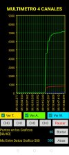
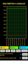
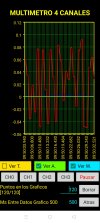
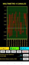
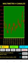
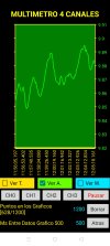
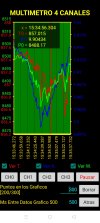
The problem I have is trying to see very different values in the same graph at some point, if the three magnitudes have a similar value, for example 2.00V, 2.00A and 4.00W in the graph you can see each of the series well, On the contrary, if the magnitudes are 1000.00V, 0.10A and 100.00W in the graph, only the series of V and W are appreciated since the series of A is of very small values, at that moment if I hide the Series of V and W could see the A series well.

With this piece of code I try to hide one of the series but it does not work for me, the intention is depending on the state of the CHECKBOX to see or not the series in the graph. But thinking about it, this does not solve the problem of scale, does it?

Private Sub CH_Ver_T_CheckedChange(Checked As Boolean)
Private ID As ItemData
If CH_Ver_T.Checked = False Then
ID = Grafica_Lineas_0.Items.Get(0)
ID.Color = xui.Color_ARGB(0, 255, 255, 255)
Else
ID = Grafica_Lineas_0.Items.Get(0)
ID.Color = xui.Color_ARGB(0, 255, 0, 0)
End If
Grafica_Lineas_0.Items.Set(0,ID)
Grafica_Lineas_0.DrawChart
End Sub


Many thanks for everyone's help.
Do not hesitate to ask and give options that I will apply and comment on.
Happy Holidays.
 

Attachments

  • Screenshot_2021-12-31-09-18-52-17_fa73a06bde12172f909256a835e3ae64.jpg
    Screenshot_2021-12-31-09-18-52-17_fa73a06bde12172f909256a835e3ae64.jpg
    370.2 KB · Views: 165
  • Screenshot_2021-12-31-09-25-33-66_fa73a06bde12172f909256a835e3ae64.jpg
    Screenshot_2021-12-31-09-25-33-66_fa73a06bde12172f909256a835e3ae64.jpg
    375.7 KB · Views: 160
  • Screenshot_2021-12-31-09-49-28-70_fa73a06bde12172f909256a835e3ae64.jpg
    Screenshot_2021-12-31-09-49-28-70_fa73a06bde12172f909256a835e3ae64.jpg
    409.9 KB · Views: 158
  • Screenshot_2021-12-31-09-49-47-52_fa73a06bde12172f909256a835e3ae64.jpg
    Screenshot_2021-12-31-09-49-47-52_fa73a06bde12172f909256a835e3ae64.jpg
    401.9 KB · Views: 152
  • Screenshot_2021-12-31-09-50-32-95_fa73a06bde12172f909256a835e3ae64.jpg
    Screenshot_2021-12-31-09-50-32-95_fa73a06bde12172f909256a835e3ae64.jpg
    423.7 KB · Views: 160
  • Screenshot_2021-12-31-09-50-58-16_fa73a06bde12172f909256a835e3ae64.jpg
    Screenshot_2021-12-31-09-50-58-16_fa73a06bde12172f909256a835e3ae64.jpg
    433.8 KB · Views: 166
Upvote 0

Gerardo Tenreiro

Active Member
Licensed User
Thank you so much
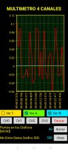
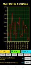
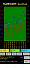
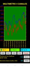
So I did and it is not that it looks very good but it does its job.
Now I'll keep moving forward that this has only just begun
In the future it would be very good to be able to turn off or on and a series in the graph, and I do not think it is very difficult to implement in the original code of the library.

Thank you very much and happy holidays.
 

Attachments

  • Screenshot_2021-12-31-12-14-12-15_fa73a06bde12172f909256a835e3ae64.jpg
    Screenshot_2021-12-31-12-14-12-15_fa73a06bde12172f909256a835e3ae64.jpg
    351.5 KB · Views: 156
  • Screenshot_2021-12-31-12-14-16-89_fa73a06bde12172f909256a835e3ae64.jpg
    Screenshot_2021-12-31-12-14-16-89_fa73a06bde12172f909256a835e3ae64.jpg
    316.1 KB · Views: 155
  • Screenshot_2021-12-31-12-14-22-66_fa73a06bde12172f909256a835e3ae64.jpg
    Screenshot_2021-12-31-12-14-22-66_fa73a06bde12172f909256a835e3ae64.jpg
    264.7 KB · Views: 159
  • Screenshot_2021-12-31-12-14-29-74_fa73a06bde12172f909256a835e3ae64.jpg
    Screenshot_2021-12-31-12-14-29-74_fa73a06bde12172f909256a835e3ae64.jpg
    273.1 KB · Views: 154
Upvote 0

klaus

Expert
Licensed User
Longtime User
Can you check the attached version 8.1.
I added a HideLine(LineIndex As Int, Hidden As Boolean) method.
It was much simpler to add than I thought.
It is valid only for LINE, H_LINE and AREA charts.
 

Attachments

  • xChart.bas
    274.3 KB · Views: 170
  • xChart.b4xlib
    40.3 KB · Views: 157
Upvote 0

Gerardo Tenreiro

Active Member
Licensed User
Hiding the line works perfectly.
Perfect.
Thank you so much.
A passing question.
How can I determine the number of vertical lines of division of the graph?
As you can see in this graph there are 300 points and the green vertical division lines are 300, I would like to be able to adjust them in the program to depend on the number of points to be able to put more or less.
Thank you so much
 

Attachments

  • Screenshot_2021-12-31-15-35-53-17_fa73a06bde12172f909256a835e3ae64.jpg
    Screenshot_2021-12-31-15-35-53-17_fa73a06bde12172f909256a835e3ae64.jpg
    378.1 KB · Views: 150
Upvote 0

klaus

Expert
Licensed User
Longtime User
When you add points you have the ShowTick parameter.
B4X:
AddLineMultiplePoints(X As String, YArray() As Double, ShowTick As Boolean)
You can set it like below:
B4X:
LineChart.AddLineMultiplePoints(i, Vals, i Mod 10 = 0)
i Mod 10 = 0 shows the tick and vertical lines only every 10 points.
 
Upvote 0
Top