I have been using all B4X IDE suites for several years now and loving all of the constant improvements.
Unfortunately, I need to work with a reduced resolution display these days. I don't know if any thought has gone into using the new IDE on say 1024x768 resolution. It gets very cluttered.
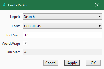
The new Quick Search is great but I need to be able to drag the result columns to make the first column (module name) show more than a couple of characters. Also a word-wrap option of the result code text (of me) would again make the results immediately readable. At the moment I have to constantly slide the left edge of the window back and forth every time I choose something.
Finally (and most annoying), when I select something from the Quick Search window, it would be so much better if my selection would remain highlighted until I select something else in the list, making it so much easier to click through the search results without missing one of them.
I know not everyone will agree with my issues, but in the low resolution screen environment (yes I am already using a large 32" monitor) the usability of the IDE has actually decreased significantly for me with the new changes. Maybe some additional TICK settings in the Tools/IDE Options/ menu would overcome these problems.
-- I feel my Accessibility is gradually being taken away. Please give it some thought.

