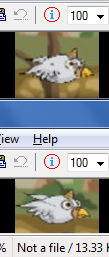
In the B4J version the birds look good. In the B4A version they lose a lot of quality. This is due to the too large size of the sprites, for smartphones. I decreased them up to 23% and this is the difference:

The image below (both from my smartphone) is after the reduction to 23%, of course.
Also, there is a horizontal black line, approximately 2/3 of the height of the screen. I think it is the border of the command rectangle, whose color should be set to Transparent.
The image below (both from my smartphone) is after the reduction to 23%, of course.
Also, there is a horizontal black line, approximately 2/3 of the height of the screen. I think it is the border of the command rectangle, whose color should be set to Transparent.
