Note: You should use B4A 6.0 or above for this tutorial.
Android 5.0 (also called "Lollipop") introduced a new design for apps called "Material Design".
With this tutorial series I will introduce some of the Material Design guidelines and explain some differences to the Holo Design.
For a good start it will be helpful if you know what material design is so it is a good idea to spend some time to study the first few chapters of the official Google "Material Design" guidelines.
Basic Material Example
In this tutorial we will create a very simple app that uses Material design on Android 5.0+ (Lollipop, Marshmallow, Nougat and above) devices and the normal Holo design on Android 4.0 devices.
Important:
Because we use features of the SDK version 21 you have to configure the correct android.jar in the Configure Paths dialog of the IDE. Set the path for android.jar to at least <Your_Android_SDK_HOME>\platforms\android-21\android.jar. You should always use the latest android.jar that is available like android-24/android.jar. Don't worry. Your app will run on older Android versions, too.
Android always uses a theme for the UI. The default theme of an app depends on the installed OS version and the targetSdkVersion specified in the manifest of the app.
Therefore it is a good idea to explicitly set a Holo theme if your current app does not really support Material Design. There are some changes in Material Design theme that will probably break your app.
Be aware that setting targetSdkVersion affects the default theme. You can explicitly set another theme in the manifest if you want.
Best practice is to set targetSdkVersion to the highest OS version number your app should support and it has been tested on. So for our example app we set it to 21.
The minSdkVersion has to be set to the lowest OS version number the app should support. Since our app will use the ActionBar and the StdActionBar library this will be OS version 11 (Honeycomb). So we have to change the following line in the Manifest Editor:
This will enable the default dark Material theme on Android 5.0 Lollipop devices.
Using our own Theme
Because we want to use the light Material theme (with a dark ActionBar) and not the dark one in our app and we want to use custom colors for the ActionBar and StatusBar we have to create our own theme resource file. There are several ways to create resource files.
The theme declares three attributes:
colorPrimary - This color is the main color for the app and is used for example as the ActionBar background
colorPrimaryDark - This color is used for the StatusBar
colorAccent - This is the AccentColor used for other UI elements like checkboxes, radio buttons etc.
So if we set these three attributes we can change the whole appearance of our app. Note that the colors defined here are also used in the systems task manager on Lollipop devices.
The material design guidelines gives some hints of what colors should be used in an app. Please study these pages about colors for further information.
Now we have to set our custom theme in the Manifest Editor:
Ok, now we have set the theme for Android Lollipop (5.0) devices. But what about the other versions like Jelly Bean (4.x) or KitKat (4.4)?
We simply add a theme that sets the Holo theme for the app. So we add the following lines to the Manifest editor:
So we have now set Material theme on Lollipop (and higher) devices and Holo theme on lower Android versions.
Differences between Holo and Material Design
So what are the main differences between the Holo theme and Material theme?
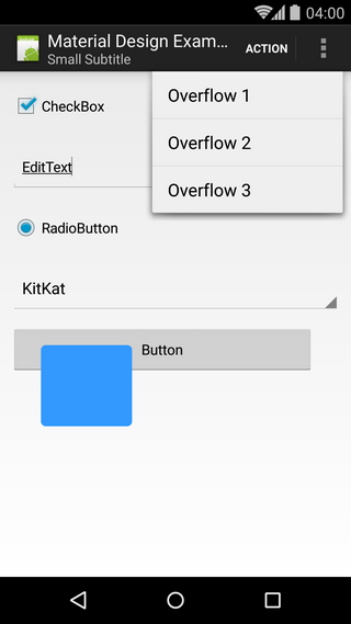
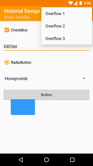
Here are some screenshots of the example app with the differences. In addition to some visual enhancements there are some very important changes:


Android 5.0 (also called "Lollipop") introduced a new design for apps called "Material Design".
With this tutorial series I will introduce some of the Material Design guidelines and explain some differences to the Holo Design.
For a good start it will be helpful if you know what material design is so it is a good idea to spend some time to study the first few chapters of the official Google "Material Design" guidelines.
Basic Material Example
In this tutorial we will create a very simple app that uses Material design on Android 5.0+ (Lollipop, Marshmallow, Nougat and above) devices and the normal Holo design on Android 4.0 devices.
Important:
Because we use features of the SDK version 21 you have to configure the correct android.jar in the Configure Paths dialog of the IDE. Set the path for android.jar to at least <Your_Android_SDK_HOME>\platforms\android-21\android.jar. You should always use the latest android.jar that is available like android-24/android.jar. Don't worry. Your app will run on older Android versions, too.
Android always uses a theme for the UI. The default theme of an app depends on the installed OS version and the targetSdkVersion specified in the manifest of the app.
- A targetSdkVersion up to 10 results in the old Classic Android theme on all OS versions.
- targetSdkVersion of 11 up to 13 results in a dark Holo theme on OS versions 3.0+ (Honeycomb and up).
- If targetSdkVersion is 14 or above, the app will have Holo theme on OS versions up to 4.4 (KitKat) and (this is a bit strange) Material theme on 5.0 (Lollipop).
Therefore it is a good idea to explicitly set a Holo theme if your current app does not really support Material Design. There are some changes in Material Design theme that will probably break your app.
Be aware that setting targetSdkVersion affects the default theme. You can explicitly set another theme in the manifest if you want.
Best practice is to set targetSdkVersion to the highest OS version number your app should support and it has been tested on. So for our example app we set it to 21.
The minSdkVersion has to be set to the lowest OS version number the app should support. Since our app will use the ActionBar and the StdActionBar library this will be OS version 11 (Honeycomb). So we have to change the following line in the Manifest Editor:
B4X:
<uses-sdk android:minSdkVersion="11" android:targetSdkVersion="21"/>This will enable the default dark Material theme on Android 5.0 Lollipop devices.
Using our own Theme
Because we want to use the light Material theme (with a dark ActionBar) and not the dark one in our app and we want to use custom colors for the ActionBar and StatusBar we have to create our own theme resource file. There are several ways to create resource files.
- You can save them in <project-home>\Objects\res folder and make the files read only.
- You can create your own folder for resouce files and add it to B4A with #AdditionalRes attribute.
- You can create the resource files with CreateResource() in the Manifest editor.
B4X:
CreateResource(values-v21, themes.xml,
<resources>
    <style name="MyAppTheme" parent="@android:style/Theme.Material.Light.DarkActionBar">
        <item name="android:colorPrimary">#FF9800</item>
        <item name="android:colorPrimaryDark">#F57C00</item>
        <item name="android:colorAccent">#FFA726</item>
    </style>
</resources>
)
The theme declares three attributes:
colorPrimary - This color is the main color for the app and is used for example as the ActionBar background
colorPrimaryDark - This color is used for the StatusBar
colorAccent - This is the AccentColor used for other UI elements like checkboxes, radio buttons etc.
So if we set these three attributes we can change the whole appearance of our app. Note that the colors defined here are also used in the systems task manager on Lollipop devices.
The material design guidelines gives some hints of what colors should be used in an app. Please study these pages about colors for further information.
Now we have to set our custom theme in the Manifest Editor:
B4X:
SetApplicationAttribute(android:theme, "@style/MyAppTheme")Ok, now we have set the theme for Android Lollipop (5.0) devices. But what about the other versions like Jelly Bean (4.x) or KitKat (4.4)?
We simply add a theme that sets the Holo theme for the app. So we add the following lines to the Manifest editor:
B4X:
CreateResource(values, themes.xml,
<resources>
    <style name="MyAppTheme" parent="@android:style/Theme.Holo.Light.DarkActionBar">
    </style>
</resources>
)
So we have now set Material theme on Lollipop (and higher) devices and Holo theme on lower Android versions.
Differences between Holo and Material Design
So what are the main differences between the Holo theme and Material theme?
Here are some screenshots of the example app with the differences. In addition to some visual enhancements there are some very important changes:
- No Application Icon in ActionBar - In Material Design there is no Application Icon in the ActionBar. Though it is still possible to show the up-arrow or a menu icon. This will be shown in a later tutorial.
- Different ActionBar Height - ActionBar height should be 48dip on landscape phone, and 56dip in portrait. On tablets it should always have 64dip.
- Buttons floating above all other views - With Material Design every visible "object" has an elevation value. Buttons by default have an elevation of 2dip though floating above other views. View.BringToFront() does not work anymore on buttons!
- List Popups and Menus start over root object and not below - As you can see in the screenshots the overflow menu overlaps the ActionBar on Material Design.
Attachments
Last edited:
