Note: You should use B4A 6.0 or above for this tutorial.
In the first Material Design tutorial we created a simple app with Material Design for Android 5.0 (Lollipop) devices. But what about older Android versions?
For compatibility with older devices Google created the support libraries which brings new features to older Android releases. For Material Design the most important support library is the AppCompat library. This tutorial will show how to use the AppCompat library with B4A.
Setting up AppCompat library
For this tutorial we need the AppCompat wrapper library. Please set it up as explainded in the first post of the library thread.
First we need to add the AppCompat library to our project. For this check the AppCompat library in the libs tab of the IDE.
Next thing to know is that every Activity which uses AppCompat features has to extend the android.support.v7.app.AppCompatActivity. This can be done with the #Extends attribute in the activity modules.
Setting up the theme
If we want to use AppCompat, we must use an AppCompat theme. Because we want to configure some colors in the theme we set up our own theme resource in the Manifest Editor:
As you can see we use a parent of Theme.AppCompat for our example. There are also Theme.AppCompat.Light or Theme.AppCompat.Light.DarkActionBar themes like the standard Material Design themes. Additionally to the theme name we set colorPrimary, colorPrimaryDark and colorAccent. See the first Material Design tutorial for an explanation of these colors.
So let's see how our app looks like. For the first example I just added some UI elements like EditText, CheckBox, RadioButton, Spinner, ...
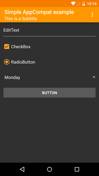
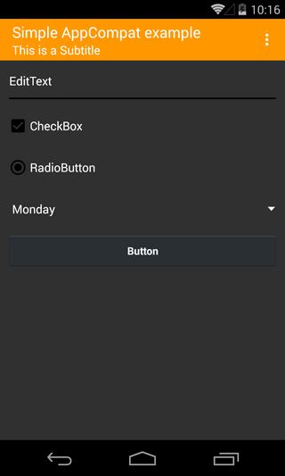
On Lollipop devices this looks nice but there seems to be something wrong with pre Lollipop devices like KitKat, JellyBean or even Gingerbread. The UI elements like EditText, CheckBox and RadioButton just show black and are hard to see on the dark theme.
This is because the way B4A creates its views in the designer is not compatible with the AppCompat library. The AppCompat wrapper library contains some views which are compatible with AppCompat. Instead of EditText, CheckBox or RadioButton just use ACEditText, ACCheckBox and ACRadioButton views. These can be added as CustomViews in the designer or they can be added to the Activity (or to a Panel) manually by code just like the standard views.
Additionally there is a new ACSwitch view which looks like the standard on/off switch.
In the second attached example all these views are used as a CustomView with the designer. The examples should work on all devices with API 7 or above. On GingerBread devices there is not the nice coloring of the views but the app should still work.
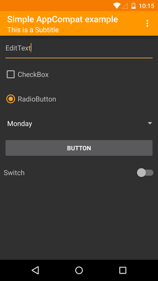
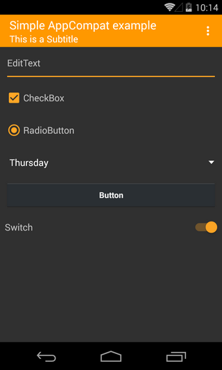
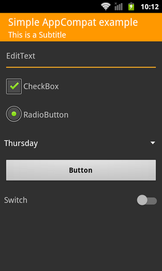
Notice that on Gingerbread devices there is no overflow menu anymore.
In the first Material Design tutorial we created a simple app with Material Design for Android 5.0 (Lollipop) devices. But what about older Android versions?
For compatibility with older devices Google created the support libraries which brings new features to older Android releases. For Material Design the most important support library is the AppCompat library. This tutorial will show how to use the AppCompat library with B4A.
Setting up AppCompat library
For this tutorial we need the AppCompat wrapper library. Please set it up as explainded in the first post of the library thread.
First we need to add the AppCompat library to our project. For this check the AppCompat library in the libs tab of the IDE.
Next thing to know is that every Activity which uses AppCompat features has to extend the android.support.v7.app.AppCompatActivity. This can be done with the #Extends attribute in the activity modules.
B4X:
#Extends: android.support.v7.app.AppCompatActivitySetting up the theme
If we want to use AppCompat, we must use an AppCompat theme. Because we want to configure some colors in the theme we set up our own theme resource in the Manifest Editor:
B4X:
SetApplicationAttribute(android:theme, "@style/MyAppTheme")

CreateResource(values, theme.xml,
<resources>
    <style name="MyAppTheme" parent="@style/Theme.AppCompat">
        <item name="colorPrimary">#FF9800</item>
        <item name="colorPrimaryDark">#F57C00</item>
        <item name="colorAccent">#FFA726</item>
    </style>
</resources>
)
As you can see we use a parent of Theme.AppCompat for our example. There are also Theme.AppCompat.Light or Theme.AppCompat.Light.DarkActionBar themes like the standard Material Design themes. Additionally to the theme name we set colorPrimary, colorPrimaryDark and colorAccent. See the first Material Design tutorial for an explanation of these colors.
So let's see how our app looks like. For the first example I just added some UI elements like EditText, CheckBox, RadioButton, Spinner, ...
On Lollipop devices this looks nice but there seems to be something wrong with pre Lollipop devices like KitKat, JellyBean or even Gingerbread. The UI elements like EditText, CheckBox and RadioButton just show black and are hard to see on the dark theme.
This is because the way B4A creates its views in the designer is not compatible with the AppCompat library. The AppCompat wrapper library contains some views which are compatible with AppCompat. Instead of EditText, CheckBox or RadioButton just use ACEditText, ACCheckBox and ACRadioButton views. These can be added as CustomViews in the designer or they can be added to the Activity (or to a Panel) manually by code just like the standard views.
Additionally there is a new ACSwitch view which looks like the standard on/off switch.
In the second attached example all these views are used as a CustomView with the designer. The examples should work on all devices with API 7 or above. On GingerBread devices there is not the nice coloring of the views but the app should still work.
Notice that on Gingerbread devices there is no overflow menu anymore.
Attachments
Last edited:
