I've previously created a simple class that provides some ComboBox-like functionality in B4I. The problem was that this did not work very well with Designer, so I’ve now created an improved version that allows you to position and size the ComboBoxes using Designer.
The ComboBoxes are positioned on top of TextFields, which you position along with other fields etc in Designer. This allows the ComboBoxes to be in the right place when the device is rotated or when used across a range of devices. Most of the properties of the TextField are also applied to the fields of the drop-down but you can easily override this if necessary to create a more customised view.
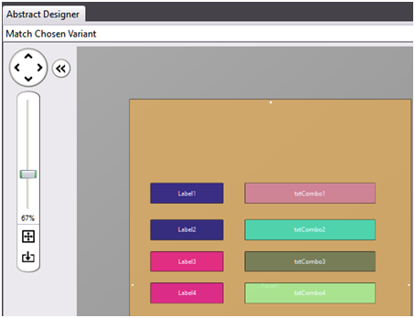
This is a typical designer layout using the Class:

The Combo drop-downs will be positioned below the text views when they are activated.
They are declared like this:
Here is an example of initializing a ComboBox:
The base object is txtCombo1. Each row of the drop-down will be 1.5 times the height of the TextField, and there will be a maximum of 5 rows of data displayed below the TextField.
The Graphic for the DropDown Arrow at the right of the text box is taken from the bmTransparentArrow bitmap. It will be re-sized to fit into the right-hand side of the TextField.
If the corresponding TextField is Enabled, then the user can enter data from the keyboard otherwise they have to make a selection from the specified list.
There are multiple methods for adding data to the ComboBox viz:
Images can be added to the existing sections from a list of file-names or BitMaps
Numerous properties of the ComboBoxes can be changed
Examples:
Results
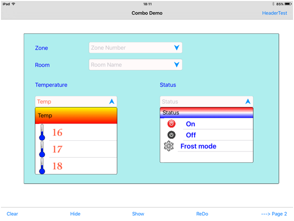
Here is a small example of what is possible:

There are many other facilities. Please study the examples in the attached Zipped project. This contains the required Combo.bas class and also another class ColorByName, which is used in some of the examples.
This is a summary of how to use the ComboBox class:
'These are the steps to creating and using Combo-boxes
' 1. Create TextView boxes in Designer (set the Tag property to the name of the ComboBox object eg Combo1)
' (If you don't want the user to be able to enter text directly then set Enabled=False in the TextView)
' 2. Declare the Combo objects in Process Globals and load a bitmap for the DropDown Arrow
' 3. Initialise the Combo objects when needed. Just decide how big each drop-row needs to be and
' how many rows you want to be visible in the dropdown.
' 4. Add Sections of data to the ComboBox using any of the following methods:
' AddSection (Add a list of items with optional common image)
' AddBitmapsToSection (Adds/Replaces Images in Section)
' AddBitmapsFromFileList (Adds/Replaces Images in Section)
' AddSingleLine
' AddTwoLines
' All of the above methods allow for an optional bitmap to be added to the elements
' 4. Be sure to call the combo Resize method in the Page_Resize event, so that the combo objects are
' re-aligned and re-sized with the TextField
' 5. There are other methods to do further customisation. Most properties are inherited from the TextField object
' You can access the underlying TableView directly with the the TableView property of the Combobox
You are free to use this code in any project. If you use this to create a chargeable library it would be nice to acknowledge the origin of parts of the code that you have re-used.
If you have suggestions for useful additions/changes then please post them in the forum.
Derek Johnson
P.S See Post #23 by Jack Cole for a fix to a problem with the Up/Down arrow. I've attached his amended version as JC_ComboBox.zip
The ComboBoxes are positioned on top of TextFields, which you position along with other fields etc in Designer. This allows the ComboBoxes to be in the right place when the device is rotated or when used across a range of devices. Most of the properties of the TextField are also applied to the fields of the drop-down but you can easily override this if necessary to create a more customised view.
This is a typical designer layout using the Class:
The Combo drop-downs will be positioned below the text views when they are activated.
They are declared like this:
B4X:
Sub Process_Globals
    'These global variables will be declared once when the application starts.
    'Public variables can be accessed from all modules.
    Public App As Application
    Public NavControl As NavigationController
    Private Page1, Page2 As Page

    'You can set the desired placement and properties of the txtboxes using designer
    Dim txtCombo1,txtCombo2,txtCombo3,txtCombo4,txtCombo5,txtCombo6,txtCombo7 As TextField

    Dim Combo1,Combo2, Combo3, Combo4, Combo5, Combo6, Combo7 As Combo
Here is an example of initializing a ComboBox:
B4X:
Private Sub Application_Start (Nav As NavigationController)
.....
    Combo1.Initialize(txtCombo1, 1.5, 5, bmTransparentArrow)
The base object is txtCombo1. Each row of the drop-down will be 1.5 times the height of the TextField, and there will be a maximum of 5 rows of data displayed below the TextField.
The Graphic for the DropDown Arrow at the right of the text box is taken from the bmTransparentArrow bitmap. It will be re-sized to fit into the right-hand side of the TextField.
If the corresponding TextField is Enabled, then the user can enter data from the keyboard otherwise they have to make a selection from the specified list.
There are multiple methods for adding data to the ComboBox viz:
B4X:
AddSection ( SectionHeader As String, items As List, IndentLevel As Int, StdIcon As Bitmap)
'This will add a list of string items with a section header
'If the StdIcon bitmap is initialised this bitmap will be added to all the list items
e.g.
Combo2.AddSection("Downstairs",Array("Hall","Kitchen","Dining room","Lounge","Study","Gym"),1,Null)

AddSingleLine ( itemtext As String, image As Bitmap)
'This will add a one line item to the end of the combo-box
'If the image is initialised with a bitmap, then it will be added to the element

AddTwoLines ( itemtext1 As String, itemtext2 As String, image As Bitmap)
'This will add a two line item to the end of the combo-box
'If the image is initialised with a bitmap, then it will be added to the element
Images can be added to the existing sections from a list of file-names or BitMaps
B4X:
AddBitMapsFromFileList(SectionIndex As Int,Dir As String,FileNames As List)

'This will add (or replace) the existing images in the specified SectionIndex with the files from the specified list

'SectionIndex is the number of the section to which the Images will be added
'Dir is the folder in which the files reside e.g. Files.DirAssets etc
'FileNames is a list containing filenames eg Array("abc.png","pqr.png").  You can use Null or empty string elements to prevent the corresponding item from being changed

AddBitMapsToSection(SectionIndex As Int,Bitmaps As List)

'This will add (or replace) the existing images in the specified SectionIndex with the bitmaps in the specified list
'SectionIndex is the number of the section to which the Images will be added
'Bitmaps is a list containing preloaded bitmaps. You can use Null elements to prevent the corresponding item from being changed.
Numerous properties of the ComboBoxes can be changed
Examples:
B4X:
    'Apply 2-color gradient effect to section header background
    Combo3.SectionHeaderColors=Array(Colors.Yellow,Colors.red)
    'Set large bold font
    Combo3.Font=Font.CreateNew2("Cochin-Bold",36)  ‘Over-rides TextField font

    Combo3.AddSection("Temp",Array("16","17","18","19","20","21","22","23","24","25"),1,hotimg)
    'Replace images in first 4 elements with different image
    Combo3.AddBitmapsToSection(0,Array(coolImg,coolImg,coolImg,coolImg))

    'You can set the properties of the dropdown table using the underlying Tableview object    e.g.
    Combo3.Tableview.Alpha=0.9 ‘This makes the drop-down slightly transparent
Results
Here is a small example of what is possible:
There are many other facilities. Please study the examples in the attached Zipped project. This contains the required Combo.bas class and also another class ColorByName, which is used in some of the examples.
This is a summary of how to use the ComboBox class:
'These are the steps to creating and using Combo-boxes
' 1. Create TextView boxes in Designer (set the Tag property to the name of the ComboBox object eg Combo1)
' (If you don't want the user to be able to enter text directly then set Enabled=False in the TextView)
' 2. Declare the Combo objects in Process Globals and load a bitmap for the DropDown Arrow
' 3. Initialise the Combo objects when needed. Just decide how big each drop-row needs to be and
' how many rows you want to be visible in the dropdown.
' 4. Add Sections of data to the ComboBox using any of the following methods:
' AddSection (Add a list of items with optional common image)
' AddBitmapsToSection (Adds/Replaces Images in Section)
' AddBitmapsFromFileList (Adds/Replaces Images in Section)
' AddSingleLine
' AddTwoLines
' All of the above methods allow for an optional bitmap to be added to the elements
' 4. Be sure to call the combo Resize method in the Page_Resize event, so that the combo objects are
' re-aligned and re-sized with the TextField
' 5. There are other methods to do further customisation. Most properties are inherited from the TextField object
' You can access the underlying TableView directly with the the TableView property of the Combobox
You are free to use this code in any project. If you use this to create a chargeable library it would be nice to acknowledge the origin of parts of the code that you have re-used.
If you have suggestions for useful additions/changes then please post them in the forum.
Derek Johnson
P.S See Post #23 by Jack Cole for a fix to a problem with the Up/Down arrow. I've attached his amended version as JC_ComboBox.zip
Attachments
Last edited:
