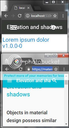
Another area where ABM's navbar differs from Google's Material Design website is when the browser window is shrunk.
ABM crowds and overlaps the content while Google neatly clips.
https://material.google.com/material-design/elevation-shadows.html

Is it possible to change (set a property?) so that the ABM navbar responds like Google's site?
ABM crowds and overlaps the content while Google neatly clips.
https://material.google.com/material-design/elevation-shadows.html

Is it possible to change (set a property?) so that the ABM navbar responds like Google's site?
