Android Question Adjust views to device screen resolution

vecino

Well-Known Member
Licensed User
Longtime User
Hi, every time I design a screen I run into the big problem that it fits well on some, looks small on others, doesn't fit on others, etc.
Users start calling complaining about the size, and you have to adjust everything to each device. It's a pain.
What method is best to adjust everything as automatically as possible?
Thank you.
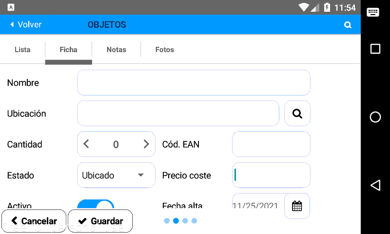
screenshot.png
 

Andrew (Digitwell)

Well-Known Member
Licensed User
Longtime User
How are you designing the layouts (using anchors and scripts)?

Have you considered using scrolling.

If you put the layout in a panel and put the panel in a CustomListView this will allow the user to scroll (only in one direction)

In the case above the buttons could be outside the customlistview so that they are always visible.

1637846955010.png


Edit: Messed the anchors up. The customlistview should have left+right and Top&bottom anchors.
 
Upvote 0

vecino

Well-Known Member
Licensed User
Longtime User
How are you designing the layouts (using anchors and scripts)?
Hello, I am trying to adjust it by script.
But it is very complicated sometimes to look good on a small 4" screen and low resolution and at the same time on a big 10" tablet with a very high resolution.
That's why I ask, just in case there is a more automatic way to adjust to all screens, regardless of their size and resolution.
The scroll option does not work for my clients, they want to see everything on screen without scrolling.
Thank you very much.
 
Upvote 0

Ivica Golubovic

Active Member
Licensed User
I use my subroutine to resize objects and fonts depending on the size and resolution of the screen and so far it has proven to be very effective in all situations. Anchors and scripts are a bit confusing when a large number of objects are in one activity.
 
Upvote 0

emexes

Expert
Licensed User
I use my subroutine to resize objects and fonts depending on the size and resolution of the screen and so far it has proven to be very effective in all situations.
How did you handle logos and images vs different aspect ratios? eg phones started off 4:3 (1.333:1) and then headed to 2:1 and beyond.
 
Upvote 0

Ivica Golubovic

Active Member
Licensed User
How did you handle logos and images vs different aspect ratios? eg phones started off 4:3 (1.333:1) and then headed to 2:1 and beyond.
Okay, you need to add landscape and portrait designer variants. You place objects in the desired positions for both modes. You put all the anchors on top-left. You delete all the lines in the design script (also "AutoScaleAll"). You add a "PanelMain" that will be the size of the activity and you insert all the objects into that panel (not directly into the activity). Add the following subroutine:

ResizeAllSubroutine::
Sub ResizeAllViews
    Dim ScaleX As Float
    Dim ScaleY As Float
    
    'For example I use 960/520 variant for landscape and 520/960 for portrait
    If Activity.Width>Activity.Height Then  'Landscape mode
        ScaleX=(Activity.Width/960)/GetDeviceLayoutValues.Scale
        ScaleY=(Activity.Height/520)/GetDeviceLayoutValues.Scale
    Else 'Portrait mode
        ScaleX=(Activity.Width/520)/GetDeviceLayoutValues.Scale
        ScaleY=(Activity.Height/960)/GetDeviceLayoutValues.Scale
    End If
    
    'Resizing Main Panel which contain all views
    PanelMain.Width=Round2(PanelMain.Width*ScaleX,0)
    PanelMain.Height=Round2(PanelMain.Height*ScaleY,0)
    '-------------------------------------------
    
    'Resizing all views in main Panel
    For Each V As View In PanelMain.GetAllViewsRecursive
        Try
            V.Width=Round2(V.Width*ScaleX,0)
            V.Height=Round2(V.Height*ScaleY,0)
            V.Left=Round2(V.Left*ScaleX,0)
            V.Top=Round2(V.Top*ScaleY,0)
        Catch
            Log (Exception)
        End Try
        
        'Resizing Font size for view
        Try
            Dim C As B4XView=v
            If ScaleX<ScaleY Then
                C.TextSize=C.TextSize*ScaleX
            Else If ScaleY<ScaleX Then
                C.TextSize=C.TextSize*ScaleY
            Else
                C.TextSize=C.TextSize*ScaleY
            End If
        Catch
            Log (Exception)
        End Try
    Next
    
    'If some view throw exception then you can put manual resize here (use ScaleX and Scaley)
End Sub
 
Upvote 1

vecino

Well-Known Member
Licensed User
Longtime User
Two completely different layouts should be created for smartphones and tablets.
The problem is that it is very difficult to differentiate a smartphone from a tablet, there are phones with higher resolution screens than many tablets, even if they are smaller. And there are phones almost as big as small tablets. And tablets with less resolution than small phones.
It's a headache to be able to adjust so that it looks on everyone, mainly because I don't know which phone or tablet the customers are going to use.
In the end, more or less, you can adjust, but that's why my question is: "as automatically as possible".
 
Upvote 0

LucaMs

Expert
Licensed User
Longtime User
The problem is that it is very difficult to differentiate a smartphone from a tablet, there are phones with higher resolution screens than many tablets, even if they are smaller. And there are phones almost as big as small tablets. And tablets with less resolution than small phones.
It's a headache to be able to adjust so that it looks on everyone, mainly because I don't know which phone or tablet the customers are going to use.
In the end, more or less, you can adjust, but that's why my question is: "as automatically as possible".
I think you should consider the size of the display, the inches. Up to 6 "or 6.5" you consider it a smartphone and use a certain layout; for larger sizes, a different version of that layout (i.e. placing Views side by side and, of course, functionalities).

The resolution is less important, size and positions of the Views are in DIP.
 
Last edited:
Upvote 1

emexes

Expert
Licensed User
Okay, you need to add landscape and portrait designer variants. You place objects in the desired positions for both modes. You put all the anchors on top-left. You delete all the lines in the design script (also "AutoScaleAll"). You add a "PanelMain" that will be the size of the activity and you insert all the objects into that panel (not directly into the activity).
Well, that's simpler (as in better from a benefit:complexity perspective) than I was doing. My problem was that the customer had a logo which would be squished or squashed when ScaleX ≠ ScaleY. My solution was to use a single scale that was the smaller of your ScaleX and ScaleY, and an OffsetX and OffsetY to center the display in whichever direction had excess space. Worked a treat.

Then I went to an even better solution: four layouts (per orientation) as in font multimastering, eg small/large x short/tall and interpolate between them according to the size and aspect ratio of the display. Worked a treat, but was a bummer that B4X layouts don't have different text sizes for different variants, and that the only way I found to programmatically load a particular variant was to temporarily load it into different-sized panels.
 
Upvote 0

vecino

Well-Known Member
Licensed User
Longtime User
Hi, in my case I always force the program to not allow to change the orientation, that is, depending on the program I only allow portrait or landscape mode. I don't allow to change it.
But anyway the settings for different smartphones and tablets always come up, which do not fit well.
And although it's usually the only solution there is, it doesn't make sense to have to be changing the font sizes by code depending on the screen size, as that's something AutoScaleAll is supposed to do.
 
Upvote 0

Didier9

Well-Known Member
Licensed User
Longtime User
When I want the app to be usable in landscape or portrait, I split the screen in two parts (panels) that are one above the other in portrait and side by side in landscape. It makes the layout somewhat easier.
You can get Android's opinion of the display size, I forgot the command at the moment. I am referring to it as an opinion because it is fairly imprecise and does not really help differentiating between my Pixel 2 XL 6.2" hi res display and a cheap 7" tablet like the Fire with a low res display, but it is better than nothing.
 
Upvote 0

vecino

Well-Known Member
Licensed User
Longtime User
Thanks, yes, I look first of all at the screen size so I can adjust the font size.
I always use portrait or landscape (depends on the application), but I never allow to change it.
Thanks again.
 
Upvote 0

MrKim

Well-Known Member
Licensed User
Longtime User
I think you should consider the size of the display, the inches. Up to 6 "or 6.5" you consider it a smartphone and use a certain layout; for larger sizes, a different version of that layout (i.e. placing Views side by side and, of course, functionalities).

The resolution is less important, size and positions of the Views are in DIP.
But Erel is always saying use designer and scripts. There is no way that I know to get the screen size in designer scripts. Do you do a small and large layout and load a different one depending on GetDeviceLayoutValues.ApproximateScreenSize? As pointed out this can be extremely inaccurate.
'Lenovo Tablet reports 6.833616532763395 - sells as an 8 inch 1280 x 800
'Pixel 3 reports 5.34022339719066 sells as a 6.3 inch 2,960x1,440
 
Upvote 0

LucaMs

Expert
Licensed User
Longtime User
But Erel is always saying use designer and scripts.
In fact, anchors and scripts must be used.

There is this method:
1638868507594.png


I meant that you have to choose which layout to load based on the size of the display - not its resolution. Create a layout for smartphones and one for tablets. However, as far as the pixel density is concerned, for the same size of the displays, dip is used. As for the relationship between base and height, continuing to thank the producers 🤬🤬🤬, we have to make do, generally leaving at least a ten dip free on the edges.
 
Last edited:
Upvote 0

vecino

Well-Known Member
Licensed User
Longtime User
I think all these different comments, ideas, tips, etc. show that it is really very complex to adjust screens to all sizes.
There should be an "AutoScaleAll" that would actually do that, scale everything, like an image, to the size of each device.
 
Upvote 0

watesoft

Active Member
Licensed User
Longtime User
Upvote 0
Top