Share My Creation [BANanoVuetifyAD3] Website / Landing Page Template

Hi there

Demo on Netlify

This amazing website template has 6 sections, these being:
  • Home
  • About Us
  • Portfolio
  • Project
  • Gallery
  • Contact Us
You can customize it how you need:

On Mobile


On Desktop


WebSite.jpg


Home, About Us, Portfolio - check...

Web02.jpg


How the Portfolio Section works...

Project.gif


The Project Section

ProjectDetails.jpg


Gallery

Gallery.jpg


Contact Us & Footer

ContactUsFooter.jpg


**** UPDATE

bvad3web01.jpg
bvad3web02.jpg
bvad3web03.jpg
bvad3web04.jpg
bvad3web05.jpg
bvad3web06.jpg
bvad3web07.jpg
bvad3web08.jpg
bvad3web09.jpg
bvad3web10.jpg
bvad3web11.jpg
bvad3web12.jpg


So what you you get when you buy me coffee for $5? (Please top this with paypal charges)

You get the complete source code to build the website which will show you how the website template has been designed.

Thank you so much for your support.

Happy BANanoVuetifyAD3 Coding!

 
Last edited:

Mashiane

Expert
Licensed User
Longtime User
What is Special About this project?

1. We are NOT using the abstract designer. Off course everything done here can be done with the abstract designer.
2. We are using custom-components, this is like a normal page, but instead of calling .AddRoute, one uses .Import. for example, this is in pgIndex.

B4X:
Sub Init                    'ignoreDeadCode
    'initialize the app
    vuetify.Initialize(Me, Main.AppName)
    'add the compulsory VApp parent element
    inspire = vuetify.CreateVApp("inspire")
    inspire.AddToParentDT(vuetify.Here)
    'we are not using a router
    vuetify.RouterViewName = ""
    '
    '**** import the component
    Dim ctheader As CHeader
    ctheader.Initialize(vuetify)
    '**** add the header custom tag
    ct_header = vuetify.CreateVCustomTag(ctheader.name, ctheader.name)
    ct_header.AddToParentDT(inspire.here)
    '
  blah blah blah..


    'render the ux
    vuetify.Serve
End Sub

Then on the component i.e class

B4X:
Sub Initialize(v As VuetifyApp)
    'establish a reference to the app
    vuetify = v
    'initialize the component
    page.Initialize(Me, name)
    page.vuetify = vuetify
    'build the component
    appBar = page.CreateVAppBar("appbar")
    appBar.ColorDT = vuetify.COLOR_WHITE
    appBar.AppDT = True
    appBar.AddToParentDT(page.Here)
    'add styles after adding element to parent
    appBar.AddStyle("padding", "0px 90px")
    '
    blah blah blah
   
    'import the component to vuetify instance
    vuetify.Import(page)
End Sub
 
Last edited:

Mashiane

Expert
Licensed User
Longtime User
Unfortunately, when Tushar designed this, he did not optimize it for mobile devices and was wearing the "desktop" hat only. That is not a problem anyway.

Will need to add "responsiveness" classes on the elements and add a few other things to support small devices. For example, the footer is very large to work for mobile devices, so we can use a "visibility" class to control whether that is shown / some portions of it shown on mobile devices.

The "Styles and Animations" - Display Helpers section talks about these classes.

1. The menu for example - on mobile devices this should be shown as a drawer and "hidden" on small devices on the toolbar. So we need to add a drawer on pgIndex for this, so that one can use the drawer to access the menu and hide the menu on small devices.

2. The footer - this is very large for mobile devices also. We can perhaps hide some sections in it on small devices or "move" these out of the footer to be shown on the page for small devices.

I will enhance the design to support mobile devices. Please expect an update next week.
 

sdleidel

Active Member
Licensed User
Longtime User
Unfortunately, when Tushar designed this, he did not optimize it for mobile devices and was wearing the "desktop" hat only. That is not a problem anyway.

Will need to add "responsiveness" classes on the elements and add a few other things to support small devices. For example, the footer is very large to work for mobile devices, so we can use a "visibility" class to control whether that is shown / some portions of it shown on mobile devices.

The "Styles and Animations" - Display Helpers section talks about these classes.

1. The menu for example - on mobile devices this should be shown as a drawer and "hidden" on small devices on the toolbar. So we need to add a drawer on pgIndex for this, so that one can use the drawer to access the menu and hide the menu on small devices.

2. The footer - this is very large for mobile devices also. We can perhaps hide some sections in it on small devices or "move" these out of the footer to be shown on the page for small devices.

I will enhance the design to support mobile devices. Please expect an update next week.
Any News for the Update ?
 

Mashiane

Expert
Licensed User
Longtime User
Update on Netlify

What we did..

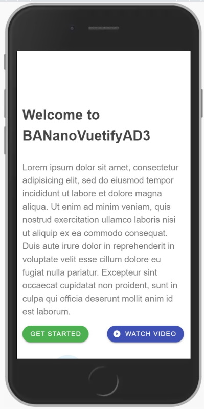
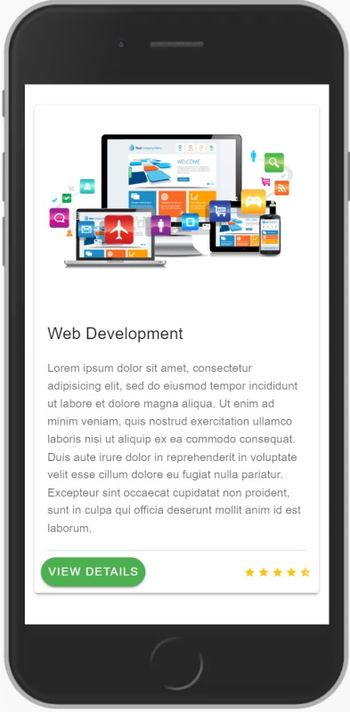
We added media queries so that the text is shrunk when a mobile device is used. The end result is

1661721385927.png


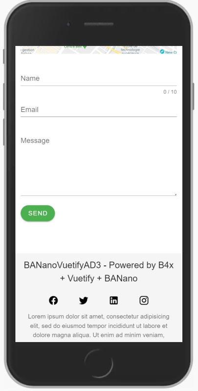
We also added a directive for the footer to "not be on top", so that it only appears when you reach to it.

1661721489074.png


PS: Please also note that the AppBar will hide itself thus hiding the top menu on small devices.

Find the updated files on mega.
 
Top