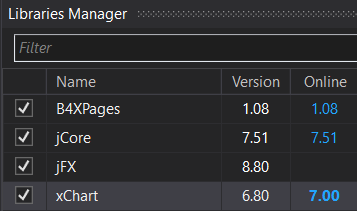
Or even an option to change it to red or green when there's an update available.
When working in the IDE, I don't always see that there's an update to a library available even tough the tab is open, bold blue (to my eyes) just too close to blue. Maybe it's because I have my screen quite dark and that it's high res, but having the online version appear another color completely when there's an update available would be a lot better in my opinion.
Considering that I've been working with xCharts for the past few day, until I saw a post from from Klaus saying that v7.0 was released, I didn't even realise that there had been a V6.9, and I'm more than sure that Klaus would have updated the online resources to say V6.9 before release V7.0.
Anyway, that's just my two cents.

Cheers...
When working in the IDE, I don't always see that there's an update to a library available even tough the tab is open, bold blue (to my eyes) just too close to blue. Maybe it's because I have my screen quite dark and that it's high res, but having the online version appear another color completely when there's an update available would be a lot better in my opinion.
Considering that I've been working with xCharts for the past few day, until I saw a post from from Klaus saying that v7.0 was released, I didn't even realise that there had been a V6.9, and I'm more than sure that Klaus would have updated the online resources to say V6.9 before release V7.0.
Anyway, that's just my two cents.
Cheers...
