B4A Library MPAndroidCharts - Various type of graphs / charts (Latest library V1.22 in post #1)

Edit 6 Sep 2015: Post #3 adds Single Vertical Bar Charts and update for Pie Charts
Edit 8 Sep 2015 Post #6 update for Single Vertical Bar Charts
Edit 11 Sep 2015 Post #7 adds Single Line Charts
Edit 12 Sep 2015 Post #8 update for Single Line Charts
Edit 12 Sep 2015 Post #9 adds Single Horizontal Bar Charts
Edit 12 Sep 2015 Post #11 adds Radar Charts
Edit 13 Sep 2015 Post #12 update for Single Line and Single Bar Charts
Edit 14 Sep 2015 Post #16 update for Radar Charts
Edit 16 Sep 2015 Post #19 adds Multiple Line Charts
Edit 17 Sep2016 Post #21 adds Multi Vertical Bar Charts
Edit 19 Sep 2015 Post #23 adds Multi Bubble Charts
Edit 19 Sep 2015 Post #24 adds Multi Horizontal Bar Charts
Edit 19 Sep 2015 Post #25 adds Multi Scatter Charts
Edit 19 Sep 2015 Post #26 adds Stacked Bar Charts
Edit 20 Sep 2015 Post #27 adds Candlestick Charts
Edit 20 Sep 2015 Post #28 adds Combined Line & Bar Charts
Edit 23 Sep 2015 Post #31 fixed no-show of Chart Title for Combined Charts and added ability to rotate X-axis labels between -30 and + 30 degrees

I am busy wrapping this Github project. Attached is the Pie Chart functionality of the project/library. Posting the B4A project and Library files. Copy the library files to your additional library folder.

Some remarks about the Pie Chart:
1. It will display the values passed as a percentage of the total of the values that you pass
2. There are 3 x arrays that are passed to the library. Ensure that you pass the same number of elements in each of the arrays.
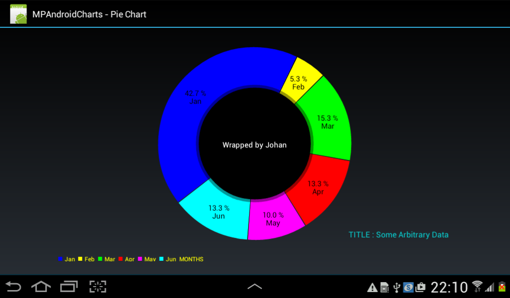
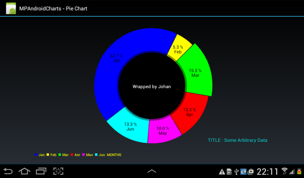
3. When you click on a pie slice the slice will increase in radial size (see pics below)
4. If you click on the radial increased slice it will return to normal size.
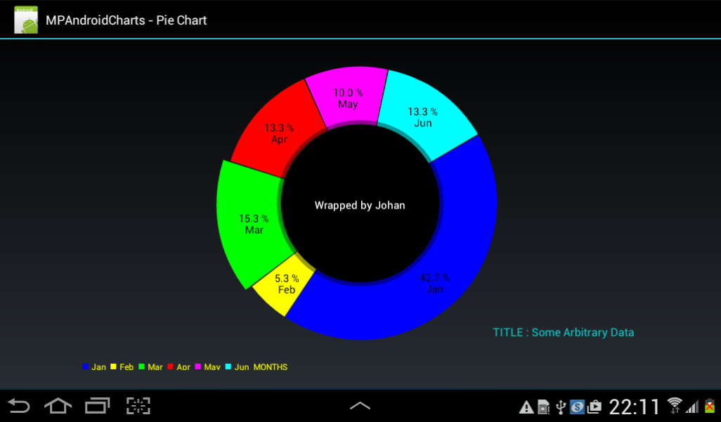
5. You can spin the pie chart around its centre point (CW and ACW) with your finger.

Untouched ...

Pie.gif


1.png


Green slice touched ...

2.png


Pie Chart rotated with finger...

3.png


Some sample code:

B4X:
#Region  Project Attributes
    #ApplicationLabel: MPChart
    #VersionCode: 1
    #VersionName:
    'SupportedOrientations possible values: unspecified, landscape or portrait.
    #SupportedOrientations: landscape
    #CanInstallToExternalStorage: False
#End Region

#Region  Activity Attributes
    #FullScreen: False
    #IncludeTitle: True
#End Region

Sub Process_Globals
    'These global variables will be declared once when the application starts.
    'These variables can be accessed from all modules.

End Sub

Sub Globals
    'These global variables will be redeclared each time the activity is created.
    'These variables can only be accessed from this module.

    Private mpc1 As PieChart
End Sub

Sub Activity_Create(FirstTime As Boolean)
    'Do not forget to load the layout file created with the visual designer. For example:
    Activity.LoadLayout("main")

mpc1.DrawHoleEnabled = True
mpc1.HoleColorTransparent = True

mpc1.TransparentCircleColor = Colors.White
mpc1.TransparentCircleAlpha = 110

mpc1.HoleRadius = 58.0
mpc1.TransparentCircleRadius = 61.0

mpc1.DrawCenterText = True

mpc1.CenterText = "Wrapped by Johan"
mpc1.CenterTextColor = Colors.White
mpc1.CenterTextRadiusPercent = 100.0
mpc1.CenterTextSize = 15.0

mpc1.DrawSliceText = True
mpc1.HoleColor = Colors.Black
mpc1.TransparentCircleColor = Colors.Transparent

mpc1.setTheLegendPosition
mpc1.TheLegendColor = Colors.yellow
mpc1.TheLegendTextSize = 12.0
mpc1.LegendTitle = "MONTHS"

mpc1.ChartDescription = "TITLE : Some Arbitrary Data"
mpc1.ChartDescriptionColor = Colors.ARGB(200,0,255,255)
mpc1.ChartDescriptionTextSize = 17

mpc1.ValueTextColor = Colors.Black
mpc1.ValueTextSize = 15.0

mpc1.PieColors = Array As Int(Colors.Blue, Colors.Yellow, Colors.Green, Colors.Red, Colors.Magenta, Colors.Cyan)
mpc1.LegendText = Array As String("Jan", "Feb", "Mar", "Apr", "May", "Jun")
mpc1.ChartData = Array As Float(128.0, 16.0, 46.0, 40.0, 30.0, 40.0)    'values - it will be converted to %

mpc1.PieData = 6

End Sub

Sub Activity_Resume

End Sub

Sub Activity_Pause (UserClosed As Boolean)

End Sub
 

Attachments

  • b4aMPChart.zip
    7.9 KB · Views: 1,581
  • mpChartLibraryFiles.zip
    221.5 KB · Views: 1,692
  • mpChartLibV1.15.zip
    355.2 KB · Views: 766
  • mpChartLibV1.16.zip
    355.7 KB · Views: 761
  • mpChartLibV1.17.zip
    355.8 KB · Views: 932
  • mpChartLibV1.18.zip
    356.4 KB · Views: 833
  • mpChartLibV1.20.zip
    358.1 KB · Views: 641
  • mpChartLibV1.21.zip
    358 KB · Views: 198
  • mpChartLibV1.22.zip
    359.2 KB · Views: 258
Last edited:

Johan Schoeman

Expert
Licensed User
Longtime User
The attached project adds Multi Bar charts. It uses a lot of arrays to set up the individual bar graphs within a chart. See the code within the project. You can customize each bar graph within a chart to "your liking". It also has a very nice animation when a new chart it drawn. Click on the button at the bottom of the chart to cycle through some examples that I have created in the code.

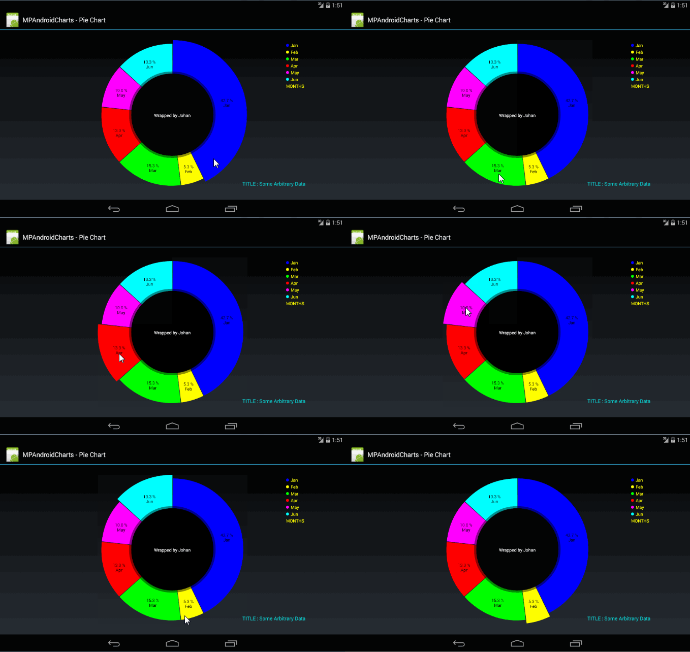
The pics below is what the code in the project draws at present. You can obviously change your individual graphs to your liking (different X-axis data, different, Y-axis data, colours, etc.). There are lots of methods that can be applied to the charts.

You can draw/display from 1 to 5 bar charts (see code in the B4A project). You can also load data for 5 graphs and just display for eg the first 2. It also allows you to for eg only display a defined portion of the X axis (and then obviously the corresponding y-axis values).

It incorporates all of the single bar chart functionality in Post #3 above and some more (the pop-up marker views is still there if you touch a data point, pinch zoom in/out, double tap zoom, etc)

Uploading the B4A project and the new library files.

Note: Animations have also been added for single bar charts (vertical and horizontal) and for single line charts. The code to execute the animations is the same as in for eg the attached B4A project.

1.png


2.png


3.png


4.png


5.png


6.png


7.png


Some sample code (the code below is different from that in the attached B4A project as far as the animations is concerned. Copy/replace the code in the B4A project with this and see the change in animations) :

B4X:
#Region  Project Attributes
    #ApplicationLabel: MPMultiBarChart
    #VersionCode: 1
    #VersionName:
    'SupportedOrientations possible values: unspecified, landscape or portrait.
    #SupportedOrientations: landscape
    #CanInstallToExternalStorage: False
#End Region

#Region  Activity Attributes
    #FullScreen: False
    #IncludeTitle: True
#End Region

Sub Process_Globals
    'These global variables will be declared once when the application starts.
    'These variables can be accessed from all modules.

End Sub

Sub Globals
    'These global variables will be redeclared each time the activity is created.
    'These variables can only be accessed from this module.

    Private mlc1  As MultiBarChart
    Private Button1 As Button
    Dim flag As Int = 0
End Sub

Sub Activity_Create(FirstTime As Boolean)
    'Do not forget to load the layout file created with the visual designer. For example:
    Activity.LoadLayout("main")
   
    mlc1.ChartDescription = "TITLE : Just some random data"
    mlc1.ChartDescriptionColor = Colors.Red
    mlc1.ChartDescriptionTextSize = 15   
    mlc1.GridBackgroundColor = Colors.DarkGray
   
'    RIGHT_OF_CHART, RIGHT_OF_CHART_CENTER, RIGHT_OF_CHART_INSIDE,
'    LEFT_OF_CHART, LEFT_OF_CHART_CENTER, LEFT_OF_CHART_INSIDE,
'    BELOW_CHART_LEFT, BELOW_CHART_RIGHT, BELOW_CHART_CENTER,

'   CIRCLE, SQUARE, LINE

    mlc1.LegendShapeSize = 10.0
    mlc1.setTheLegendPositionAndForm("BELOW_CHART_CENTER","CIRCLE")
    mlc1.TheLegendColor = Colors.yellow
    mlc1.TheLegendTextSize = 10.0   
    mlc1.LegendText = Array As String("2011", "2012", "2013", "2014", "2015")


    mlc1.ValueTextColor = Array As Int(Colors.White, Colors.Red, Colors.White, Colors.Red, Colors.White)
    mlc1.ValueTextSize = Array As Float(12.0, 10.0, 14.0, 8.0, 16.0)

    mlc1.YaxisTextSize = 10.0
    mlc1.YaxisTextColor = Colors.White
   
'   We are going to draw 2 charts/graphs
    mlc1.Chart_1_Data = Array As Float(1100.0, 550.0, 550.0, -300.0, 600.5, 445.0, 849.7, -250.4, -380.2, 345.0, 453.5, 783.7)
    mlc1.Chart_2_Data = Array As Float(1200.0, 750.0, 450.0, 960.0, 730.0, 1100.0, 676.5, 985.6, 1010.8, 836.4, 498.5, 965.3)   

    mlc1.DrawGraphValues = Array As Boolean(True, True, False, True, False)   
   
'   Maximum 5 colors to be passed ==> must be at least equal to the number of data sets that are passed i.e maximum 5
'   If you pass only for eg 2 data sets then at least 2 colors need to be passed
'   If more that 2 colors are passed with for eg only 2 data sets then only the first 2 colors will be used in the color array
    mlc1.LineColors = Array As Int(Colors.Yellow, Colors.Red, Colors.Blue, Colors.Green, Colors.Cyan)
    mlc1.GraphLineWidth = Array As Float(2.0, 3.0, 4.0, 5.0, 6.0)
   
    mlc1.XaxisTextColor = Colors.Cyan
    mlc1.XaxisTextSize = 12.0   
    mlc1.XaxisLables = Array As String("Jan", "Feb", "Mar", "Apr", "May", "Jun", "Jul", "Aug", "Sep", "Oct", "Nov", "Dec")
'  TOP, BOTTOM, BOTH_SIDED, TOP_INSIDE, BOTTOM_INSIDE
    mlc1.XaxisLabelPosition = "BOTTOM"
   
    mlc1.YaxisMinVal = -600           'commented it out so that the scale will be set automatically
    mlc1.YaxisMaxVal = 1600           'commented it out so that the scale will be set automatically
    mlc1.YaxisTextSize = 10.0
    mlc1.YaxisTextColor = Colors.White   
    mlc1.ShowYaxisRightLabels = False
   
    mlc1.CubicIntensity = Array As Float(0.1, 0.2, 0.3, 0.4, 0.5)
    mlc1.DrawCubicGraph = Array As Boolean(True, False, True, False, True)
    mlc1.DrawDashedLine = Array As Boolean(True, False, True, False, True)
    mlc1.MarkerToUse = 4
   
    mlc1.XAnimate = True
    mlc1.YAnimate = False
    mlc1.XYAnimate = False
    mlc1.ChartAnimationTime = 2000                     'milliseconds
   
'   the number of charts to be drawn (maximum 5, in this case 2)
'   the number of x-axis values per chart (in this case 12 = number of elements in the array passed to mlc1.XaxisLables)
    mlc1.setBarData(2,12)
    flag = flag + 1

End Sub

Sub Activity_Resume

End Sub

Sub Activity_Pause (UserClosed As Boolean)

End Sub


Sub Button1_Click
   
    If flag = 8 Then
      flag = 1
    End If
    If flag = 1 Then
      mlc1 = Null        
      draw_graph_2
    else If flag = 2 Then
      mlc1 = Null        
      draw_graph_3
    else if flag = 3 Then
      mlc1 = Null        
      draw_graph_4         
    else if flag = 4 Then
      mlc1 = Null        
      draw_graph_5   
    else if flag = 5 Then
      mlc1 = Null        
      draw_graph_6       
    else if flag = 6 Then
      mlc1 = Null        
      draw_graph_7        
    else if flag = 7 Then
      mlc1 = Null        
      draw_graph_8                                                                                                                                
    End If       

End Sub

Sub draw_graph_2

    mlc1.ChartDescription = "Graph of Sine(x)"
    mlc1.ChartDescriptionColor = Colors.Red
    mlc1.ChartDescriptionTextSize = 15   
    mlc1.GridBackgroundColor = Colors.DarkGray
   
'    RIGHT_OF_CHART, RIGHT_OF_CHART_CENTER, RIGHT_OF_CHART_INSIDE,
'    LEFT_OF_CHART, LEFT_OF_CHART_CENTER, LEFT_OF_CHART_INSIDE,
'    BELOW_CHART_LEFT, BELOW_CHART_RIGHT, BELOW_CHART_CENTER,

'   CIRCLE, SQUARE, LINE

    mlc1.LegendShapeSize = 10.0
    mlc1.setTheLegendPositionAndForm("BELOW_CHART_CENTER","CIRCLE")
    mlc1.TheLegendColor = Colors.yellow
    mlc1.TheLegendTextSize = 10.0   
    mlc1.LegendText = Array As String("Sine(x)")


    mlc1.ValueTextColor = Array As Int(Colors.White)
    mlc1.ValueTextSize = Array As Float(12.0)


    mlc1.YaxisTextSize = 10.0
    mlc1.YaxisTextColor = Colors.White
   
'   We are going to draw 1 charts/graphs
    Dim cnt As Int = 0
    Dim cd1(73), cd2(73), cd3(73), cd4(73), cd5(73)As Float
    Dim xal(73) As String
    For i = 0 To 360 Step 5
        cd1(cnt) = SinD(i)
        xal(cnt) = i
        cnt = cnt + 1
    Next
    mlc1.Chart_1_Data = cd1
    mlc1.XaxisLables = xal

    mlc1.DrawGraphValues = Array As Boolean(False)   
   
'   Maximum 5 colors to be passed ==> must be at least equal to the number of data sets that are passed i.e maximum 5
'   If you pass only for eg 2 data sets then at least 2 colors need to be passed
'   If more that 2 colors are passed with for eg only 2 data sets then only the first 2 colors will be used in the color array
    mlc1.LineColors = Array As Int(Colors.Cyan)
    mlc1.GraphLineWidth = Array As Float(2.0)
   
    mlc1.XaxisTextColor = Colors.Cyan
    mlc1.XaxisTextSize = 12.0   
'   TOP, BOTTOM, BOTH_SIDED, TOP_INSIDE, BOTTOM_INSIDE
    mlc1.XaxisLabelPosition = "BOTTOM"
   
    mlc1.YaxisMinVal = -1.1           'commented it out so that the scale will be set automatically
    mlc1.YaxisMaxVal = 1.1        'commented it out so that the scale will be set automatically
    mlc1.YaxisTextSize = 10.0
    mlc1.YaxisTextColor = Colors.White   
    mlc1.ShowYaxisRightLabels = False
   
    mlc1.DrawDashedLine = Array As Boolean(False)
    mlc1.MarkerToUse = 3
   
    mlc1.XAnimate = False
    mlc1.YAnimate = True
    mlc1.XYAnimate = False
    mlc1.ChartAnimationTime = 2000                     'milliseconds
   
'   the number of charts to be drawn (maximum 5, in this case 1)
'   the number of x-axis values per chart (in this case 12 = number of elements in the array passed to mlc1.XaxisLables)
    mlc1.setBarData(1,73)   
    flag = flag + 1
   
   
End Sub

Sub draw_graph_3

    mlc1.ChartDescription = "Graph of Cosine(x)"
    mlc1.ChartDescriptionColor = Colors.Red
    mlc1.ChartDescriptionTextSize = 15   
    mlc1.GridBackgroundColor = Colors.DarkGray
   
'    RIGHT_OF_CHART, RIGHT_OF_CHART_CENTER, RIGHT_OF_CHART_INSIDE,
'    LEFT_OF_CHART, LEFT_OF_CHART_CENTER, LEFT_OF_CHART_INSIDE,
'    BELOW_CHART_LEFT, BELOW_CHART_RIGHT, BELOW_CHART_CENTER,

'   CIRCLE, SQUARE, LINE

    mlc1.LegendShapeSize = 10.0
    mlc1.setTheLegendPositionAndForm("BELOW_CHART_CENTER","CIRCLE")
    mlc1.TheLegendColor = Colors.yellow
    mlc1.TheLegendTextSize = 10.0   
    mlc1.LegendText = Array As String("Cosine(x)")


    mlc1.ValueTextColor = Array As Int(Colors.White)
    mlc1.ValueTextSize = Array As Float(12.0)


    mlc1.YaxisTextSize = 10.0
    mlc1.YaxisTextColor = Colors.White
   
'   We are going to draw 1 charts/graphs
    Dim cnt As Int = 0
    Dim cd1(73), cd2(73), cd3(73), cd4(73), cd5(73)As Float
    Dim xal(73) As String
    For i = 0 To 360 Step 5
        cd1(cnt) = CosD(i)
        xal(cnt) = i
        cnt = cnt + 1
    Next
    mlc1.Chart_1_Data = cd1
    mlc1.XaxisLables = xal


    mlc1.DrawGraphValues = Array As Boolean(False)   
   
'   Maximum 5 colors to be passed ==> must be at least equal to the number of data sets that are passed i.e maximum 5
'   If you pass only for eg 2 data sets then at least 2 colors need to be passed
'   If more that 2 colors are passed with for eg only 2 data sets then only the first 2 colors will be used in the color array
    mlc1.LineColors = Array As Int(Colors.Cyan)
    mlc1.GraphLineWidth = Array As Float(2.0)
'    mlc1.DrawFilled = Array As Boolean(False)
   
    mlc1.XaxisTextColor = Colors.Cyan
    mlc1.XaxisTextSize = 12.0   
'   TOP, BOTTOM, BOTH_SIDED, TOP_INSIDE, BOTTOM_INSIDE
    mlc1.XaxisLabelPosition = "BOTTOM"
   
    mlc1.YaxisMinVal = -1.1           'commented it out so that the scale will be set automatically
    mlc1.YaxisMaxVal = 1.1        'commented it out so that the scale will be set automatically
    mlc1.YaxisTextSize = 10.0
    mlc1.YaxisTextColor = Colors.White   
    mlc1.ShowYaxisRightLabels = False
   
    mlc1.DrawDashedLine = Array As Boolean(True)
    mlc1.MarkerToUse = 2
   
    mlc1.XAnimate = False
    mlc1.YAnimate = False
    mlc1.XYAnimate = True
    mlc1.ChartAnimationTime = 2000                     'milliseconds
   
'   the number of charts to be drawn (maximum 5, in this case 1)
'   the number of x-axis values per chart (in this case 12 = number of elements in the array passed to mlc1.XaxisLables)
    mlc1.setBarData(1,73)   
    flag = flag + 1
   
   
End Sub

Sub draw_graph_4

    mlc1.ChartDescription = "Graph of Sine(x + y)"
    mlc1.ChartDescriptionColor = Colors.Red
    mlc1.ChartDescriptionTextSize = 15   
    mlc1.GridBackgroundColor = Colors.DarkGray
   
'    RIGHT_OF_CHART, RIGHT_OF_CHART_CENTER, RIGHT_OF_CHART_INSIDE,
'    LEFT_OF_CHART, LEFT_OF_CHART_CENTER, LEFT_OF_CHART_INSIDE,
'    BELOW_CHART_LEFT, BELOW_CHART_RIGHT, BELOW_CHART_CENTER,

'   CIRCLE, SQUARE, LINE

    mlc1.LegendShapeSize = 10.0
    mlc1.setTheLegendPositionAndForm("BELOW_CHART_CENTER","CIRCLE")
    mlc1.TheLegendColor = Colors.yellow
    mlc1.TheLegendTextSize = 10.0   
    mlc1.LegendText = Array As String("Sine(x + 0)", "Sine(x + 30)", "Sine(x + 60)", "Sine(x + 90)", "Sine(x + 120)")


    mlc1.ValueTextColor = Array As Int(Colors.White, Colors.Green, Colors.Red, Colors.Magenta, Colors.Cyan)
    mlc1.ValueTextSize = Array As Float(4.0, 5.0, 6.0, 7.0, 8.0)


    mlc1.YaxisTextSize = 10.0
    mlc1.YaxisTextColor = Colors.White
   
'   We are going to draw 5 charts/graphs
    Dim cnt As Int = 0
    Dim cd1(73), cd2(73), cd3(73), cd4(73), cd5(73)As Float
    Dim xal(73) As String
    For i = 0 To 360 Step 5
        cd1(cnt) = SinD(i)
        cd2(cnt) = SinD(i+30)
        cd3(cnt) = SinD(i+60)
        cd4(cnt) = SinD(i+90)
        cd5(cnt) = SinD(i+120)                       
        xal(cnt) = i
        cnt = cnt + 1
    Next
    mlc1.Chart_1_Data = cd1
    mlc1.Chart_2_Data = cd2
    mlc1.Chart_3_Data = cd3
    mlc1.Chart_4_Data = cd4
    mlc1.Chart_5_Data = cd5               
    mlc1.XaxisLables = xal


    mlc1.DrawGraphValues = Array As Boolean(False, False, False, False, False)   
   
'   Maximum 5 colors to be passed ==> must be at least equal to the number of data sets that are passed i.e maximum 5
'   If you pass only for eg 2 data sets then at least 2 colors need to be passed
'   If more that 2 colors are passed with for eg only 2 data sets then only the first 2 colors will be used in the color array
    mlc1.LineColors = Array As Int(Colors.White, Colors.Green, Colors.Red, Colors.Magenta, Colors.Cyan)
    mlc1.GraphLineWidth = Array As Float(2.0, 3.0, 4.0, 5.0, 6.0)
   
    mlc1.XaxisTextColor = Colors.Cyan
    mlc1.XaxisTextSize = 12.0   
'   TOP, BOTTOM, BOTH_SIDED, TOP_INSIDE, BOTTOM_INSIDE
    mlc1.XaxisLabelPosition = "BOTTOM"
   
    mlc1.YaxisMinVal = -1.1           'commented it out so that the scale will be set automatically
    mlc1.YaxisMaxVal = 1.1        'commented it out so that the scale will be set automatically
    mlc1.YaxisTextSize = 10.0
    mlc1.YaxisTextColor = Colors.White   
    mlc1.ShowYaxisRightLabels = False
   
    mlc1.DrawDashedLine = Array As Boolean(True, False, True, False, True)
    mlc1.MarkerToUse = 1
   
    mlc1.XAnimate = True
    mlc1.YAnimate = False
    mlc1.XYAnimate = False
    mlc1.ChartAnimationTime = 2000                     'milliseconds
   
'   the number of charts to be drawn (maximum 5, in this case 5)
'   the number of x-axis values per chart (in this case 12 = number of elements in the array passed to mlc1.XaxisLables)
    mlc1.setBarData(5,73)   
    flag = flag + 1
   
   
End Sub

Sub draw_graph_5

    mlc1.ChartDescription = "Graph of Cosine(x+y)"
    mlc1.ChartDescriptionColor = Colors.Red
    mlc1.ChartDescriptionTextSize = 15   
    mlc1.GridBackgroundColor = Colors.DarkGray
   
'    RIGHT_OF_CHART, RIGHT_OF_CHART_CENTER, RIGHT_OF_CHART_INSIDE,
'    LEFT_OF_CHART, LEFT_OF_CHART_CENTER, LEFT_OF_CHART_INSIDE,
'    BELOW_CHART_LEFT, BELOW_CHART_RIGHT, BELOW_CHART_CENTER,

'   CIRCLE, SQUARE, LINE

    mlc1.LegendShapeSize = 10.0
    mlc1.setTheLegendPositionAndForm("BELOW_CHART_CENTER","CIRCLE")
    mlc1.TheLegendColor = Colors.yellow
    mlc1.TheLegendTextSize = 10.0   
    mlc1.LegendText = Array As String("Cosine(x + 0)", "Cosine(x + 36)", "Cosine(x + 72)", "Cosine(x + 108)", "Cosine(x + 144)")


    mlc1.ValueTextColor = Array As Int(Colors.White, Colors.Green, Colors.Red, Colors.Magenta, Colors.Cyan)
    mlc1.ValueTextSize = Array As Float(4.0, 5.0, 6.0, 7.0, 8.0)

    mlc1.YaxisTextSize = 10.0
    mlc1.YaxisTextColor = Colors.White
   
'   We are going to draw 5 charts/graphs
    Dim cnt As Int = 0
    Dim cd1(73), cd2(73), cd3(73), cd4(73), cd5(73)As Float
    Dim xal(73) As String
    For i = 0 To 360 Step 5
        cd1(cnt) = CosD(i)
        cd2(cnt) = CosD(i+36)
        cd3(cnt) = CosD(i+72)
        cd4(cnt) = CosD(i+108)
        cd5(cnt) = CosD(i+144)                       
        xal(cnt) = i
        cnt = cnt + 1
    Next
    mlc1.Chart_1_Data = cd1
    mlc1.Chart_2_Data = cd2
    mlc1.Chart_3_Data = cd3
    mlc1.Chart_4_Data = cd4
    mlc1.Chart_5_Data = cd5               
    mlc1.XaxisLables = xal

    mlc1.DrawGraphValues = Array As Boolean(False, False, False, False, False)   
   
'   Maximum 5 colors to be passed ==> must be at least equal to the number of data sets that are passed i.e maximum 5
'   If you pass only for eg 2 data sets then at least 2 colors need to be passed
'   If more that 2 colors are passed with for eg only 2 data sets then only the first 2 colors will be used in the color array
    mlc1.LineColors = Array As Int(Colors.White, Colors.Green, Colors.Red, Colors.Magenta, Colors.Cyan)
    mlc1.GraphLineWidth = Array As Float(2.0, 3.0, 4.0, 5.0, 6.0)
'    mlc1.DrawFilled = Array As Boolean(False, False, False, False, False)
   
    mlc1.XaxisTextColor = Colors.Cyan
    mlc1.XaxisTextSize = 12.0   
'   TOP, BOTTOM, BOTH_SIDED, TOP_INSIDE, BOTTOM_INSIDE
    mlc1.XaxisLabelPosition = "BOTTOM"
   
    mlc1.YaxisTextSize = 10.0
    mlc1.YaxisTextColor = Colors.White   
    mlc1.ShowYaxisRightLabels = False
   
    mlc1.DrawDashedLine = Array As Boolean(True, False, True, False, True)
    mlc1.MarkerToUse = 4
   
    mlc1.XAnimate = False
    mlc1.YAnimate = False
    mlc1.XYAnimate = True
    mlc1.ChartAnimationTime = 2000                     'milliseconds
   
'   the number of charts to be drawn (maximum 5, in this case 5)
'   the number of x-axis values per chart (in this case 12 = number of elements in the array passed to mlc1.XaxisLables)
    mlc1.setBarData(5,73)   
    flag = flag + 1
   
End Sub   

Sub draw_graph_6
   
    mlc1.ChartDescription = "TITLE : Just some random data"
    mlc1.ChartDescriptionColor = Colors.Red
    mlc1.ChartDescriptionTextSize = 15   
    mlc1.GridBackgroundColor = Colors.DarkGray
   
'    RIGHT_OF_CHART, RIGHT_OF_CHART_CENTER, RIGHT_OF_CHART_INSIDE,
'    LEFT_OF_CHART, LEFT_OF_CHART_CENTER, LEFT_OF_CHART_INSIDE,
'    BELOW_CHART_LEFT, BELOW_CHART_RIGHT, BELOW_CHART_CENTER,

'   CIRCLE, SQUARE, LINE

    mlc1.LegendShapeSize = 10.0
    mlc1.setTheLegendPositionAndForm("BELOW_CHART_CENTER","CIRCLE")
    mlc1.TheLegendColor = Colors.yellow
    mlc1.TheLegendTextSize = 10.0   
    mlc1.LegendText = Array As String("2011", "2012", "2013", "2014", "2015")


    mlc1.ValueTextColor = Array As Int(Colors.White, Colors.Red, Colors.White, Colors.Red, Colors.White)
    mlc1.ValueTextSize = Array As Float(12.0, 10.0, 14.0, 8.0, 16.0)

    mlc1.YaxisTextSize = 10.0
    mlc1.YaxisTextColor = Colors.White
   
'   We are going to draw 3 charts/graphs
    mlc1.Chart_1_Data = Array As Float(1100.0, 550.0, 550.0, -300.0, 600.5, 445.0, 849.7, -250.4, -380.2, 345.0, 453.5, 783.7)
    mlc1.Chart_2_Data = Array As Float(1200.0, 750.0, 450.0, 960.0, 730.0, 1100.0, 676.5, 985.6, 1010.8, 836.4, 498.5, 965.3)   
    mlc1.Chart_3_Data = Array As Float(836.4, 1010.8, 985.6, 676.5, 1100.0, 730.0, 960.0, 450.0, 750.0, 1200, 1134.8, 736.1)   


    mlc1.DrawGraphValues = Array As Boolean(True, True, False, True, False)   
   
'   Maximum 5 colors to be passed ==> must be at least equal to the number of data sets that are passed i.e maximum 5
'   If you pass only for eg 2 data sets then at least 2 colors need to be passed
'   If more that 2 colors are passed with for eg only 2 data sets then only the first 2 colors will be used in the color array
    mlc1.LineColors = Array As Int(Colors.Yellow, Colors.Red, Colors.Blue, Colors.Green, Colors.Cyan)
    mlc1.GraphLineWidth = Array As Float(2.0, 3.0, 4.0, 5.0, 6.0)
   
    mlc1.XaxisTextColor = Colors.Cyan
    mlc1.XaxisTextSize = 12.0   
    mlc1.XaxisLables = Array As String("Jan", "Feb", "Mar", "Apr", "May", "Jun", "Jul", "Aug", "Sep", "Oct", "Nov", "Dec")
'  TOP, BOTTOM, BOTH_SIDED, TOP_INSIDE, BOTTOM_INSIDE
    mlc1.XaxisLabelPosition = "BOTTOM"
   
    mlc1.YaxisMinVal = -600           'commented it out so that the scale will be set automatically
    mlc1.YaxisMaxVal = 1600           'commented it out so that the scale will be set automatically
    mlc1.YaxisTextSize = 10.0
    mlc1.YaxisTextColor = Colors.White   
    mlc1.ShowYaxisRightLabels = False
   
    mlc1.CubicIntensity = Array As Float(0.1, 0.2, 0.3, 0.4, 0.5)
    mlc1.DrawCubicGraph = Array As Boolean(True, False, True, False, True)
    mlc1.DrawDashedLine = Array As Boolean(True, False, True, False, True)
    mlc1.MarkerToUse = 3
   
    mlc1.XAnimate = False
    mlc1.YAnimate = True
    mlc1.XYAnimate = False
    mlc1.ChartAnimationTime = 2000                     'milliseconds
   
'   the number of charts to be drawn (maximum 5, in this case 3)
'   the number of x-axis values per chart (in this case 12 = number of elements in the array passed to mlc1.XaxisLables)
    mlc1.setBarData(3,12)
    flag = flag + 1   
   
   
End Sub

Sub draw_graph_7
   
    mlc1.ChartDescription = "TITLE : Just some random data"
    mlc1.ChartDescriptionColor = Colors.Red
    mlc1.ChartDescriptionTextSize = 15   
    mlc1.GridBackgroundColor = Colors.DarkGray
   
'    RIGHT_OF_CHART, RIGHT_OF_CHART_CENTER, RIGHT_OF_CHART_INSIDE,
'    LEFT_OF_CHART, LEFT_OF_CHART_CENTER, LEFT_OF_CHART_INSIDE,
'    BELOW_CHART_LEFT, BELOW_CHART_RIGHT, BELOW_CHART_CENTER,

'   CIRCLE, SQUARE, LINE

    mlc1.LegendShapeSize = 10.0
    mlc1.setTheLegendPositionAndForm("BELOW_CHART_CENTER","CIRCLE")
    mlc1.TheLegendColor = Colors.yellow
    mlc1.TheLegendTextSize = 10.0   
    mlc1.LegendText = Array As String("2011", "2012", "2013", "2014", "2015")


    mlc1.ValueTextColor = Array As Int(Colors.White, Colors.Red, Colors.White, Colors.Red, Colors.White)
    mlc1.ValueTextSize = Array As Float(12.0, 10.0, 14.0, 8.0, 16.0)

    mlc1.YaxisTextSize = 10.0
    mlc1.YaxisTextColor = Colors.White
   
'   We are going to draw 4 charts/graphs
    mlc1.Chart_1_Data = Array As Float(1100.0, 550.0, 550.0, -300.0, 600.5, 445.0, 849.7, -250.4, -380.2, 345.0, 453.5, 783.7)
    mlc1.Chart_2_Data = Array As Float(1200.0, 750.0, 450.0, 960.0, 730.0, 1100.0, 676.5, 985.6, 1010.8, 836.4, 498.5, 965.3)   
    mlc1.Chart_3_Data = Array As Float(836.4, 1010.8, 985.6, 676.5, 1100.0, 730.0, 960.0, 450.0, 750.0, 1200, 1134.8, 736.1)   
    mlc1.Chart_4_Data = Array As Float(345.0, -380.2, -250.4, 849.7, 445.0, 600.5, -300.0, 50.0, 550.0, 1100.0, 894.2, 993.8)   

    mlc1.DrawGraphValues = Array As Boolean(True, True, False, True, False)   
   
'   Maximum 5 colors to be passed ==> must be at least equal to the number of data sets that are passed i.e maximum 5
'   If you pass only for eg 2 data sets then at least 2 colors need to be passed
'   If more that 2 colors are passed with for eg only 2 data sets then only the first 2 colors will be used in the color array
    mlc1.LineColors = Array As Int(Colors.Yellow, Colors.Red, Colors.Blue, Colors.Green, Colors.Cyan)
    mlc1.GraphLineWidth = Array As Float(2.0, 3.0, 4.0, 5.0, 6.0)
'    mlc1.DrawFilled = Array As Boolean(False, False, False, False, False)
   
    mlc1.XaxisTextColor = Colors.Cyan
    mlc1.XaxisTextSize = 12.0   
    mlc1.XaxisLables = Array As String("Jan", "Feb", "Mar", "Apr", "May", "Jun", "Jul", "Aug", "Sep", "Oct", "Nov", "Dec")
'  TOP, BOTTOM, BOTH_SIDED, TOP_INSIDE, BOTTOM_INSIDE
    mlc1.XaxisLabelPosition = "BOTTOM"
   
    mlc1.YaxisMinVal = -600           'commented it out so that the scale will be set automatically
    mlc1.YaxisMaxVal = 1600           'commented it out so that the scale will be set automatically
    mlc1.YaxisTextSize = 10.0
    mlc1.YaxisTextColor = Colors.White   
    mlc1.ShowYaxisRightLabels = False
   
    mlc1.CubicIntensity = Array As Float(0.1, 0.2, 0.3, 0.4, 0.5)
    mlc1.DrawCubicGraph = Array As Boolean(True, False, True, False, True)
    mlc1.DrawDashedLine = Array As Boolean(True, False, True, False, True)
    mlc1.MarkerToUse = 2
   
    mlc1.XAnimate = False
    mlc1.YAnimate = False
    mlc1.XYAnimate = True
    mlc1.ChartAnimationTime = 2000                     'milliseconds
   
'   the number of charts to be drawn (maximum 5, in this case 4)
'   the number of x-axis values per chart (in this case 12 = number of elements in the array passed to mlc1.XaxisLables)
    mlc1.setBarData(4,12)
    flag = flag + 1   
   
   
End Sub

Sub draw_graph_8
   
    mlc1.ChartDescription = "TITLE : Just some random data"
    mlc1.ChartDescriptionColor = Colors.Red
    mlc1.ChartDescriptionTextSize = 15   
    mlc1.GridBackgroundColor = Colors.DarkGray
   
'    RIGHT_OF_CHART, RIGHT_OF_CHART_CENTER, RIGHT_OF_CHART_INSIDE,
'    LEFT_OF_CHART, LEFT_OF_CHART_CENTER, LEFT_OF_CHART_INSIDE,
'    BELOW_CHART_LEFT, BELOW_CHART_RIGHT, BELOW_CHART_CENTER,

'   CIRCLE, SQUARE, LINE

    mlc1.LegendShapeSize = 10.0
    mlc1.setTheLegendPositionAndForm("BELOW_CHART_CENTER","CIRCLE")
    mlc1.TheLegendColor = Colors.yellow
    mlc1.TheLegendTextSize = 10.0   
    mlc1.LegendText = Array As String("2011", "2012", "2013", "2014", "2015")


    mlc1.ValueTextColor = Array As Int(Colors.White, Colors.Red, Colors.White, Colors.Red, Colors.White)
    mlc1.ValueTextSize = Array As Float(12.0, 10.0, 14.0, 8.0, 16.0)

    mlc1.YaxisTextSize = 10.0
    mlc1.YaxisTextColor = Colors.White
   
'   We are going to draw 5 charts/graphs
    mlc1.Chart_1_Data = Array As Float(1100.0, 550.0, 550.0, -300.0, 600.5, 445.0, 849.7, -250.4, -380.2, 345.0, 453.5, 783.7)
    mlc1.Chart_2_Data = Array As Float(1200.0, 750.0, 450.0, 960.0, 730.0, 1100.0, 676.5, 985.6, 1010.8, 836.4, 498.5, 965.3)   
    mlc1.Chart_3_Data = Array As Float(836.4, 1010.8, 985.6, 676.5, 1100.0, 730.0, 960.0, 450.0, 750.0, 1200, 1134.8, 736.1)   
    mlc1.Chart_4_Data = Array As Float(345.0, -380.2, -250.4, 849.7, 445.0, 600.5, -300.0, 50.0, 550.0, 1100.0, 894.2, 993.8)   
    mlc1.Chart_5_Data = Array As Float(1050.0, 850.0, 650.0, 1400.0, 760.8, -450.7, 934.9, 576.2, 896.4, -380.6, 636.7, 1215.9)   
   

    mlc1.DrawGraphValues = Array As Boolean(True, True, False, True, False)   
   
'   Maximum 5 colors to be passed ==> must be at least equal to the number of data sets that are passed i.e maximum 5
'   If you pass only for eg 2 data sets then at least 2 colors need to be passed
'   If more that 2 colors are passed with for eg only 2 data sets then only the first 2 colors will be used in the color array
    mlc1.LineColors = Array As Int(Colors.Yellow, Colors.Red, Colors.Blue, Colors.Green, Colors.Cyan)
    mlc1.GraphLineWidth = Array As Float(2.0, 3.0, 4.0, 5.0, 6.0)
   
    mlc1.XaxisTextColor = Colors.Cyan
    mlc1.XaxisTextSize = 12.0   
    mlc1.XaxisLables = Array As String("Jan", "Feb", "Mar", "Apr", "May", "Jun", "Jul", "Aug", "Sep", "Oct", "Nov", "Dec")
'  TOP, BOTTOM, BOTH_SIDED, TOP_INSIDE, BOTTOM_INSIDE
    mlc1.XaxisLabelPosition = "BOTTOM"
   
    mlc1.YaxisMinVal = -600           'commented it out so that the scale will be set automatically
    mlc1.YaxisMaxVal = 1600           'commented it out so that the scale will be set automatically
    mlc1.YaxisTextSize = 10.0
    mlc1.YaxisTextColor = Colors.White   
    mlc1.ShowYaxisRightLabels = False
   
    mlc1.CubicIntensity = Array As Float(0.1, 0.2, 0.3, 0.4, 0.5)
    mlc1.DrawCubicGraph = Array As Boolean(True, False, True, False, True)
    mlc1.DrawDashedLine = Array As Boolean(True, False, True, False, True)
    mlc1.MarkerToUse = 1
   
    mlc1.XAnimate = False
    mlc1.YAnimate = True
    mlc1.XYAnimate = False
    mlc1.ChartAnimationTime = 2000                     'milliseconds
   
'   the number of charts to be drawn (maximum 5, in this case 5)
'   the number of x-axis values per chart (in this case 12 = number of elements in the array passed to mlc1.XaxisLables)
    mlc1.setBarData(5,12)
    flag = flag + 1   
   
   
End Sub
 

Attachments

  • mpChartLibraryFiles.zip
    272 KB · Views: 657
  • MPMultiBarChart.zip
    30.2 KB · Views: 638
Last edited:

Johan Schoeman

Expert
Licensed User
Longtime User
The attached project adds Multi Bubble Charts. It uses a lot of arrays to set up the individual bubble graphs within a chart. See the code within the project. You can customize each bubble graph within a chart to "your liking". It also has a very nice animation when a new chart it drawn. Click on the button at the bottom of the chart to generate some random bubble charts. It will also randomly choose graph features in order to demonstrate most of the features that are available in the library.
The pics below is what the code in the project randomly generated. You can obviously change your individual graphs to your liking (different X-axis data, different, Y-axis data, colours, etc.). There are lots of methods that can be applied to the charts.

You can draw/display from 1 to 5 bubble charts (see code in the B4A project). You can also load data for 5 graphs and just display for eg the first 2. It also allows you to for eg only display a defined portion of the X axis (and then obviously the corresponding y-axis values).

The pop-up marker views is still there if you touch a data point, pinch zoom in/out, double tap zoom, etc)

Uploading the B4A project and the new library files.

1.png


2.png


3.png


4.png


5.png
 

Attachments

  • MPMultiBubbleChart.zip
    31.2 KB · Views: 442
  • mpChartLibraryFiles.zip
    288.4 KB · Views: 440

Johan Schoeman

Expert
Licensed User
Longtime User
The attached project adds Multi Horizontal Bar charts. It uses a lot of arrays to set up the individual bar graphs within a chart. See the code within the project. You can customize each bar graph within a chart to "your liking". It also has a very nice animation when a new chart it drawn. Click on the button at the bottom of the chart to cycle through some examples that I have created in the code.

The pics below is what the code in the project draws at present. You can obviously change your individual graphs to your liking (different X-axis data, different, Y-axis data, colours, etc.). There are lots of methods that can be applied to the charts.

You can draw/display from 1 to 5 bar charts (see code in the B4A project). You can also load data for 5 graphs and just display for eg the first 2. It also allows you to for eg only display a defined portion of the X axis (and then obviously the corresponding y-axis values).

It incorporates all of the single Horizontal Bar Chart and Multi Vertical Bar Chart functionality. Also supports the pinch zoom in/out and double tap zoom.

Uploading the B4A project and the new library files.

1.png


2.png


3.png


4.png
 

Attachments

  • mpChartLibraryFiles.zip
    295.1 KB · Views: 447
  • MPMultiHorizontalBarChart.zip
    30.5 KB · Views: 456

Johan Schoeman

Expert
Licensed User
Longtime User
The attached project adds Multi Scatter Charts. It uses a lot of arrays to set up the individual scatter graphs within a chart. See the code within the project. You can customize each scatter graph within a chart to "your liking". It also has a very nice animation when a new chart it drawn. Click on the button at the bottom of the chart to cycle through some examples that I have created in the code.

The pics below is what the code in the project has drawn ramdomly. You can obviously change your individual graphs to your liking (different X-axis data, different, Y-axis data, colours, etc.). There are lots of methods that can be applied to the charts.

You can draw/display from 1 to 5 scatter graphs (see code in the B4A project). You can also load data for 5 graphs and just display for eg the first 2. It also allows you to for eg only display a defined portion of the X axis (and then obviously the corresponding y-axis values).

The project/library also supports pinch zoom in/out and double tap zoom.

Uploading the B4A project and the new library files.

Some sample code:
B4X:
#Region  Project Attributes
    #ApplicationLabel: MPMultiScatterChart
    #VersionCode: 1
    #VersionName:
    'SupportedOrientations possible values: unspecified, landscape or portrait.
    #SupportedOrientations: landscape
    #CanInstallToExternalStorage: False
#End Region

#Region  Activity Attributes
    #FullScreen: False
    #IncludeTitle: True
#End Region

Sub Process_Globals
    'These global variables will be declared once when the application starts.
    'These variables can be accessed from all modules.

End Sub

Sub Globals
    'These global variables will be redeclared each time the activity is created.
    'These variables can only be accessed from this module.

    Private mlc1  As MultiScatterChart
    Private Button1 As Button
    Dim r As Int = 0
End Sub

Sub Activity_Create(FirstTime As Boolean)
    'Do not forget to load the layout file created with the visual designer. For example:
    Activity.LoadLayout("main")
  

End Sub

Sub Activity_Resume
  
draw_chart  

End Sub

Sub Activity_Pause (UserClosed As Boolean)

End Sub

Sub Button1_Click
  
draw_chart

End Sub

Sub draw_chart
  
    mlc1.ChartDescription = "TITLE : Just some random data"
    mlc1.ChartDescriptionColor = Colors.ARGB(255, Rnd(100, 256), Rnd(100, 256), 0)
    mlc1.ChartDescriptionTextSize = Rnd(10,26)  
    mlc1.GridBackgroundColor = Colors.LightGray
  
'    RIGHT_OF_CHART, RIGHT_OF_CHART_CENTER, RIGHT_OF_CHART_INSIDE,
'    LEFT_OF_CHART, LEFT_OF_CHART_CENTER, LEFT_OF_CHART_INSIDE,
'    BELOW_CHART_LEFT, BELOW_CHART_RIGHT, BELOW_CHART_CENTER,

'   CIRCLE, SQUARE, LINE
    mlc1.LegendShapeSize = Rnd(10,16)
    mlc1.setTheLegendPositionAndForm(LegendPosition.RANDOM_POSITION,LegendForm.RANDOM_FORM)
    mlc1.TheLegendColor = Colors.ARGB(255, 0, Rnd(100, 256), Rnd(100, 256))
    mlc1.TheLegendTextSize = Rnd(10,16)  
    mlc1.LegendText = Array As String("2011", "2012", "2013", "2014", "2015")

  
    mlc1.ValueTextColor = Array As Int(Colors.Black, Colors.White, Colors.DarkGray, Colors.White, Colors.DarkGray)
    mlc1.ValueTextSize = Array As Float(Rnd(10,16), Rnd(10,16), Rnd(10,16), Rnd(10,16), Rnd(10,16))

    'draw or dont draw graph values for each of the 5 data sets that we are going to generate
    r = Rnd(1,3)
    If r = 1 Then mlc1.DrawGraphValues = Array As Boolean(False, False, False, False, False)
    If r = 2 Then mlc1.DrawGraphValues = Array As Boolean(True, True, True, True, True)  
  
'   We are going to generate data for 5 charts/graphs
    Dim d1(12), d2(12), d3(12), d4(12), d5(12) As Float
    For i = 1 To 12
        d1(i-1) = Rnd(1,101)
        d2(i-1) = Rnd(1,101)
        d3(i-1) = Rnd(1,101)
        d4(i-1) = Rnd(1,101)                      
        d5(i-1) = Rnd(1,101)      
    Next
  
    mlc1.Chart_1_Data = d1
    mlc1.Chart_2_Data = d2  
    mlc1.Chart_3_Data = d3  
    mlc1.Chart_4_Data = d4  
    mlc1.Chart_5_Data = d5
                  
    'set for which of the 5 graphs to draw the graph values for              
'    mlc1.DrawGraphValues = Array As Boolean(True, True, True, True, True)  
  
'   Maximum 5 colors to be passed ==> must be at least equal to the number of data sets that are passed i.e maximum 5
'   If you pass only for eg 2 data sets then at least 2 colors need to be passed
'   If more that 2 colors are passed with for eg only 2 data sets then only the first 2 colors will be used in the color array
    mlc1.ScatterColors = Array As Int(Colors.ARGB(255, Rnd(100, 256), 0, 0), _
                                     Colors.ARGB(255, 0, 0, Rnd(100, 256)), _
                                     Colors.ARGB(255, 0, Rnd(100, 256), 0), _
                                     Colors.ARGB(255, Rnd(100, 256), Rnd(100, 256), 0), _
                                     Colors.ARGB(255, Rnd(100, 256), 0, Rnd(100, 256)))
  
    mlc1.XaxisTextColor = Colors.ARGB(255, Rnd(100, 256), Rnd(100, 256), 0)
    mlc1.XaxisTextSize = Rnd(8,21)  
    mlc1.XaxisLables = Array As String("Jan", "Feb", "Mar", "Apr", "May", "Jun", "Jul", "Aug", "Sep", "Oct", "Nov", "Dec")
'  TOP, BOTTOM, BOTH_SIDED, TOP_INSIDE, BOTTOM_INSIDE

   mlc1.XaxisLabelPosition = XaxisLabelPosition.RANDOM_POSITION
      
    mlc1.YaxisMinVal = 0           'commented it out so that the scale will be set automatically
    mlc1.YaxisMaxVal = 120          'commented it out so that the scale will be set automatically
    mlc1.YaxisTextSize = Rnd(8,16)
    mlc1.YaxisTextColor = Colors.ARGB(Rnd(200,256), Rnd(150, 256), Rnd(150,256), Rnd(150, 256))

    r = Rnd(1,3)
    If r = 1 Then mlc1.ShowYaxisRightLabels = True
    If r = 2 Then mlc1.ShowYaxisRightLabels = False
  
    r = Rnd(1,3)
    If r = 1 Then mlc1.ShowYaxisLeftLabels = True
    If r = 2 Then mlc1.ShowYaxisLeftLabels = False  
  
    mlc1.MarkerToUse = Rnd(1,5)
  
    r = Rnd(1,4)
    If r = 1 Then
        mlc1.XAnimate = True
        mlc1.YAnimate = False
        mlc1.XYAnimate = False      
    End If
    If r = 2 Then
        mlc1.XAnimate = False
        mlc1.YAnimate = True
        mlc1.XYAnimate = False      
    End If
    If r = 3 Then
        mlc1.XAnimate = False
        mlc1.YAnimate = False
        mlc1.XYAnimate = True      
    End If
    mlc1.ChartAnimationTime = Rnd(1000,2001)
  
    mlc1.ScatterShapeSize = Array As Float(Rnd(20,40), Rnd(20,40), Rnd(20,40), Rnd(20,40), Rnd(20,40))
    mlc1.ScatterShape = Array As String(ScatterShape.RANDOM_SHAPE, ScatterShape.RANDOM_SHAPE, ScatterShape.RANDOM_SHAPE, ScatterShape.RANDOM_SHAPE, ScatterShape.RANDOM_SHAPE)
  
'   the number of charts to be drawn (maximum 5, in this case 2)
'   the number of x-axis values per chart (in this case 12 = number of elements in the array passed to mlc1.XaxisLables)
    mlc1.setScatterData(Rnd(1,6),Rnd(6,13))  


End Sub

1.png


2.png


3.png


4.png
 

Attachments

  • MPMultiScatterChart.zip
    31.8 KB · Views: 450
  • mpChartLibraryFiles.zip
    302.3 KB · Views: 439

Johan Schoeman

Expert
Licensed User
Longtime User
The attached project adds Stacked Bar Charts. Click the button and see what happens...Posting the B4A project and the new library files (Jar & XML). Also posting the Java Source code as it stands at present.

1.png


2.png


3.png


4.png
 

Attachments

  • mpChartLibraryFiles.zip
    308 KB · Views: 422
  • MPStackedBarChart.zip
    31 KB · Views: 478
  • TheJavaCode.zip
    252.7 KB · Views: 398
Last edited:

Johan Schoeman

Expert
Licensed User
Longtime User
The attached project adds Candlestick Charts. Click the button to see a random display of most features that the library has available. The data used in the project is actual historical data of ticker NYSE:SAI for January and February 2010.

Posting the B4A project and the new library files (Jar & XML).

Candle.gif


1.png


2.png


3.png


4.png


Some sample code:

B4X:
#Region  Project Attributes
    #ApplicationLabel: MPCandleStickChart
    #VersionCode: 1
    #VersionName:
    'SupportedOrientations possible values: unspecified, landscape or portrait.
    #SupportedOrientations: landscape
    #CanInstallToExternalStorage: False
#End Region

#Region  Activity Attributes
    #FullScreen: False
    #IncludeTitle: True
#End Region

Sub Process_Globals
    'These global variables will be declared once when the application starts.
    'These variables can be accessed from all modules.

End Sub

Sub Globals
    'These global variables will be redeclared each time the activity is created.
    'These variables can only be accessed from this module.

    Private mlc1  As CandleStickChart
    Private Button1 As Button
    Dim r As Int = 0
 
End Sub

Sub Activity_Create(FirstTime As Boolean)
'    'Do not forget to load the layout file created with the visual designer. For example:
    Activity.LoadLayout("main")

End Sub

Sub Activity_Resume
 
    draw_graph

End Sub

Sub Activity_Pause (UserClosed As Boolean)

End Sub


Sub Button1_Click
 
draw_graph

End Sub

Sub draw_graph
 
    mlc1 = Null
 
    mlc1.ChartDescription = "TITLE : NYSE:SAI"
    mlc1.ChartDescriptionColor = Colors.ARGB(255, Rnd(100, 256), Rnd(100, 256), 0)
    mlc1.ChartDescriptionTextSize = Rnd(10,26) 
    mlc1.GridBackgroundColor = Colors.DarkGray
    mlc1.DrawGridBackground = False
 
'    RIGHT_OF_CHART, RIGHT_OF_CHART_CENTER, RIGHT_OF_CHART_INSIDE,
'    LEFT_OF_CHART, LEFT_OF_CHART_CENTER, LEFT_OF_CHART_INSIDE,
'    BELOW_CHART_LEFT, BELOW_CHART_RIGHT, BELOW_CHART_CENTER, RANDOM_POSITION

'   CIRCLE, SQUARE, LINE, RANDOM_FORM
    mlc1.LegendShapeSize = Rnd(10,16)
    mlc1.LegendCustomColor = Array As Int(Colors.Yellow)
    mlc1.LegendCustomText = Array As String("2010")
    'keep the order of the above code and the code of the next two lines
    mlc1.setTheLegendPositionAndForm(LegendPosition.RANDOM_POSITION,LegendForm.RANDOM_FORM)
       mlc1.TheLegendTextSize = Rnd(10,16)     
    mlc1.TheLegendTextColor = Colors.White
 
    'we are loading 38 data points per array
    mlc1.Chart_High_Data = Array As Float(19.17,19.18,19.29,19.1,19.09,19.07,19.08,19.05,19.06,19.09,19.11,19.05,19.07,18.85,18.67,18.66,18.34,18.43,18.5,18.62,18.64,18.69,18.62,18.68,18.67,18.57,18.57,18.67,18.77,19.1,19.18,19.24,19.14,19.2,19.08,19.48,19.43,19.75)
    mlc1.Chart_Low_Data = Array As Float(18.89,18.85,19,18.95,18.96,18.96,18.92,18.75,18.88,18.88,18.83,18.85,18.66,18.37,18.42,18.24,18.19,18.16,18.23,18.11,18.39,18.5,18.38,18.37,18.34,18.26,18.38,18.36,18.44,18.72,18.97,19.04,18.82,18.96,18.92,19.07,19.06,19.44) 
    mlc1.Chart_Open_Data = Array As Float(19.02,19.08,19.23,19.05,19.01,19.04,18.96,19.05,18.96,19,18.9,19.03,18.87,18.7,18.57,18.58,18.28,18.28,18.33,18.28,18.59,18.57,18.38,18.47,18.65,18.57,18.44,18.59,18.56,18.8,19.05,19.15,18.99,19.11,18.95,19.14,19.25,19.45) 
    mlc1.Chart_Close_Data = Array As Float(19.11,19.03,19.08,19.09,19.06,19.01,19.03,18.95,19,18.9,19.11,18.89,18.7,18.41,18.62,18.35,18.27,18.29,18.33,18.6,18.64,18.53,18.48,18.68,18.35,18.51,18.56,18.66,18.75,19,19.17,19.06,19.11,19.01,19.07,19.48,19.39,19.7)


    mlc1.XaxisTextColor = Colors.ARGB(255, Rnd(100, 256), Rnd(100, 256), 0)
    mlc1.XaxisTextSize = Rnd(8,21) 
    'we need to set up 38 labels to match the number of data point in the above data arrays
    mlc1.XaxisLables = Array As String("04 Jan","05 Jan","06 Jan","07 Jan","08 Jan","11 Jan","12 Jan","13 Jan","14 Jan","15 Jan","19 Jan","20 Jan","21 Jan","22 Jan","25 Jan","26 Jan","27 Jan","28 Jan","29 Jan","01 Feb","02 Feb","03 Feb","04 Feb","05 Feb","08 Feb","09 Feb","10 Feb","11 Feb","12 Feb","16 Feb","17 Feb","18 Feb","19 Feb","22 Feb","23 Feb","24 Feb","25 Feb","26 Feb")

'  TOP, BOTTOM, BOTH_SIDED, TOP_INSIDE, BOTTOM_INSIDE, RANDOM_POSITION
   mlc1.XaxisLabelPosition = XaxisLabelPosition.RANDOM_POSITION
     
'    mlc1.YaxisMinVal = 0            'commented it out so that the scale will be set automatically
'    mlc1.YaxisMaxVal = 25          'commented it out so that the scale will be set automatically
    mlc1.YaxisTextSize = Rnd(8,16)
    mlc1.YaxisTextColor = Colors.ARGB(Rnd(200,256), Rnd(150, 256), Rnd(150,256), Rnd(150, 256))

    r = Rnd(1,3)
    If r = 1 Then mlc1.ShowYaxisRightLabels = True
    If r = 2 Then mlc1.ShowYaxisRightLabels = False
 
    r = Rnd(1,3)
    If r = 1 Then mlc1.ShowYaxisLeftLabels = True
    If r = 2 Then mlc1.ShowYaxisLeftLabels = False 
 
    mlc1.MarkerToUse = Rnd(1,5)
 
    r = Rnd(1,4)
    If r = 1 Then
        mlc1.XAnimate = True
        mlc1.YAnimate = False
        mlc1.XYAnimate = False     
    End If
    If r = 2 Then
        mlc1.XAnimate = False
        mlc1.YAnimate = True
        mlc1.XYAnimate = False     
    End If
    If r = 3 Then
        mlc1.XAnimate = False
        mlc1.YAnimate = False
        mlc1.XYAnimate = True     
    End If
    mlc1.ChartAnimationTime = Rnd(1000,2001)
 
    mlc1.DrawXaxisGridLines = False
    mlc1.DrawYaxisGridLines = True
 
    mlc1.DrawValues = False
    mlc1.ValueTextColor = Colors.white
    mlc1.ValueTextSize = Rnd(8,15)
 
    mlc1.ShadowColor = Colors.White
 
'   the number of x-axis values per chart (in this case 20 of the 38  = number of elements in the array passed to mlc1.XaxisLables)
'   You can change the value passed from 1 to the number of elemets in in the array passed to mlc1.XaxisLables
    mlc1.CandleData = Rnd(1,39)

 
End Sub
 

Attachments

  • mpChartLibraryFiles.zip
    315.2 KB · Views: 477
  • MPCandleStickChart.zip
    31.3 KB · Views: 445
Last edited:

Johan Schoeman

Expert
Licensed User
Longtime User
The attached project adds Combined Bar & Line Charts. Click the button to see a random display of most features that the library has available. Posting the B4A project and the new library files (Jar & XML). Also posting the Java code as it stands at present. I am now leaving this project here. Will gladly assist for whoever might want to amend/change/add to it.

1.png


2.png


Sample Code:

B4X:
#Region  Project Attributes
    #ApplicationLabel: MPCombinedLineBarChart
    #VersionCode: 1
    #VersionName:
    'SupportedOrientations possible values: unspecified, landscape or portrait.
    #SupportedOrientations: landscape
    #CanInstallToExternalStorage: False
#End Region

#Region  Activity Attributes
    #FullScreen: False
    #IncludeTitle: True
#End Region

Sub Process_Globals
    'These global variables will be declared once when the application starts.
    'These variables can be accessed from all modules.

End Sub

Sub Globals
    'These global variables will be redeclared each time the activity is created.
    'These variables can only be accessed from this module.

    Private mlc1 As CombinedChart
    Private Button1 As Button
    Dim r As Int  = 0

End Sub

Sub Activity_Create(FirstTime As Boolean)
    'Do not forget to load the layout file created with the visual designer. For example:
    Activity.LoadLayout("main")
   
End Sub

Sub Activity_Resume
   
draw_graph   

End Sub

Sub Activity_Pause (UserClosed As Boolean)

End Sub


Sub Button1_Click
   
draw_graph   

End Sub

Sub draw_graph
   
    mlc1.ChartDescription = "TITLE : Just some random data"
    mlc1.ChartDescriptionColor = Colors.Red
    mlc1.ChartDescriptionTextSize = 15   
    mlc1.GridBackgroundColor = Colors.ARGB(Rnd(200,256), Rnd(150, 256), Rnd(150,256), Rnd(150, 256))
    mlc1.DrawBorders = True
    mlc1.BorderColor = Colors.ARGB(Rnd(200,256), Rnd(150, 256), Rnd(150,256), Rnd(150, 256))
    mlc1.BorderWidth = Rnd(1,11)
   
'    RIGHT_OF_CHART, RIGHT_OF_CHART_CENTER, RIGHT_OF_CHART_INSIDE,
'    LEFT_OF_CHART, LEFT_OF_CHART_CENTER, LEFT_OF_CHART_INSIDE,
'    BELOW_CHART_LEFT, BELOW_CHART_RIGHT, BELOW_CHART_CENTER, RANDOM_POSITION

'   CIRCLE, SQUARE, LINE, RANDOM_FORM

    mlc1.LegendShapeSize = Rnd (10,16)
    mlc1.setTheLegendPositionAndForm(LegendPosition.RANDOM_POSITION,LegendForm.RANDOM_FORM)
    mlc1.TheLegendColor = Colors.White
    mlc1.TheLegendTextSize = Rnd(10,16)   
    mlc1.LineLegendText = "Sales"
    mlc1.BarLegendText = "Cost of Sales"

    mlc1.LineValueTextColor = Colors.Black
    mlc1.LineValueTextSize = Rnd(10,16)
    Dim lincol As Int = Colors.Blue
    mlc1.LineColor = lincol
    mlc1.DrawLineValues = True
    mlc1.LineChartData = Array As Float(200.0, 250.0, 550.0, -300.0, 600.5, 445.0, 849.7, -250.4, -380.2, 345.0, -453.5, 310.7)   
    mlc1.DrawCubicGraph = True
    mlc1.CubicIntensity = 0.2
    mlc1.GraphCircleColor = Colors.Magenta
    mlc1.GraphCircleSize = 7.0
    mlc1.DrawGraphHollowCircles = True
    mlc1.DrawDashedLine = True
    mlc1.GraphLineWidth = 5.0
    'LEFT, RIGHT, RANDOM_POSITION
    mlc1.LineAxisDependency = AxisDependency.RIGHT
   
    mlc1.BarValueTextColor = Colors.red
    mlc1.BarValueTextSize = 10.0   
    Dim barcol As Int = Colors.Yellow
    mlc1.BarColor = barcol
    mlc1.DrawBarValues = True
    mlc1.BarChartData = Array As Float(1200.0, 750.0, -450.0, 960.0, -730.0, 1100.0, 676.5, 985.6, 1010.8, -836.4, 498.5, 965.3)       
    'LEFT, RIGHT, RANDOM_POSITION
    mlc1.BarAxisDependency = AxisDependency.LEFT


'    mlc1.YaxisMinVal = -600           'commented it out so that the scale will be set automatically
'    mlc1.YaxisMaxVal = 1600            'commented it out so that the scale will be set automatically
    mlc1.YaxisTextSize = 15.0
    mlc1.LeftYaxisTextColor = barcol   
   
    mlc1.RightYaxisTextColor = lincol
    mlc1.ShowYaxisRightLabels = True

'   Maximum 5 colors to be passed ==> must be at least equal to the number of data sets that are passed i.e maximum 5
'   If you pass only for eg 2 data sets then at least 2 colors need to be passed
'   If more that 2 colors are passed with for eg only 2 data sets then only the first 2 colors will be used in the color array

   
    mlc1.XaxisTextColor = Colors.Red
    mlc1.XaxisTextSize = Rnd(10,16)
    mlc1.XaxisLables = Array As String("Jan", "Feb", "Mar", "Apr", "May", "Jun", "Jul", "Aug", "Sep", "Oct", "Nov", "Dec")
'  TOP, BOTTOM, BOTH_SIDED, TOP_INSIDE, BOTTOM_INSIDE, RANDOM_POSITION
    mlc1.XaxisLabelPosition = XaxisLabelPosition.RANDOM_POSITION
   
   
    mlc1.MarkerToUse = Rnd(1,5)
   
    r = Rnd(1,4)
    If r = 1 Then
        mlc1.XAnimate = True
        mlc1.YAnimate = False
        mlc1.XYAnimate = False       
    End If
    If r = 2 Then
        mlc1.XAnimate = False
        mlc1.YAnimate = True
        mlc1.XYAnimate = False       
    End If
    If r = 3 Then
        mlc1.XAnimate = False
        mlc1.YAnimate = False
        mlc1.XYAnimate = True       
    End If
    mlc1.ChartAnimationTime = Rnd(1000,2001)
   
'   the number of charts to be drawn (maximum 5, in this case 2)
'   the number of x-axis values per chart (in this case 12 = number of elements in the array passed to mlc1.XaxisLables)
    mlc1.setCombinedData   
   
End Sub
 

Attachments

  • MPCombinedLineBarChart.zip
    31.8 KB · Views: 443
  • TheJavaCode.zip
    265.8 KB · Views: 415
  • mpChartLibraryFiles.zip
    315.9 KB · Views: 445

Mahares

Expert
Licensed User
Longtime User
In order to explore the power of MPAndroidCharts library engineered by the powerhouse @Johan Schoeman , I created a full example of a combined line/bar chart in the attached project modeled after Johan's example, where data is automatically imported from a SQLite table.
1. The example creates a SQLite table of top countries, their population and area.
2. It imports the countries in the Xaxis, population in the left Yaxis and the area in the right Yaxis.

Items for Johan to look into:
1. The chart title (description) is not shown despite the existence of code method to show it.
2. My wish : to be able to change the alignment angle of the Xaxis labels (values) in order to display slanted labels at different degrees.
 

Attachments

  • MPCombinedLineBarChartUsingSQLite092315.zip
    58 KB · Views: 401

Johan Schoeman

Expert
Licensed User
Longtime User
Items for Johan to look into:
1. The chart title (description) is not shown despite the existence of code method to show it.
2. My wish : to be able to change the alignment angle of the Xaxis labels (values) in order to display slanted labels at different degrees.

Thanks for the feedback. Will look at it later today and see if I can sort it out. Not sure where the title suddenly disappeared to...
 

Johan Schoeman

Expert
Licensed User
Longtime User
Items for Johan to look into:
1. The chart title (description) is not shown despite the existence of code method to show it.
2. My wish : to be able to change the alignment angle of the Xaxis labels (values) in order to display slanted labels at different degrees.

Here it is:
1. No-show of the title has been sorted out
2. Added the ability to rotate the x axis labels but have capped the rotation to -30.0 <= rotation <= 30.0

Posting the updated B4A project and the updated library files (JAR & XML). Also posting the updated Java code for whoever wants to amend/change it. I will do a separate post for how to compile the library with @Erel's Simple Library Compiler and also explain where you can amend the code for the rotation of the X-axis labels should you want to amend/change it.

Angle of X-axis labels (text) set to +30 degrees:

1.png


Angle of X-axis labels (text) set to -30 degrees:
2.png

New sample code:

B4X:
#Region  Project Attributes
    #ApplicationLabel: MPCombinedLineBarChart
    #VersionCode: 1
    #VersionName:
    'SupportedOrientations possible values: unspecified, landscape or portrait.
    #SupportedOrientations: landscape
    #CanInstallToExternalStorage: False
#End Region

#Region  Activity Attributes
    #FullScreen: False
    #IncludeTitle: True
#End Region

Sub Process_Globals
    'These global variables will be declared once when the application starts.
    'These variables can be accessed from all modules.

End Sub

Sub Globals
    'These global variables will be redeclared each time the activity is created.
    'These variables can only be accessed from this module.

    Private mlc1 As CombinedChart
    Private Button1 As Button
    Dim r As Int  = 0

End Sub

Sub Activity_Create(FirstTime As Boolean)
    'Do not forget to load the layout file created with the visual designer. For example:
    Activity.LoadLayout("main")
   
End Sub

Sub Activity_Resume
   
draw_graph   

End Sub

Sub Activity_Pause (UserClosed As Boolean)

End Sub


Sub Button1_Click
   
draw_graph   

End Sub

Sub draw_graph
   
    mlc1.ChartDescription = "TITLE : Just some random data"
    mlc1.ChartDescriptionColor = Colors.Red
    mlc1.ChartDescriptionTextSize = 15   
    mlc1.GridBackgroundColor = Colors.ARGB(Rnd(200,256), Rnd(150, 256), Rnd(150,256), Rnd(150, 256))
    mlc1.DrawBorders = True
    mlc1.BorderColor = Colors.ARGB(Rnd(200,256), Rnd(150, 256), Rnd(150,256), Rnd(150, 256))
    mlc1.BorderWidth = Rnd(1,5)
   
'    RIGHT_OF_CHART, RIGHT_OF_CHART_CENTER, RIGHT_OF_CHART_INSIDE,
'    LEFT_OF_CHART, LEFT_OF_CHART_CENTER, LEFT_OF_CHART_INSIDE,
'    BELOW_CHART_LEFT, BELOW_CHART_RIGHT, BELOW_CHART_CENTER, RANDOM_POSITION

'   CIRCLE, SQUARE, LINE, RANDOM_FORM

    mlc1.LegendShapeSize = Rnd (10,16)
    mlc1.setTheLegendPositionAndForm(LegendPosition.RANDOM_POSITION,LegendForm.RANDOM_FORM)
    mlc1.TheLegendColor = Colors.White
    mlc1.TheLegendTextSize = Rnd(10,16)   
    mlc1.LineLegendText = "Sales"
    mlc1.BarLegendText = "Cost of Sales"

    mlc1.LineValueTextColor = Colors.Black
    mlc1.LineValueTextSize = Rnd(10,16)
    Dim lincol As Int = Colors.ARGB(255, Rnd(200,256), Rnd(100, 256), Rnd(150,256))
    mlc1.LineColor = lincol
    mlc1.DrawLineValues = True
    mlc1.LineChartData = Array As Float(200.0, 250.0, 550.0, -300.0, 600.5, 445.0, 849.7, -250.4, -380.2, 345.0, -453.5, 310.7)   
    mlc1.DrawCubicGraph = True
    mlc1.CubicIntensity = 0.2
    mlc1.GraphCircleColor = Colors.Magenta
    mlc1.GraphCircleSize = 7.0
    mlc1.DrawGraphHollowCircles = True
    r = Rnd(0,2)
    If r = 0 Then mlc1.DrawDashedLine = True
    If r = 1 Then mlc1.DrawDashedLine = False
    mlc1.GraphLineWidth = 5.0
    'LEFT, RIGHT, RANDOM_POSITION
    mlc1.LineAxisDependency = AxisDependency.RIGHT
   
    mlc1.BarValueTextColor = Colors.red
    mlc1.BarValueTextSize = 10.0   
    Dim barcol As Int = Colors.ARGB(175, Rnd(150,256), Rnd(100, 256), Rnd(150,256))
    mlc1.BarColor = barcol
    mlc1.DrawBarValues = True
    mlc1.BarChartData = Array As Float(1200.0, 750.0, -450.0, 960.0, -730.0, 1100.0, 676.5, 985.6, 1010.8, -253.7, 498.5, 965.3)       
    'LEFT, RIGHT, RANDOM_POSITION
    mlc1.BarAxisDependency = AxisDependency.LEFT


'    mlc1.YaxisMinVal = -600           'commented it out so that the scale will be set automatically
'    mlc1.YaxisMaxVal = 1600            'commented it out so that the scale will be set automatically
    mlc1.YaxisTextSize = 15.0
    mlc1.LeftYaxisTextColor = barcol   
   
    mlc1.RightYaxisTextColor = lincol
    mlc1.ShowYaxisRightLabels = True

'   Maximum 5 colors to be passed ==> must be at least equal to the number of data sets that are passed i.e maximum 5
'   If you pass only for eg 2 data sets then at least 2 colors need to be passed
'   If more that 2 colors are passed with for eg only 2 data sets then only the first 2 colors will be used in the color array

   
    mlc1.XaxisTextColor = Colors.Magenta
    mlc1.XaxisTextSize = Rnd(10,16)
    mlc1.XaxisLables = Array As String("Jan", "Feb", "Mar", "Apr", "May", "Jun", "Jul", "Aug", "Sep", "Oct", "Nov", "Dec")
'  TOP, BOTTOM, BOTH_SIDED, TOP_INSIDE, BOTTOM_INSIDE, RANDOM_POSITION
    mlc1.XaxisLabelPosition = XaxisLabelPosition.RANDOM_POSITION
    mlc1.XaxisTextAngle = 30
   
   
    mlc1.MarkerToUse = Rnd(1,5)
   
    r = Rnd(1,4)
    If r = 1 Then
        mlc1.XAnimate = True
        mlc1.YAnimate = False
        mlc1.XYAnimate = False       
    End If
    If r = 2 Then
        mlc1.XAnimate = False
        mlc1.YAnimate = True
        mlc1.XYAnimate = False       
    End If
    If r = 3 Then
        mlc1.XAnimate = False
        mlc1.YAnimate = False
        mlc1.XYAnimate = True       
    End If
    mlc1.ChartAnimationTime = Rnd(1000,2001)
   
'   the number of charts to be drawn (maximum 5, in this case 2)
'   the number of x-axis values per chart (in this case 12 = number of elements in the array passed to mlc1.XaxisLables)
    mlc1.setCombinedData   
   
End Sub
 

Attachments

  • MPCombinedLineBarChart.zip
    31.8 KB · Views: 464
  • mpChartLibraryFiles.zip
    316.3 KB · Views: 507
  • TheJavaCode.zip
    266.2 KB · Views: 399

Mahares

Expert
Licensed User
Longtime User
1. No-show of the title has been sorted out
2. Added the ability to rotate the x axis labels but have capped the rotation to -30.0 <= rotation <= 30.0
Superb. I tested it in my SQL example and it works perfectly. If you are seeking more feedback here are 3 essential ones that will make your library more magnificent:
1. Allow the Xaxis value rotation to be between -90 and 90 degrees in the event of many values. The Xaxis can still be crowded when using a small angle like 30 degrees.
2. In the X value labels, allow the user to skip displaying the labels every so many values. This can be very useful when you have a large number of x values which can jam the X axis. Example: my X values are 0, 1,2,3,4,5,6,7,8,9,10, but I want to only display: 0, 5, 10.
3. Similar to item 1 suggestion, but pertains to the Y axis for the exact same reason: avoid clutter.
 

Johan Schoeman

Expert
Licensed User
Longtime User
Superb. I tested it in my SQL example and it works perfectly. If you are seeking more feedback here are 3 essential ones that will make your library more magnificent:
1. Allow the Xaxis value rotation to be between -90 and 90 degrees in the event of many values. The Xaxis can still be crowded when using a small angle like 30 degrees.
2. In the X value labels, allow the user to skip displaying the labels every so many values. This can be very useful when you have a large number of x values which can jam the X axis. Example: my X values are 0, 1,2,3,4,5,6,7,8,9,10, but I want to only display: 0, 5, 10.
3. Similar to item 1 suggestion, but pertains to the Y axis for the exact same reason: avoid clutter.

I will try and explain the compiling of the library with Simple Library Compiler the best I can:
1. You need Simple Library Compiler on your PC/Laptop (download it from the forum but ensure to download/install the B4A version and not the B4J version)
1. Attached is the Java code (src.zip)
2. Download src.zip and then unzip it (in whatever folder you want to on whatever drive you would prefer)
3. Then set up a folder structure that looks as follows:
MPChartLib
src
4. src (and all the folders/files within it) must be the folder that you have downloaded from the attached src.zip file. Copy the unzipped src folder in its entirety to the MPChartLib folder so that the src folder is the first sub folder in the MPCharLib folder.
5. It should then look like this:
MPChartLib
src
com
github
mikephil
charting
animation
java files​
buffer
java files​
charts
java files​
components
java files​
data
filter
java files​
java files​
exception
java files​
highlight
java files​
interfaces
java files​
jobs
java files​
listener
java files​
matrix
java files​
renderer
java files​
utils
java files​
mpandroidchartwrapper
barChartWrapper.java
candleStickChartWrapper.java
etc...
etc...​
6. Start Simple Library Compiler (SLC) and once it has started browse to the project folder MPChartLib (see point 3 above) that you have created and that has the src folder as its first sub folder. See pic below

3.png


7. Enter mpChartLib in the "Library Name" field of SLC (see pic above)
8. Enter com in the "-b4aignore" field of SLC (see pic above)
9. Click on button Compile of SLC. The Jar and XML files (mpChartLib.jar and mpChartLib.xml) will be created and will be added to your additional library folder (provided you have set up/defined your additional library folder)
10. Start your B4A project and find mpChartLib in the Libraries Manager tab (bottom right of the IDE). Click in the box to enable it (see pic below)

4.png


You can now create your charts - see examples in posts #1 to post #31 in this thread.

In order to amend the X-Axis label rotation you need to modify/amend the java code in src/com/github/mikephil/charting/renderer/XAxisRenderer.java. See the comments where I have amended the code to effect the rotation in method
protected void drawLabels(Canvas c, float pos)
The same will apply for the Y-Axis labels by editing and amending/changing the code in src/com/github/mikephil/charting/renderer/YAxisRenderer.java
There will in all probability be changes required in other java classes within this Github project to achieve the ultimate appearance.

I have merely wrapped as much as possible of the original Github project and don't want to delve too deep into the original code to effect certain outcomes. It could keep one busy for weeks on end. Thus, I leave you with the java code (original and wrappers) and the description above of how to compile it with SLC. Change/amend and use the code whichever way will suite you.

As a side note - the wrappers for this Github project (including changes/additions to the original code) were all created/edited with Notepad and compiled with Simple Library Compiler. No part of this library was created by making use of Eclipse or anything similar.
 

Attachments

  • src.zip
    266.2 KB · Views: 416
Last edited:

georgelbs

Member
Licensed User
Longtime User
Thank you very much for this library, is it possible to draw combinated (multi bar charts and line charts) like:
 

Attachments

  • upload_2015-9-29_10-45-23.png
    upload_2015-9-29_10-45-23.png
    228.9 KB · Views: 407
  • sample.jpg
    sample.jpg
    150.4 KB · Views: 402

Johan Schoeman

Expert
Licensed User
Longtime User
Thank you very much for this library, is it possible to draw combinated (multi bar charts and line charts) like:
Not at present. I will have to add that to the library. It will at present only draw a combination Bar/Line chart that consists of one of each (i.e a single bar chart with a single line chart). I will amend the code to make provision for 5 of each. But will need a couple of days to do so. Will try and post it before the end of this coming weekend.
 

Harris

Expert
Licensed User
Longtime User
log1.png


Can it do a simple graph like this (without the grid of course)?
These are basically lines drawn on a canvas, but a heck of alot of code to render properly on various devices.
 

Johan Schoeman

Expert
Licensed User
Longtime User
Top