Toggle Buttons and Check Boxes are standard fare for any program but to make them look good you need StateListDrawables and bunches of Image files. With SmartHost you can use font characters or Emoji to achieve the same thing.
I'm going to assume that you have read Lesson 1 and are familiar with Initializing a SmartHost and doing a SetLayout to place it on the screen.
Before we get into the code here is the basic principle of operation.
A SmartHost has two special layers which are accessible by the constants .cLayerChecked and .cLayerUnchecked. The image we want presented when the button is in the checked state is placed on layer .cLayerChecked. The image we want presented when the button is in the unchecked state is placed on layer .cLayerUnchecked. We then enable the SmartHost as a Toggle\Checkbox and the appropriate image is automatically displayed.
In this example we will build a basic CheckBox and have a green check mark when the state is checked and a red X mark when the state is unchecked. Note: In this example I am using basic colors to keep the code shorter. I would use my Colors_ class if I was doing this for real and have a bit more nuance.
In the Activity_Create sub we will Initialize the Icon lists we are interested in and load FontAwesome.TTF
Create the CheckBox SmartHost
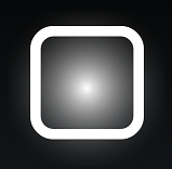
This is what we have so far.
Add Icons
Now we have to add the two Icons\Emoji that we want to represent the Checked and Unchecked states.
Now we have this.

Adjust Layers
That's a bit ugly because the X isn't in the middle of the box! Why is that? You have to remember that we are dealing with font characters and their alignment is determined by the font. You will notice that the tops and bottoms of the letters h and p are not aligned. How font characters align is 100% determined by the author of the font.
Sounds like a problem but it isn't really. The font characters are on separate layers and we can manipulate each layer independently so all we have to do is move one layer and they will align. In this case we will move the "Box" layer but we could have move the CheckMark just as easily.
Now it looks like this. Much better.


How did I know how much to move the "Box" layer. Trial and error mostly however each SmartHost has some built-in guides to help in the development process. I can turn on the Developer Grid like this.
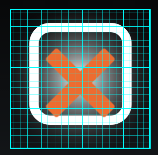
Each box nominally represents 5% so you can make a pretty good first guess this way and fine tune from there.
This is what we have for code so far to create the CheckBox
Create the Callback
Now for the last step we need to add our Callback event. A normal Checkbox looks for a callback ending in _CheckChanged and this is no different, except that the checked State is also passed back at the same time. So this is what we need.
Wrap Up
That is all there is to creating a CheckBox or Toggle Button with SmartHost. Part of the beauty is the ease with which you can change colors, sizes, Icons, positions etc without having to get new artwork!
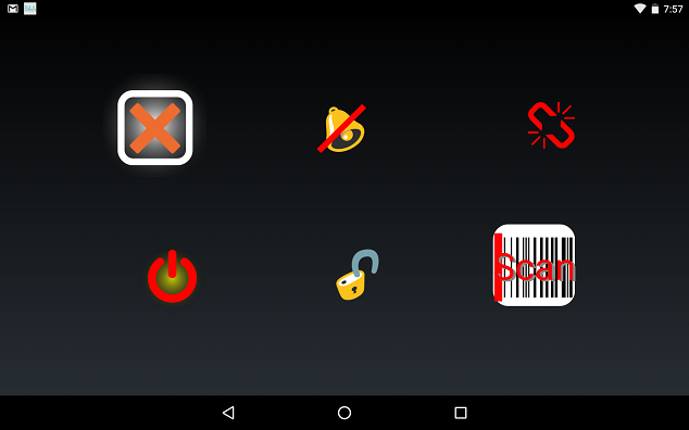
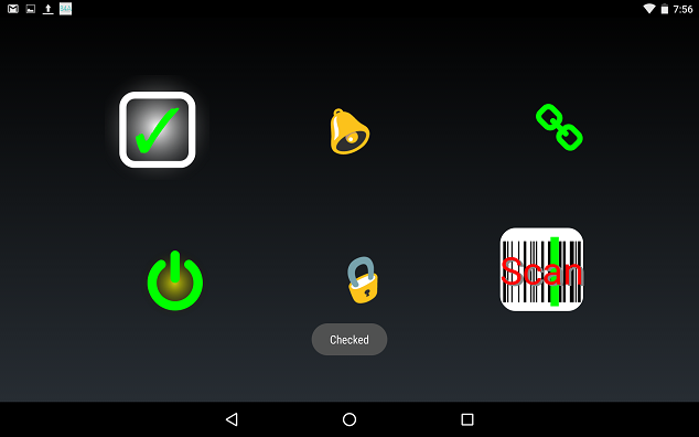
I've created a few more examples within the demo. Here they are in their Checked and Unchecked states.
Note: You can use the Checked_Get and Checked_Set functions to Get or Set the checked state of a SmartHost once it has ToggleModeEnabled. This is useful when you may wish to have a Toggle\CheckBox start in the Checked state.
Demo files are attached and includes the FontAwesome font.
I'm going to assume that you have read Lesson 1 and are familiar with Initializing a SmartHost and doing a SetLayout to place it on the screen.
Before we get into the code here is the basic principle of operation.
A SmartHost has two special layers which are accessible by the constants .cLayerChecked and .cLayerUnchecked. The image we want presented when the button is in the checked state is placed on layer .cLayerChecked. The image we want presented when the button is in the unchecked state is placed on layer .cLayerUnchecked. We then enable the SmartHost as a Toggle\Checkbox and the appropriate image is automatically displayed.
In this example we will build a basic CheckBox and have a green check mark when the state is checked and a red X mark when the state is unchecked. Note: In this example I am using basic colors to keep the code shorter. I would use my Colors_ class if I was doing this for real and have a bit more nuance.
B4X:
'Initialize a SmartHost and we will use the Icons list to make things easier.
Sub Globals
    Dim CheckBox
    Dim Icons As Icons_
End Sub
In the Activity_Create sub we will Initialize the Icon lists we are interested in and load FontAwesome.TTF
B4X:
'The first True is FontAwesome
'The third True is UnicodeBasic
'The fourth True is UnicodeAll
Icons.Initialize(True, False, True, True, False)
'This is the FontAwesome font that should be in your files folder.
Dim FA As Typeface = Typeface.LoadFromAssets("fontawesome.ttf")
Create the CheckBox SmartHost
B4X:
'Note the Callback name is SHEvent.
CheckBox.Initialize("CheckBox", Me, Activity, "SHEvent", 1)

'Parameters are: Left, Top, Width, Height, IconSize, IconPosition.
'The checkbox is square so the Width and Height are the same.
'We want the Icons to fill the SmartHost so it matches the width and height. This makes "CC" redundant.
CheckBox.SetLayout(15%x, 15%y, 10%x, 10%x, 10%x, "CC")

'Add a gradient for visual interest.
CheckBox.BackgroundGradient("HOST", Array As Int(Colors.White, Colors.Transparent), CheckBox.HostWidth*0.6, "RADIAL")

'Now we add an empty CheckBox from the FontAwesome font and color it White.
CheckBox.LayerAddIcon("Box", Icons.FA.Square_O, Colors.White, 100, FA)
This is what we have so far.
Add Icons
Now we have to add the two Icons\Emoji that we want to represent the Checked and Unchecked states.
B4X:
'These two lines are explained in the first tutorial.
CheckBox.LayerAddIcon(CheckBox.cLayerChecked, Icons.Unicode.Dingbats.Check_Mark, Colors.Green, 80, Typeface.DEFAULT)
CheckBox.LayerAddIcon(CheckBox.cLayerUnchecked, Icons.Unicode.Dingbats.Cross_Mark, Colors.Red, 80, Typeface.DEFAULT)

'Lastly we have to enable the SmartHost as a Toggle\CheckBox.
CheckBox.ToggleModeEnabled(True)
Now we have this.
Adjust Layers
That's a bit ugly because the X isn't in the middle of the box! Why is that? You have to remember that we are dealing with font characters and their alignment is determined by the font. You will notice that the tops and bottoms of the letters h and p are not aligned. How font characters align is 100% determined by the author of the font.
Sounds like a problem but it isn't really. The font characters are on separate layers and we can manipulate each layer independently so all we have to do is move one layer and they will align. In this case we will move the "Box" layer but we could have move the CheckMark just as easily.
B4X:
'We do a LayerMove operation anytime we wish to adjust the position of any layer.
'Layer ("Box"): The name of the Layer to move.
'Left (0): Move the Layer left by this percentage of the Icon size.
'Right (0): Move the Layer right by this percentage of the Icon size.
'Up (0): Move the Layer up by this percentage of the Icon size.
'Down (6): Move the Layer down by 6 percent of the Icon size.
CheckBox.LayerMove("Box", 0, 0, 0, 6)
Now it looks like this. Much better.
How did I know how much to move the "Box" layer. Trial and error mostly however each SmartHost has some built-in guides to help in the development process. I can turn on the Developer Grid like this.
B4X:
'Color (0): Specify a color or use 0 for the default color, Colors.Cyan
'FineGrid (True): If True uses a 20 x 20 grid (5%). If False uses a 10 x 10 grid (10%).
CheckBox.DeveloperShowGrid(0, True)
Each box nominally represents 5% so you can make a pretty good first guess this way and fine tune from there.
This is what we have for code so far to create the CheckBox
B4X:
CheckBox.Initialize("CheckBox", Me, Activity, "SHEvent", 1)
CheckBox.SetLayout(15%x, 15%y, 15%x, 15%x, 15%x, "CC")
CheckBox.BackgroundGradient("HOST", Array As Int(Colors.White, Colors.Transparent), CheckBox.HostWidth*0.6, "RADIAL")
CheckBox.LayerAddIcon("Box", Icons.FA.Square_O, Colors.White, 100, FA)
CheckBox.LayerMove("Box", 0, 0, 0, 6)
CheckBox.LayerAddIcon(CheckBox.cLayerChecked, Icons.Unicode.Dingbats.Check_Mark, Colors.Green, 80, Typeface.DEFAULT)
CheckBox.LayerAddIcon(CheckBox.cLayerUnchecked, Icons.Unicode.Dingbats.Cross_Mark, Colors.Red, 80, Typeface.DEFAULT)
CheckBox.ToggleModeEnabled(True)
Create the Callback
Now for the last step we need to add our Callback event. A normal Checkbox looks for a callback ending in _CheckChanged and this is no different, except that the checked State is also passed back at the same time. So this is what we need.
B4X:
Sub SHEvent_CheckChanged(IsChecked As Boolean)
    If IsChecked = True Then
        ToastMessageShow("Checked", False)
    Else
        ToastMessageShow("Unchecked", False)
    End If
End Sub
Wrap Up
That is all there is to creating a CheckBox or Toggle Button with SmartHost. Part of the beauty is the ease with which you can change colors, sizes, Icons, positions etc without having to get new artwork!
I've created a few more examples within the demo. Here they are in their Checked and Unchecked states.
Note: You can use the Checked_Get and Checked_Set functions to Get or Set the checked state of a SmartHost once it has ToggleModeEnabled. This is useful when you may wish to have a Toggle\CheckBox start in the Checked state.
Demo files are attached and includes the FontAwesome font.
Attachments
Last edited:
