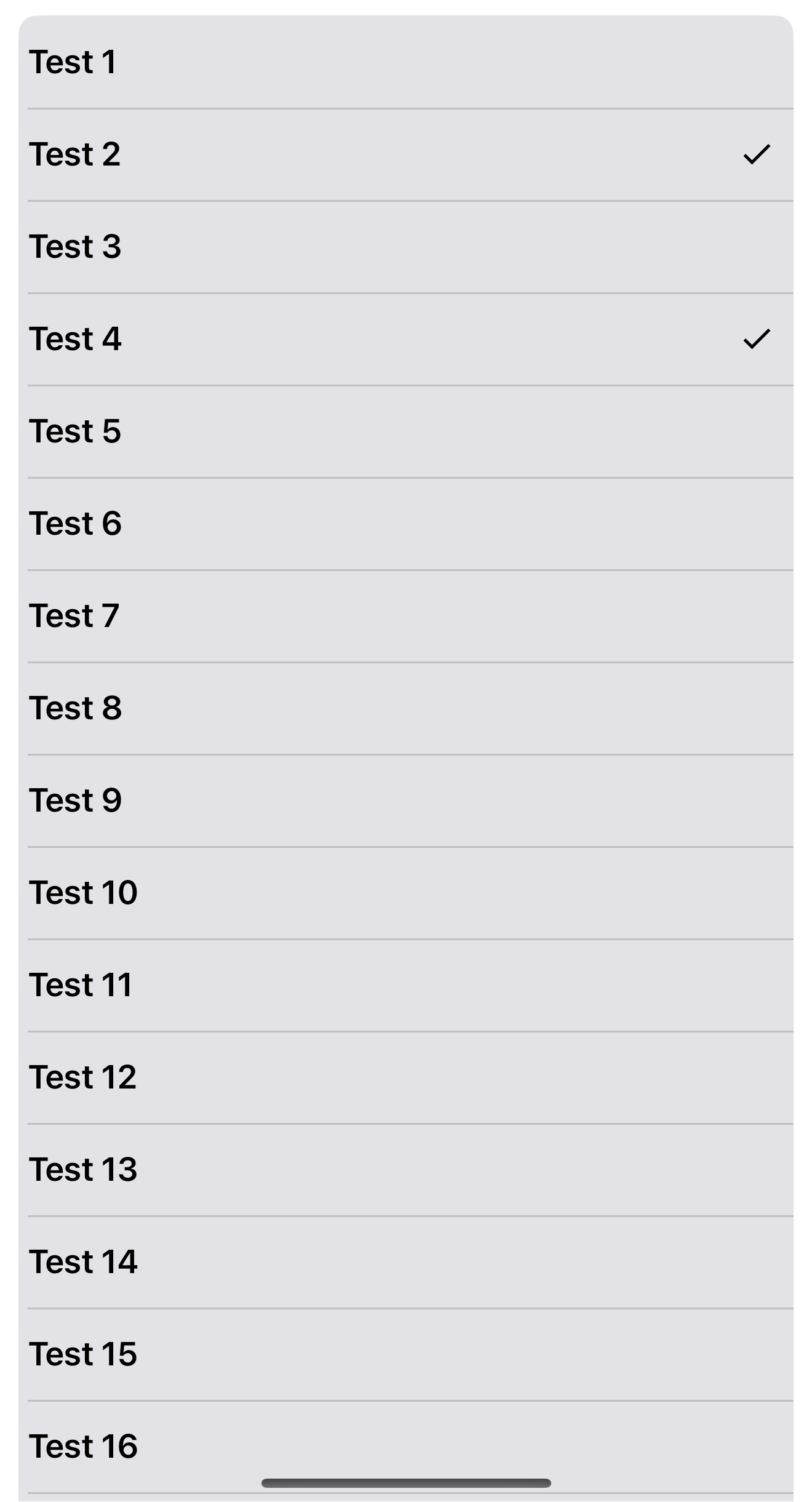
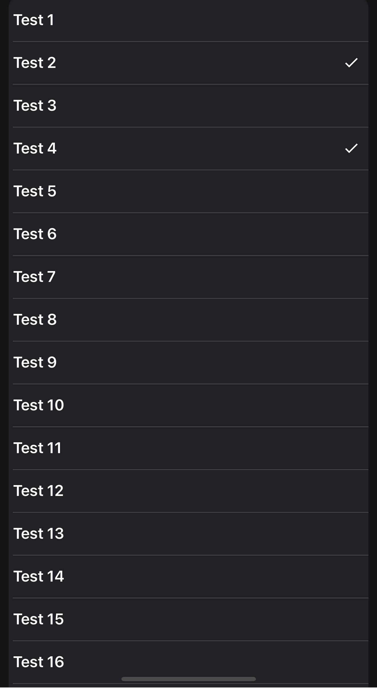
This view makes it easy to quickly provide a good looking single or multiple selection list.
I spend a lot of time in creating views, like this and to create a high quality view cost a lot of time. If you want to support me and further views, then you can do it here by Paypal or with a coffee.


Examples
Search
There is a built-in search that makes it easy to search for something while maintaining the selection.
Search with the value that was passed in the “Value” parameter when the item was added
Theming
Get Selection
SubItems

BottomSelectionList
 www.b4x.com

AS_SelectionList
Author: Alexander Stolte
Version: 2.00
Changelog
Have Fun

I spend a lot of time in creating views, like this and to create a high quality view cost a lot of time. If you want to support me and further views, then you can do it here by Paypal or with a coffee.
Examples
Simple Example:
    For i = 0 To 80 -1
        AS_SelectionList1.AddItem("Test " & (i+1),Null,i)
NextThere is a built-in search that makes it easy to search for something while maintaining the selection.
Search by text:
AS_SelectionList1.SearchByText("Test")
Search by value:
AS_SelectionList1.SearchByValue(3)
B4X:
    AS_SelectionList1.Theme = AS_SelectionList1.Theme_Light
    AS_SelectionList1.Theme = AS_SelectionList1.Theme_Dark
B4X:
Private Sub AS_SelectionList1_SelectionChanged

    For Each Item As AS_SelectionList_Item In AS_SelectionList1.GetSelections
        Log("Item selected: " & Item.Text)
    Next

End Sub
B4X:
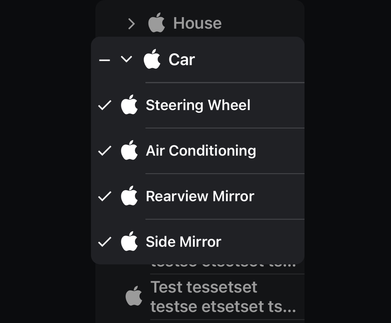
    Dim RootItem2 As AS_SelectionList_Item = AS_SelectionList1.AddItem("Car", AS_SelectionList1.FontToBitmap(Chr(0xF179),False,30,xui.Color_White), "Car")
    AS_SelectionList1.AddSubItem(RootItem2, "Steering Wheel", AS_SelectionList1.FontToBitmap(Chr(0xF179),False,30,xui.Color_White), "Steeringwheel")
    AS_SelectionList1.AddSubItem(RootItem2, "Air Conditioning", AS_SelectionList1.FontToBitmap(Chr(0xF179),False,30,xui.Color_White), "Climate")
    AS_SelectionList1.AddSubItem(RootItem2, "Rearview Mirror", AS_SelectionList1.FontToBitmap(Chr(0xF179),False,30,xui.Color_White), "BackMirror")
    AS_SelectionList1.AddSubItem(RootItem2, "Side Mirror", AS_SelectionList1.FontToBitmap(Chr(0xF179),False,30,xui.Color_White), "SideMirror")
BottomSelectionList
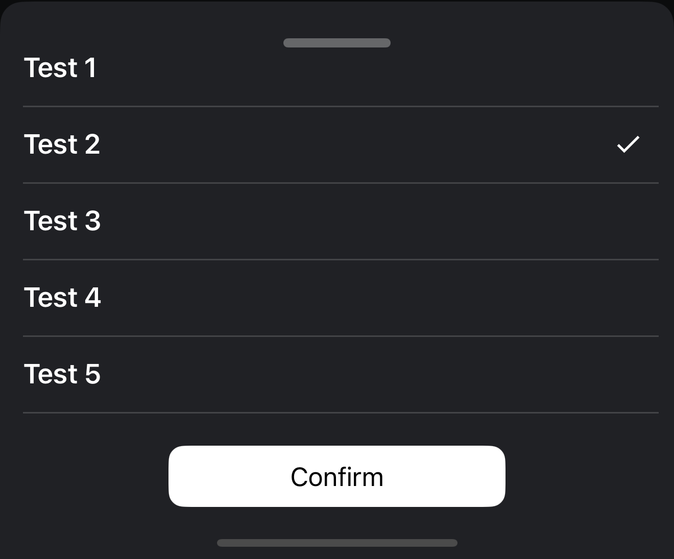
[B4X] [XUI] AS BottomSelectionList
This view makes it easy to quickly provide a good looking single or multiple selection list, based on the AS_SelectionList, built into a ready to use bottom menu. You need: AS_DraggableBottomCard V1.14+ AS_SelectionList V1.05+ I spend a lot of time in creating views, like this and to create a...
AS_SelectionList
Author: Alexander Stolte
Version: 2.00
- AS_SelectionList
- Events:
- SelectionChanged
- Fields:
- mBase As B4XView
- Tag As Object
- Functions:
- AddItem (Text As String, Icon As B4XBitmap, Value As Object) As AS_SelectionList_Item
- AddSubItem (RootItem As AS_SelectionList_Item, Text As String, Icon As B4XBitmap, Value As Object) As AS_SelectionList_SubItem
- Base_Resize (Width As Double, Height As Double)
- Clear
- ClearSearch
- ClearSelections
- CloseSubMenu
- CreateViewPerCode (Parent As B4XView, Left As Float, Top As Float, Width As Float, Height As Float)
- DesignerCreateView (Base As Object, Lbl As Label, Props As Map)
Base type must be Object - FontToBitmap (text As String, IsMaterialIcons As Boolean, FontSize As Float, color As Int) As B4XBitmap
FontAwesome To Bitmap
Unlike an older "TextToBitmap" sub that you can find in the forum, this code vertically centers the icon. It can also be used in B4J and B4i (only need to change the font line). Sub Activity_Create(FirstTime As Boolean) 'usage example Activity.AddMenuItem3("Android", "Test"... www.b4x.com
- GetItems As List
Get all items as list of AS_SelectionList_Item - GetSelections As List
<code>
For Each Item As Object In AS_SelectionList1.GetSelections
Log("Item selected: " & Item.Text)
Next
</code> - Initialize (Callback As Object, EventName As String)
- RebuildList
- SearchByText (Text As String)
- SearchByValue (Value As Object)
- SetSelections (Values As Object)
<code>AS_SelectionList1.SetSelections(Array As Object(1,3))</code> - SetSelections2 (Values As List)
<code>
    Dim lst As List
    lst.Initialize
    lst.Add(1)
    lst.Add(3)
    AS_SelectionList1.SetSelections2(lst)
</code>
- Properties:
- BackgroundColor As Int
- CornerRadius As Float
- HapticFeedback As Boolean
- ItemProperties As AS_SelectionList_ItemProperties [read only]
Height: Default: 50dip - MaxSelectionCount As Int
Only in SelectionMode = Multi - Defines the maximum number of items that may be selected
Default: 0 - RootItemClickBehavior As String
<code>AS_SelectionList1.RootItemClickBehavior = AS_SelectionList1.RootItemClickBehavior_CloseSubMenu</code> - RootItemClickBehavior_CloseSubMenu As String [read only]
- RootItemClickBehavior_SelectAllSubItems As String [read only]
Takes into account the SelectionMode and MaxSelectionCount - RootItemClickBehavior_SelectRootItem As String [read only]
- SelectedItemProperties As AS_SelectionList_SelectedItemProperties [read only]
- SelectedSubItemPropertiess As AS_SelectionList_SelectedSubItemProperties [read only]
- SelectionMode As String
Single or Multi - SelectionMode_Multi As String [read only]
- SelectionMode_Single As String [read only]
- SeperatorWidth_BeginWithIcon As String [read only]
- SeperatorWidth_BeginWithText As String [read only]
- SeperatorWidth_FullWidth As String [read only]
- SideGap As Float
Default: 10dip - Size As Int [read only]
- SubItemProperties As AS_SelectionList_SubItemProperties [read only]
Height: Default: 50dip - Theme As AS_SelectionList_Theme [write only]
- Theme_Dark As AS_SelectionList_Theme [read only]
- Theme_Light As AS_SelectionList_Theme [read only]
- ThemeChangeTransition As String
Fade or None - ThemeChangeTransition_Fade As String [read only]
- ThemeChangeTransition_None As String [read only]
- Events:
- 1.00
- Release
- 1.01
- BugFixes
- Add get and set MaxSelectionCount - Only in SelectionMode = Multi - Defines the maximum number of items that may be selected
- Default: 0
- 1.02
- Add Designer Property HapticFeedback
- Default: True
- BugFix on SearchByText - No longer takes capitalization into account
- Add Designer Property HapticFeedback
- 1.03
- BugFixes and Improvemets
- Add Clear
- Add RebuildList
- Add CreateViewPerCode
- Add "Height" to AS_SelectionList_ItemProperties Type
- 1.04
- BugFixes
- 1.05
- Add GetItems - Get all items as list of AS_SelectionList_Item
- 1.06 (read more)
- Add SetSelections2 - Set the Selections via a list
- Add Type AS_SelectionList_SelectedItemProperties
- Per Default the same settings as the AS_SelectionList_ItemProperties
- Add get and set SideGap
- Default: 10dip
- Add Desginer Property SeperatorWidth
- Default: BeginWithText
- BeginWithText - The separator begins where the text begins
- FullWidth - Full width
- BeginWithIcon - The separator starts where the icon begins, if there is no icon, then where the text begins
- 2.00 (read more)
- BugFixes and Improvements
- Add AddSubItem
- Add Designer Property RootItemClickBehavior - What should happen if you click on the root item when the sub menu is open
- Default: CloseSubMenu
- Add Type AS_SelectionList_SubItem
- Add Type AS_SelectionList_SubItemProperties
- Add Type AS_SelectionList_SelectedSubItemProperties
- Add get and set CornerRadius - First and Last Item corner radius
- 2.01
- Search BugFix
- 2.02 (read more)
- New SelectionIconAlignment - Alignment of the check icon of an item when it is selected
- Default: Right
- Left or Right
- New Designer Property SelectionIconAlignment
- Default: Right
- New get and set ShowSeperators
- New SelectionIconAlignment - Alignment of the check icon of an item when it is selected
- 2.03 (read more)
- New RefreshList - Removes the layout of the items and rebuilds the layout
- New Designer Property SearchTextHighlightedColor - The text color of the searched text when searching for something via SearchByText
- Default: Red
- New EmptyListTextLabel - Text that is displayed in the middle of the view if the list is empty, e.g. in a search if no items match the search
- New get EmptyListTextLabel
- New get and set EmptyListText
- New get and set EmptySearchListText
- New get and set EmptyListTextVisibility - If False then no Empty list text is displayed
- Default: True
- New CustomDrawItem Event
- New AS_SelectionList_CustomDrawItemViews Type
- New AddItem2 - Adding an item with AS_SelectionList_Item parameter
- Update Base_Resize - if the width changes, the items are recreated
- Change The ItemText is now based on BBLabel
- 2.04 (read more)
- New SelectionItemChanged Event - In the event, the item that was checked/unchecked is returned in order to be able to react better instead of always having to go through the complete selected item list
- 2.05 (read more)
- New DeselectItem - Deselect by AS_SelectionList_Item or AS_SelectionList_SubItem
- New DeselectItem2 - Deselect by Value
- 2.06
- BugFix subitems list height is now maximum as high as the space below
- 2.07
- BugFix highlight text sometimes causes crashes
- 2.08
- New AS_SelectionList_CheckItemProperties Type
- New get CheckItemProperties
- 2.09
- BugFixes - Thanks to @Peter Meares
- 2.10
- BugFix - SelectionChanged is now also triggered when you deselect items using code
- New SelectAll - Selects all items + subitems
Have Fun
Attachments
Last edited:
