How do they... ? #2
(French version/Version française)
I decided to dedicate my second and third tutorials to PlayerPro of BlastOn LLC. I'll show you how to reproduce the album list, the artist list and the equalizer. The interface of these lists is fairly standard for a media player. The equalizer shows a little more graphic design, with custom views.
This article assumes that you know how to use the B4A designer and install a library or class.
First part: the album list

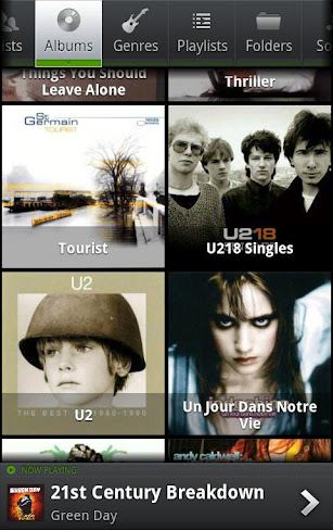
In this screenshot, there are three different areas: a tab bar at the top, a list of images below and an information area at the bottom. At first glance, one might think that the first two areas can be achieved with a TabHost except that the tab bar can scroll horizontally, which is not the case with a TabHost. Moreover, in applications displaying multiple lists filled with images, it is necessary to limit the memory consumption and avoid multiple lists loaded simultaneously. So, I will use a simple panel that I will fill depending on the selected tab. For the tab bar, I will use the ActionBar class and for the list of images, I will use the CustomGallery class, a class that can display a gallery with several vertical columns. At the very bottom, I'll put a Panel to group information about the song currently playing.
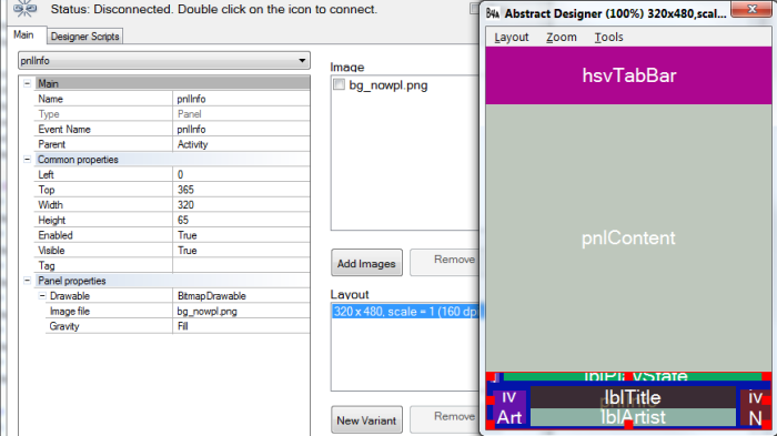
I open the designer. I create a HorizontalScrollview at the top, a panel in the middle and another panel at the bottom. In the bottom panel (pnlInfo), I place all the elements necessary to display my information: three ImageViews and three Labels. The first Label has a green text, the second a white text and the third a gray text.

The pnlInfo background is an image with a dark shade of gray. In the designer, I load the image with Add Images and I specify that this drawable is a BitmapDrawable in the Panel properties. Then, I select the image in the Image file list.
Script:
I declare all the created views in Globals:
I also declare the two classes that I'm going to use: :
The CustomGallery class requires the installation of two libraries: BitmapPlus and ScrollView2D.
I load my layout to the activity and I initialize the action bar:
The parent of the abTabs bar is the HorizontalScrollView Panel and this bar is as high as its container.
I know I'm going to put six buttons with a width of 65dip in my action bar. So I can already calculate the width of my HorizontalScrollView Panel and, therefore, the width of the action bar. I take into account the case where my screen is wide enough to display all the buttons.
Why don't I use the FillParent function of the ActionBar class? Because HorizontalScrollViews (like TabHosts) set the height of their content to the constant -1 (FILL_PARENT). Thus hsvTabBar.Panel.Height would return -1 and cause errors.
My action bar has buttons separated by a very thin divider (1dip) and these buttons share the available width equally:
In Globals, I declare my six buttons :
I add also their default color (light gray), the ColorDrawable (green) that I will use for the pressed state and the BitmapDrawable that will fill the bar background:
In Activity_Create, I load my background (a gradient dark gray with a green border at the bottom) and set the pressed state color:
Next I add the buttons :
I chose the style 2 (small icon with a text below) and I call SetText to change the text color and text size.
Let's see the result:

There are three notable differences with the model: the scrollbar is visible when one moves horizontally, the text is far too low under the icon and the shadow effect on the text is missing. For the scrollbar, I'm going to use the Reflection library to access the method setHorizontalScrollBarEnabled of HorizontalScrollView:
For the text position and the shadow effect, I could modify the class code, but that would complicate a possible update. I prefer to write two small functions to change the Label position in the button (which is not a real button, but a Panel) and add a shadow with the method setShadowLayer:
I call my function ModifyButton in Activity_Create for each button:
Result :

Now I have to manage the change of tab. I specified when adding buttons that I wanted to listen the OnClick event. It's time to create the six event handlers:
In each handler, I'm going to call a function that will change the appearance of the button depending on its state and will clean pnlContent. This function, TabChange, must remember the last clicked button in order to restore it to its default appearance when another tab is selected. For this, I declare two variables in Globals:
Then I write the function :
Since the function ReplaceIcon recalculates the position of the text under the icon, I have to call my function ModifyButton again to raise the Label. It is a good opportunity to change the text and shadow colors depending on the state.
I added a few lines of code to make sure the button is fully displayed when I click it. If this is not the case, I scroll hsvTabBar.
Example of call of the function TabChange in an event handler:
When a button is clicked, the background becomes bright and displays a green bar with an arrow. It is an image. I could create it with the exact dimensions of the button, but it would have two disadvantages: I would have to redo the image if I change my mind about the button size and my button should have the same size regardless of the orientation or the screen width. Not really convenient. So that my button can extend without glitches, I have to use a 9-patch drawable. A 9-patch drawable is an image that contains stretchable zones and content areas. You can read his description here.
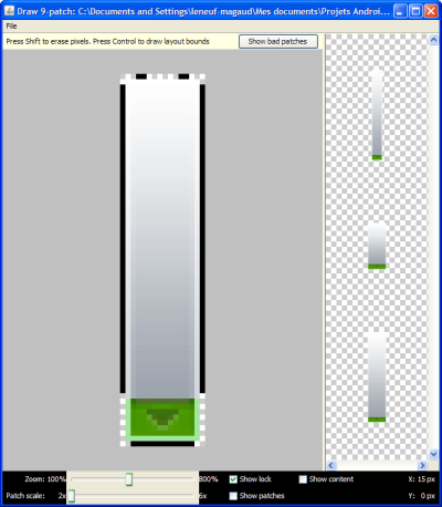
Look at the 9-patch that I drew from the screenshot:

The black lines above indicate which parts of the image can be stretched. Same thing with the line on the left. The lines on the right and below define the content area (the other views can draw only in this area).
I copied the 9-patch file into the folder Objects/res/drawable and I protected the file against being overwritten. To load in into the application, I use the following function:
Result:

I can fill now my album list. I create a function CreateAlbumList that I call from the event handler. Henceforth, the handler for albums looks like this:
In CreateAlbumList, I initialize the image gallery (the style 7 is a vertical grid style with rescaled images):
Images will be spaced 4dip and distributed on a variable number of columns depending on the width of the screen. Their ideal size will be 150dip x 150dip.
Smaller images will be enlarged to fill up their location in the grid and clicked images will be colored green (I reuse the ColorDrawable of pressed buttons):
To fill the gallery, I use the MediaBrowser library (the retrieval of album data, the loading in a separate thread and the memory management won't be discussed here). To add an image from a file, I can call the functions AddThumbnail or InsertFileAt. E.g.:
or
What remains is to create the label that displays the album title. It must be inserted in the thumbnail Panel.
I want this Label to display two lines maximum, and to end with an ellipsis if the text is too long, so I add:
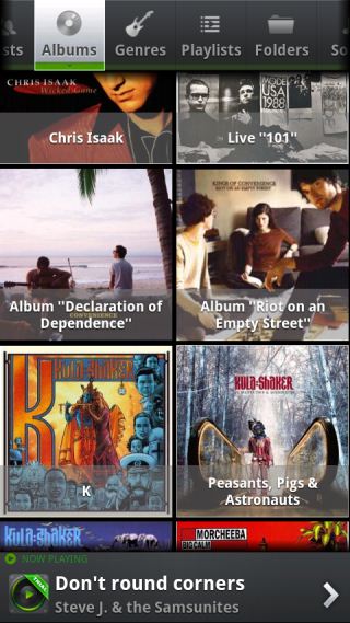
I finish by putting some demo content in the information Panel at the very bottom. Et voilà:

Scrolling through the list, one can notice that PlayerPro displays on the right a fast scroll handle, as in ListView when you set FastScrollEnabled to True. To replicate it, I'm going to use the class ScrollPanel2D (the ScrollPanel version for ScrollView2D). I initialize the class after having declared it in Globals:
I load the drawable of the fast scroll handle:
So that ScrollPanel is informed about the scrolling in the gallery, I transfer the OnScroll event to it:
I can now remove the vertical scrollbar of ScrollView2D, become useless:

<<< How do they... ? #1
How do they... ? #3 >>>
About the author: Frédéric Leneuf-Magaud. I'm a professional developper since the early 90's and I have designed or contributed to hundreds of applications. I currently work for the French administration in a supervisory team of servers. Android development is one of my hobbies.
How do they... ? #2
(French version/Version française)
I decided to dedicate my second and third tutorials to PlayerPro of BlastOn LLC. I'll show you how to reproduce the album list, the artist list and the equalizer. The interface of these lists is fairly standard for a media player. The equalizer shows a little more graphic design, with custom views.
This article assumes that you know how to use the B4A designer and install a library or class.
First part: the album list
In this screenshot, there are three different areas: a tab bar at the top, a list of images below and an information area at the bottom. At first glance, one might think that the first two areas can be achieved with a TabHost except that the tab bar can scroll horizontally, which is not the case with a TabHost. Moreover, in applications displaying multiple lists filled with images, it is necessary to limit the memory consumption and avoid multiple lists loaded simultaneously. So, I will use a simple panel that I will fill depending on the selected tab. For the tab bar, I will use the ActionBar class and for the list of images, I will use the CustomGallery class, a class that can display a gallery with several vertical columns. At the very bottom, I'll put a Panel to group information about the song currently playing.
I open the designer. I create a HorizontalScrollview at the top, a panel in the middle and another panel at the bottom. In the bottom panel (pnlInfo), I place all the elements necessary to display my information: three ImageViews and three Labels. The first Label has a green text, the second a white text and the third a gray text.
The pnlInfo background is an image with a dark shade of gray. In the designer, I load the image with Add Images and I specify that this drawable is a BitmapDrawable in the Panel properties. Then, I select the image in the Image file list.
Script:
B4X:
'All variants script
hsvTabBar.Height = 65dip
hsvTabBar.Width = 100%x
pnlInfo.Top = 100%y - 65dip
pnlInfo.Width = 100%x
pnlContent.Height = 100%y - hsvTabBar.Height - pnlInfo.Height
pnlContent.Width = 100%x

'Views in pnlInfo
ivNextBtn.Right = 100%x
lblTitle.Width = ivNextBtn.Left - lblTitle.Left - 5dip
lblArtist.Width = lblTitle.Width
I declare all the created views in Globals:
B4X:
Sub Globals
   Dim hsvTabBar As HorizontalScrollView
   Dim pnlContent As Panel
   Dim pnlInfo As Panel

   'Views in pnlInfo
   Dim ivPlayState As ImageView
   Dim lblPlayState As Label
   Dim ivArtwork As ImageView
   Dim lblTitle As Label
   Dim lblArtist As Label
   Dim ivNextBtn As ImageView
 End Sub
I also declare the two classes that I'm going to use: :
B4X:
Dim abTabs As ClsActionBar
Dim lstAlbums As ClsCustomGalleryI load my layout to the activity and I initialize the action bar:
B4X:
Sub Activity_Create(FirstTime As Boolean)
   Activity.LoadLayout("Main.bal")

   abTabs.Initialize(hsvTabBar.Panel, True, False, hsvTabBar.Height, Me)
End SubI know I'm going to put six buttons with a width of 65dip in my action bar. So I can already calculate the width of my HorizontalScrollView Panel and, therefore, the width of the action bar. I take into account the case where my screen is wide enough to display all the buttons.
B4X:
hsvTabBar.Panel.Width = Max(65dip * 6, 100%x)
abTabs.AsPanel.Width = hsvTabBar.Panel.Width
Why don't I use the FillParent function of the ActionBar class? Because HorizontalScrollViews (like TabHosts) set the height of their content to the constant -1 (FILL_PARENT). Thus hsvTabBar.Panel.Height would return -1 and cause errors.
My action bar has buttons separated by a very thin divider (1dip) and these buttons share the available width equally:
B4X:
abTabs.SetDividerWidth(1dip)
abTabs.SameWidthForAll(True)
In Globals, I declare my six buttons :
B4X:
Dim aBtn(6) As ViewI add also their default color (light gray), the ColorDrawable (green) that I will use for the pressed state and the BitmapDrawable that will fill the bar background:
B4X:
Dim btnDefaultTextColor As Int
btnDefaultTextColor = Colors.RGB(150, 150, 150) 'Gray
Dim cdPressed As ColorDrawable
cdPressed.Initialize(Colors.ARGB(128, 0, 250, 0), 0) 'Green
Dim btnBackground As BitmapDrawable
In Activity_Create, I load my background (a gradient dark gray with a green border at the bottom) and set the pressed state color:
B4X:
btnBackground.Initialize(LoadBitmap(File.DirAssets, "bg_defaut.png"))
abTabs.SetBackground(btnBackground)
abTabs.ReplacePressedDrawable(cdPressed)
Next I add the buttons :
B4X:
aBtn(0) = abTabs.AddButton(LoadBitmap(File.DirAssets, "tab_artists_defaut.png"), "", 2, 1, "Artists_Click", "")
abTabs.SetText(aBtn(0), "Artists", btnDefaultTextColor, 14)
aBtn(1) = abTabs.AddButton(LoadBitmap(File.DirAssets, "tab_albums_defaut.png"), "", 2, 2, "Albums_Click", "")
abTabs.SetText(aBtn(1), "Albums", btnDefaultTextColor, 14)
aBtn(2) = abTabs.AddButton(LoadBitmap(File.DirAssets, "tab_genres_defaut.png"), "", 2, 3, "Genres_Click", "")
abTabs.SetText(aBtn(2), "Genres", btnDefaultTextColor, 14)
aBtn(3) = abTabs.AddButton(LoadBitmap(File.DirAssets, "tab_playlists_defaut.png"), "", 2, 4, "Playlists_Click", "")
abTabs.SetText(aBtn(3), "Playlists", btnDefaultTextColor, 14)
aBtn(4) = abTabs.AddButton(LoadBitmap(File.DirAssets, "tab_folders_defaut.png"), "", 2, 5, "Folders_Click", "")
abTabs.SetText(aBtn(4), "Folders", btnDefaultTextColor, 14)
aBtn(5) = abTabs.AddButton(LoadBitmap(File.DirAssets, "tab_songs_defaut.png"), "", 2, 6, "Songs_Click", "")
abTabs.SetText(aBtn(5), "Songs", btnDefaultTextColor, 14)Let's see the result:
There are three notable differences with the model: the scrollbar is visible when one moves horizontally, the text is far too low under the icon and the shadow effect on the text is missing. For the scrollbar, I'm going to use the Reflection library to access the method setHorizontalScrollBarEnabled of HorizontalScrollView:
B4X:
Dim r As Reflector
r.Target = hsvTabBar
r.RunMethod2("setHorizontalScrollBarEnabled", False, "java.lang.boolean")
For the text position and the shadow effect, I could modify the class code, but that would complicate a possible update. I prefer to write two small functions to change the Label position in the button (which is not a real button, but a Panel) and add a shadow with the method setShadowLayer:
B4X:
Sub ModifyButton(Btn As Panel, TextColor As Int, ShadowColor As Int)
   Dim lbl As Label
   lbl = Btn.GetView(1) 'The button label is the second view in panel
   lbl.Top = lbl.Top  - 9dip
   lbl.TextColor = TextColor
   AddShadow(lbl, ShadowColor)
End Sub
Sub AddShadow(lblTxtVw As Label, Color As Int)
   Dim r As Reflector
   r.Target = lblTxtVw
   Dim Args(4) As Object
   Args(0) = 1 'radius
   Args(1) = 0 'dx
   Args(2) = 1 'dy
   Args(3) = Color
   r.RunMethod4("setShadowLayer", Args, Array As String("java.lang.float", "java.lang.float", "java.lang.float", "java.lang.int"))
End Sub
B4X:
For i = 0 To 5
   ModifyButton(aBtn(i), btnDefaultTextColor, Colors.Black)
NextNow I have to manage the change of tab. I specified when adding buttons that I wanted to listen the OnClick event. It's time to create the six event handlers:
B4X:
Sub Artists_Click(ActionBar As ClsActionBar, Btn As View)
End Sub
Sub Albums_Click(ActionBar As ClsActionBar, Btn As View)
End Sub
Sub Genres_Click(ActionBar As ClsActionBar, Btn As View)
End Sub
Sub Playlists_Click(ActionBar As ClsActionBar, Btn As View)
End Sub
Sub Folders_Click(ActionBar As ClsActionBar, Btn As View)
End Sub
Sub Songs_Click(ActionBar As ClsActionBar, Btn As View)
End Sub
In each handler, I'm going to call a function that will change the appearance of the button depending on its state and will clean pnlContent. This function, TabChange, must remember the last clicked button in order to restore it to its default appearance when another tab is selected. For this, I declare two variables in Globals:
B4X:
Dim LastBtn As View
Dim LastIcon As String
B4X:
Sub TabChange(Btn As Panel, DefaultIcon As String, SelectedIcon As String)
   If LastBtn.IsInitialized Then
      ' ReplaceIcon restores also the default background (transparent)
      abTabs.ReplaceIcon(LastBtn, LoadBitmap(File.DirAssets, LastIcon))
      ModifyButton(LastBtn, btnDefaultTextColor, Colors.Black)
   End If
   abTabs.ReplaceIcon(Btn, LoadBitmap(File.DirAssets, SelectedIcon))
   Btn.Background = LoadNinePatchDrawable("bg_select")
   ModifyButton(Btn, Colors.DarkGray, Colors.White)
   LastBtn = Btn
   LastIcon = DefaultIcon

   ' Scrolls the HSV if the button is partially hidden
   If Btn.Left + Btn.Width > hsvTabBar.ScrollPosition + hsvTabBar.Width Then
      'The margin of 10dip moves the button away from the fading edge
      hsvTabBar.ScrollPosition = Btn.Left + Btn.Width - hsvTabBar.Width + 10dip
   Else If Btn.Left < hsvTabBar.ScrollPosition Then
      hsvTabBar.ScrollPosition = Btn.Left - 10dip
   End If

   ' Cleans the panel
   For i = pnlContent.NumberOfViews - 1 To 0 Step -1
      pnlContent.RemoveViewAt(i)
   Next
End SubI added a few lines of code to make sure the button is fully displayed when I click it. If this is not the case, I scroll hsvTabBar.
Example of call of the function TabChange in an event handler:
B4X:
TabChange(Btn, "tab_albums_defaut.png", "tab_albums_select.png")When a button is clicked, the background becomes bright and displays a green bar with an arrow. It is an image. I could create it with the exact dimensions of the button, but it would have two disadvantages: I would have to redo the image if I change my mind about the button size and my button should have the same size regardless of the orientation or the screen width. Not really convenient. So that my button can extend without glitches, I have to use a 9-patch drawable. A 9-patch drawable is an image that contains stretchable zones and content areas. You can read his description here.
Look at the 9-patch that I drew from the screenshot:
The black lines above indicate which parts of the image can be stretched. Same thing with the line on the left. The lines on the right and below define the content area (the other views can draw only in this area).
I copied the 9-patch file into the folder Objects/res/drawable and I protected the file against being overwritten. To load in into the application, I use the following function:
B4X:
'Gets a 9-patch drawable from the application resources
Sub LoadNinePatchDrawable(ImageName As String) As Object
   Dim r As Reflector
   Dim package As String
   package = r.GetStaticField("anywheresoftware.b4a.BA", "packageName")
   Dim ID_Drawable As Int
   ID_Drawable = r.GetStaticField(package & ".R$drawable", ImageName)
   r.Target = r.GetContext
   r.Target = r.RunMethod("getResources")
   Return r.RunMethod2("getDrawable", ID_Drawable, "java.lang.int")
End SubI can fill now my album list. I create a function CreateAlbumList that I call from the event handler. Henceforth, the handler for albums looks like this:
B4X:
Sub Albums_Click(ActionBar As ClsActionBar, Btn As View)
   If LastBtn <> Btn Then
      TabChange(Btn, "tab_albums_defaut.png", "tab_albums_select.png")
      CreateAlbumList
   End If
End Sub
In CreateAlbumList, I initialize the image gallery (the style 7 is a vertical grid style with rescaled images):
B4X:
lstAlbums.Initialize(pnlAlbums, 0, 0, thContent.Width, thContent.Height, 7, Me, "", "lstAlbums_Click", "", "lstAlbums_Scroll")Images will be spaced 4dip and distributed on a variable number of columns depending on the width of the screen. Their ideal size will be 150dip x 150dip.
B4X:
lstAlbums.SpaceBetweenThumbnails = 4dip
Dim ColWidth, NbCols As Int
ColWidth = Min(Min(150dip, pnlContent.Height), pnlContent.Width)
NbCols = Round(lstAlbums.SV2D.Width / ColWidth)
lstAlbums.SizeInGrid = ((lstAlbums.SV2D.Width - (lstAlbums.SpaceBetweenThumbnails * (NbCols - 1))) / NbCols) - 1
Smaller images will be enlarged to fill up their location in the grid and clicked images will be colored green (I reuse the ColorDrawable of pressed buttons):
B4X:
lstAlbums.RescaleOnlyIfBigger = False
lstAlbums.PressedDrawable = cdPressed
To fill the gallery, I use the MediaBrowser library (the retrieval of album data, the loading in a separate thread and the memory management won't be discussed here). To add an image from a file, I can call the functions AddThumbnail or InsertFileAt. E.g.:
B4X:
lstAlbums.AddThumbnail(LoadBitmapSample(CoverDir, CoverFile, lstAlbums.SizeInGrid, lstAlbums.SizeInGrid), i)
B4X:
lstAlbums.InsertFileAt(CoverDir, CoverFile, lstAlbums.NumberOfThumbnails, i)What remains is to create the label that displays the album title. It must be inserted in the thumbnail Panel.
B4X:
pnlThumbnail = lstAlbums.GetThumbnailAt(lstAlbums.NumberOfThumbnails - 1) 'Gets directly the added thumbnail
'pnlThumbnail = lstAlbums.GetThumbnailWithTag(i) 'Not recommended in a loop: this function iterates through all the thumbnails to find the right one
Dim lblAlbumTitle As Label
lblAlbumTitle.Initialize("")
lblAlbumTitle.Color = Colors.ARGB(128, 128, 128, 128) 'Semi-transparent gray
lblAlbumTitle.Gravity = Gravity.CENTER_HORIZONTAL + Gravity.CENTER_VERTICAL
lblAlbumTitle.TextColor = Colors.White
lblAlbumTitle.TextSize = 13
lblAlbumTitle.Text = strAlbumTitle
lblAlbumTitle.Typeface = Typeface.DEFAULT_BOLD
pnlThumbnail.AddView(lblAlbumTitle, 0, pnlThumbnail.Height * 0.7, pnlThumbnail.Width, pnlThumbnail.Height * 0.3)
AddShadow(lblAlbumTitle, Colors.Black)
B4X:
Dim r As Reflector
r.Target = lblAlbumTitle
r.RunMethod2("setMaxLines", 2, "java.lang.int")
r.RunMethod2("setHorizontallyScrolling", False, "java.lang.boolean")
r.RunMethod2("setEllipsize", "END", "android.text.TextUtils$TruncateAt")
I finish by putting some demo content in the information Panel at the very bottom. Et voilà:
Scrolling through the list, one can notice that PlayerPro displays on the right a fast scroll handle, as in ListView when you set FastScrollEnabled to True. To replicate it, I'm going to use the class ScrollPanel2D (the ScrollPanel version for ScrollView2D). I initialize the class after having declared it in Globals:
B4X:
spFastScroll.Initialize(lstAlbums.SV2D, 60dip, 52dip, False) 'No cache
B4X:
spFastScroll.ReplaceBackground(spFastScroll.LoadDrawable("scrollbar_handle_accelerated_anim2"))
B4X:
Sub lstAlbums_Scroll(PositionX As Int, PositionY As Int)
   spFastScroll.DisplayCustomText(PositionY, "") 'No text is displayed
End Sub
B4X:
lstAlbums.SV2D.ScrollbarsVisibility(False, False)<<< How do they... ? #1
How do they... ? #3 >>>
About the author: Frédéric Leneuf-Magaud. I'm a professional developper since the early 90's and I have designed or contributed to hundreds of applications. I currently work for the French administration in a supervisory team of servers. Android development is one of my hobbies.
Last edited:
