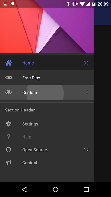
This is a port of library from here: https://github.com/mikepenz/MaterialDrawer
Its an amazing library by Mike Penz and it simplifies most of the Navigation Drawer setup and theming.


Library Setup
1. Copy the MSMaterialDrawer.jar and xml files to your AdditionalLibs folder.
2. This is also dependent on AppCompat v7 Support library, so copy that to AdditionalLibs or use AdditionalJar.
3. Make sure your android.jar in B4A > ConfigurePaths is set to point to android-22 at least.
4. There are 3 resource zip files. Unzip them in your desired area, and use #AdditionalRes to point to them.
5. If you want to use your own theme in styles.xml, you can also point to that with #AdditionalRes.
6. Depending on how you want to use it, (for e.g. with AppCompat Toolbar) you can set #Extends: with extending to ActionbarActivity. You can also specify the theme in the manifest.
7. If you want to use Iconics (Icon fonts), you also need to copy the font files in your files directory in a folder called fonts/ (lowercase).
Library Usage
Creating a simple drawer
Making a simple drawer is amazingly easy. There are two drawer objects:
- MaterialDrawerBuilder: Used to set all the params and build the drawer
- MaterialDrawer: This is the result when you build the drawer from the MaterialDrawerBuilder.
B4X:Dim MDB As MSMaterialDrawerBuilder Dim MD As MSMaterialDrawer MDB.Initialize("MD") MDB.withAccountHeader(MaterialHeaderResult) MDB.AddPrimaryDrawerItem ("Weather" , p1.Drawable ,Null ,"99+" ,True,1, "Shows the weather") MDB.AddPrimaryDrawerItem ("Insanity" , p2.Drawable ,Null ,"2" ,True,2, "") MDB.AddPrimaryDrawerItem ("Awesome" , p3.Drawable ,Null ,"" ,True,2, "") MDB.AddSectionDrawerItem ("Section" ,True) MDB.AddSecondaryDrawerItem("Settings" ,s1.Drawable ,Null ,"" ,True ,3) MDB.AddSecondaryDrawerItem("Help" ,s2.Drawable ,Null ,"" ,True ,4) MDB.AddSecondaryDrawerItem("Donate" ,s3.Drawable ,Null ,"" ,False,5) MDB.AddSecondaryDrawerItem("Yo" ,Null ,Null ,"" ,False,6) MD = MDB.Build
There are many other options like actionbar/toolbar/statusbar options. Customising the header/footer.
The theming and color can only be changed via styles.xml.
Events
The drawer can raise the following events:
- Closed
- Opened
- ItemClick
- ItemLongClick
In order to know which item was clicked/longclicked you need to assign them an 'identifier' when adding to the drawer, so you can check it later in the click event.
Theming the Drawer
The main way to customize the looks of the drawer is via a theme.
The theme is applied on the activity, and the drawer inherits its properties from that theme.
The library already comes with the following built-in themes that you can set. These built-in themes all depend on the AppCompat library and resources, so make sure you have those linked and copied as well.
- MaterialDrawerTheme (extends Theme.AppCompat.NoActionBar)
- MaterialDrawerTheme.TranslucentStatus
- MaterialDrawerTheme.ActionBar (extends Theme.AppCompat)
- MaterialDrawerTheme.ActionBar.TranslucentStatus
- MaterialDrawerTheme.Light (extends Theme.AppCompat.Light.NoActionBar)
- MaterialDrawerTheme.Light.TranslucentStatus
- MaterialDrawerTheme.Light.ActionBar (extends Theme.AppCompat.Light)
- MaterialDrawerTheme.Light.ActionBar.TranslucentStatus
- MaterialDrawerTheme.Light.DarkToolbar (extends Theme.AppCompat.DarkActionBar) (disabled the ActionBar)
- MaterialDrawerTheme.Light.DarkToolbar.TranslucentStatus
- MaterialDrawerTheme.Light.DarkToolbar.ActionBar (extends Theme.AppCompat.DarkActionBar)
- MaterialDrawerTheme.Light.DarkToolbar.ActionBar.TranslucentStatus
To further theme, you can either inherit from one of these themes and override the colors.
You can also create your own custom style, but be sure to add the style attributes requires by the Material Drawer. An example is available for this.
Using Icon Fonts
The library contains a class called MSIconicDrawable which is a port of this library: https://github.com/mikepenz/Android-Iconics
Basically it allows you to use an Icon Font as a drawable.
What is the advantage of this?
- You cant tint/color the drawable by code which is insanely cool.
- They scale well, and you can set the size according to your needs.
- The ttf files are generally small enough, so you can pack a large number of icons into a manageable file.
Currently there is support for font-awesome and google-material-icons fonts. Others can be added (but missing some features).
How to use:
You must copy the font ttf file in your projects Files/fonts/<fontname>
Here is a link to the fonts used in the project. Download fonts
Then in code:
B4X:Dim s2 As MSIconicDrawable s2.Initialize("gmd_help") 'Load a google material design icon s2.Color = 0xffff4081 'Change the color of icon Dim s3 As MSIconicDrawable s3.Initialize("faw_google_wallet") 'Load a font awesome icon s3.Color = 0xffff4081 'Change the icon color 'List all icons available in a font Log(s2.ListDrawables("gmd")) 'List Google material design icons Log(s2.ListDrawables("faw")) 'List Font awesome icons 'Use the Drawable as button.Background = s2.Drawable
Demo apk + Source: See here
More information about the icon fonts:
http://fontawesome.io/icons/
http://google.github.io/material-design-icons/
Where is link for the library? Tnx...


