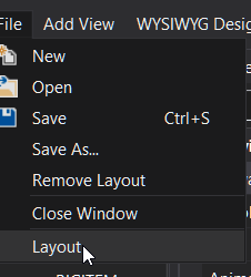
Specifically what does this option do when you click it?, I see it does something, but don't know what it is, sometimes just saves the layout, some other times it just refreshes screen and then does nothing (apparently), If Open is for opening layouts and save is for saving them, then what does LAYOUT do?

-
Welcome to B4X forum!
B4X is a set of simple and powerful cross platform RAD tools:
- B4A (free) - Android development
- B4J (free) - Desktop and Server development
- B4i - iOS development
- B4R (free) - Arduino, ESP8266 and ESP32 development
Android Question Designer gui help (Layout option in file Menu)
- Thread starter arana
- Start date
- Similar Threads Similar Threads
Similar Threads
- Article
B4A Class
[B4X] [XUI] AS Popup Menu
- Locked
- Article
Android Tutorial
GUI SDK Manager for newer versions of Android tools
